
1 Presentation Skills (but keep in mind: This is NOT a presentation) Dr Theodoros Manavis...
25
1 Presentation Skills Presentation Skills (but keep in mind: This is NOT a presentation) (but keep in mind: This is NOT a presentation) Dr Theodoros Manavis Dr Theodoros Manavis [email protected] [email protected]
-
Upload
regina-powell -
Category
Documents
-
view
227 -
download
2
Transcript of 1 Presentation Skills (but keep in mind: This is NOT a presentation) Dr Theodoros Manavis...

1
Presentation SkillsPresentation Skills(but keep in mind: This is NOT a presentation)(but keep in mind: This is NOT a presentation)
Dr Theodoros ManavisDr Theodoros [email protected]@ist.edu.gr
2
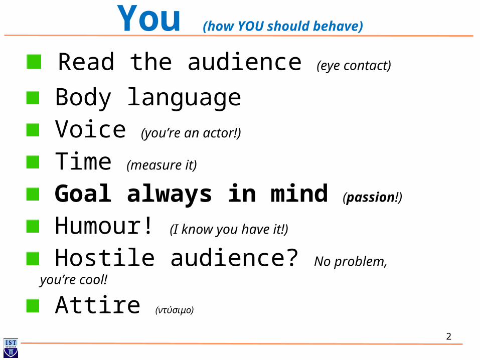
You (how YOU should behave)
Read the audience (eye contact)
Body language Voice (you’re an actor!)
Time (measure it)
Goal always in mind (passion!)
Humour! (I know you have it!)
Hostile audience? No problem, you’re cool!
Attire (ντύσιμο)

3
Do’s and don’ts
People tend to push all their information onto the slides. If the slides can pass all the information, what use is the presenter? Be SELECTIVE about what is on the slides. You can add a lot of content verbally.
Good presenters use the slides to SUPPLEMENT the presentation. They show off charts, graphs or amusing pictures or cartoons that help make their point better or more effectively. They do NOT copy out dull pages of texts. (see slide 18 for a brief example)
If you must include text - make sure its big and easy to read. If you have text up there you WANT people to read it. Make it possible. Large fonts, sans serifs, contrasting colors. Test it out if possible before hand.
4
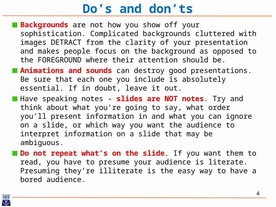
Backgrounds are not how you show off your sophistication. Complicated backgrounds cluttered with images DETRACT from the clarity of your presentation and makes people focus on the background as opposed to the FOREGROUND where their attention should be.
Animations and sounds can destroy good presentations. Be sure that each one you include is absolutely essential. If in doubt, leave it out.
Have speaking notes - slides are NOT notes. Try and think about what you’re going to say, what order you’ll present information in and what you can ignore on a slide, or which way you want the audience to interpret information on a slide that may be ambiguous.
Do not repeat what’s on the slide. If you want them to read, you have to presume your audience is literate. Presuming they’re illiterate is the easy way to have a bored audience.
Do’s and don’ts
5
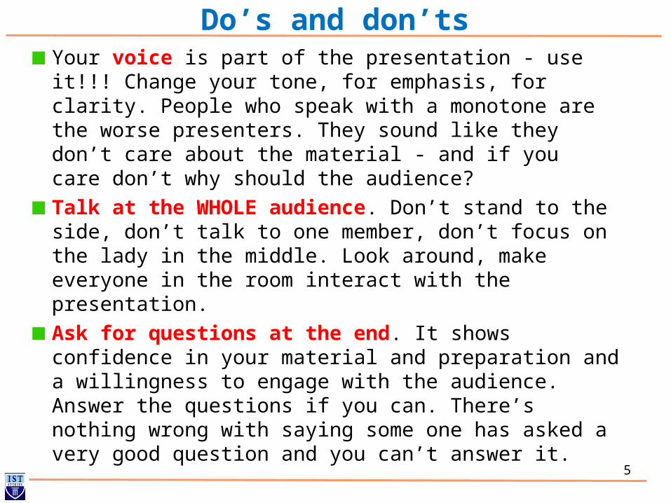
Do’s and don’tsYour voice is part of the presentation - use it!!! Change your tone, for emphasis, for clarity. People who speak with a monotone are the worse presenters. They sound like they don’t care about the material - and if you care don’t why should the audience?
Talk at the WHOLE audience. Don’t stand to the side, don’t talk to one member, don’t focus on the lady in the middle. Look around, make everyone in the room interact with the presentation.
Ask for questions at the end. It shows confidence in your material and preparation and a willingness to engage with the audience. Answer the questions if you can. There’s nothing wrong with saying some one has asked a very good question and you can’t answer it.
6
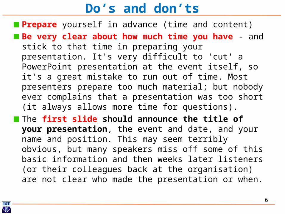
Do’s and don’tsPrepare yourself in advance (time and content)
Be very clear about how much time you have - and stick to that time in preparing your presentation. It's very difficult to 'cut' a PowerPoint presentation at the event itself, so it's a great mistake to run out of time. Most presenters prepare too much material; but nobody ever complains that a presentation was too short (it always allows more time for questions).
The first slide should announce the title of your presentation, the event and date, and your name and position. This may seem terribly obvious, but many speakers miss off some of this basic information and then weeks later listeners (or their colleagues back at the organisation) are not clear who made the presentation or when.
7
Do’s and don’tsThe second slide should catch the attention of your audience for your presentation. It could be the central proposition of your presentation or a conventional wisdom that you wish to challenge or a relevant or witty quote from a leader in your field. If it is amusing or controversial or both, so much the better.
The third slide should set out the structure of your presentation. The default structure should consist of three themes that you intend to examine. For a very short presentation, there might only be time for two; if you want to look at more than five areas, write a book instead.
Each slide should have clear heading. A question is often a good way of winning attention - but, in that case, make sure you answer the question in the body of the slide.
8
Do’s and don’ts
Each bullet point should consist of an intelligible phrase, rather than merely a word or two that is meaningless on its own or conversely a complete sentence that is better delivered orally. So, for instance, do use "Focus on profitable and growing markets" rather than simply "Focus" or "Markets".
Make appropriate use of pictures. It's a good idea to break up text with illustrations and it is true that a picture is worth a thousand words.
The last slide should set out all appropriate contact details: certainly e-mail address and possibly snail mail address.
9
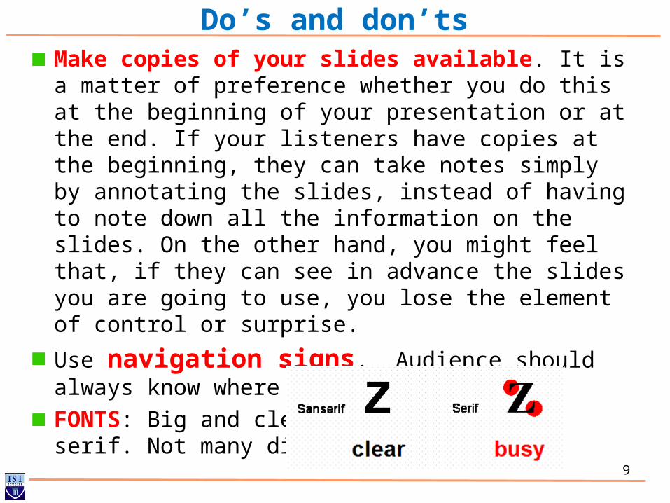
Do’s and don’tsMake copies of your slides available. It is a matter of preference whether you do this at the beginning of your presentation or at the end. If your listeners have copies at the beginning, they can take notes simply by annotating the slides, instead of having to note down all the information on the slides. On the other hand, you might feel that, if they can see in advance the slides you are going to use, you lose the element of control or surprise.
Use navigation signs. Audience should always know where they stand.
FONTS: Big and clear, preferably sans-serif. Not many different fonts!!
10
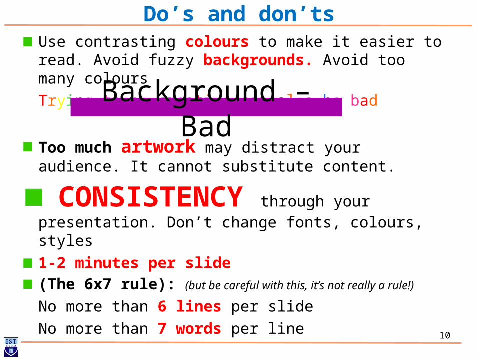
Do’s and don’tsUse contrasting colours to make it easier to read. Avoid fuzzy backgrounds. Avoid too many colours
Trying to be creative can also be bad
Too much artwork may distract your audience. It cannot substitute content.
CONSISTENCY through your presentation. Don’t change fonts, colours, styles
1-2 minutes per slide(The 6x7 rule): (but be careful with this, it’s not really a rule!)
No more than 6 lines per slide
No more than 7 words per line
Background – Bad
11
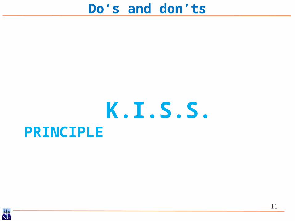
Do’s and don’ts
K.I.S.S. PRINCIPLE
12
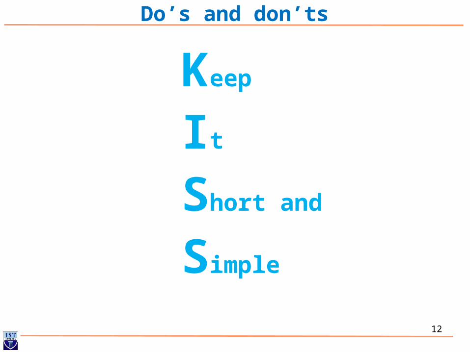
Do’s and don’ts
Keep
It
Short and
Simple
13
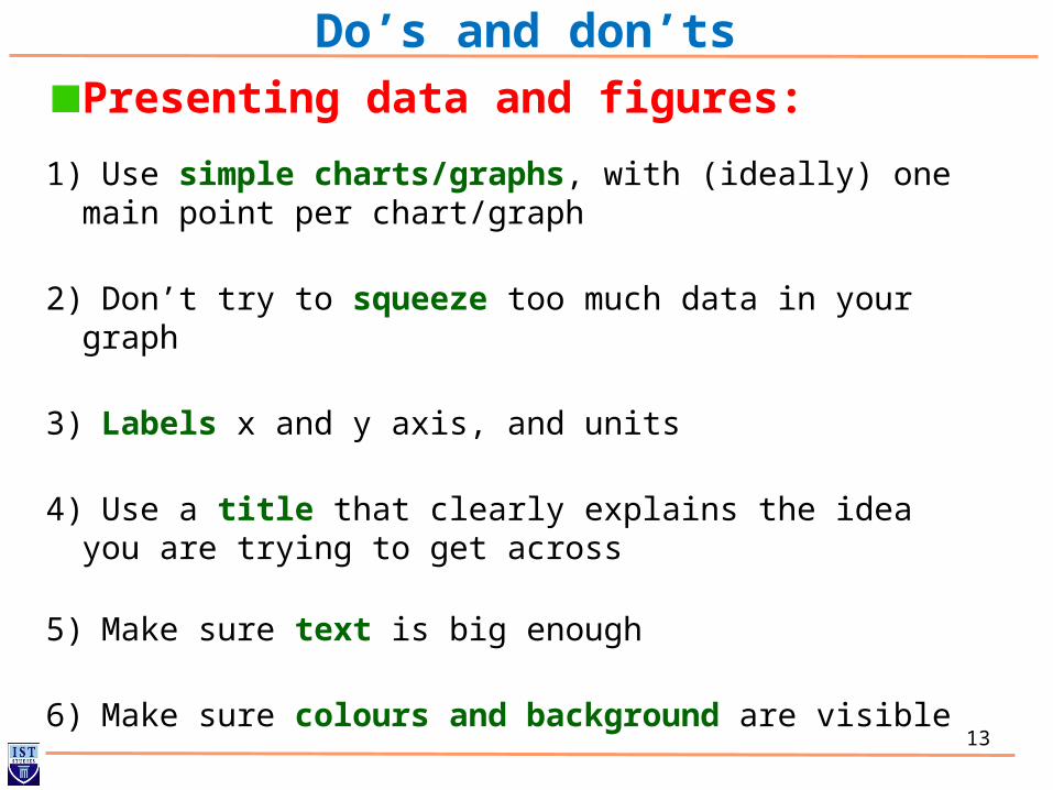
Do’s and don’ts
Presenting data and figures:
1) Use simple charts/graphs, with (ideally) one main point per chart/graph
2) Don’t try to squeeze too much data in your graph
3) Labels x and y axis, and units
4) Use a title that clearly explains the idea you are trying to get across
5) Make sure text is big enough
6) Make sure colours and background are visible
14
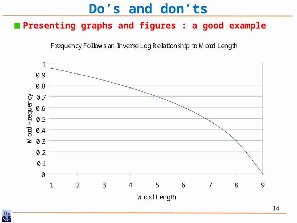
Do’s and don’tsPresenting graphs and figures : a good example
Frequency Follows an Inverse Log Relationship to Word Length
0
0.1
0.2
0.3
0.4
0.5
0.6
0.7
0.8
0.9
1
1 2 3 4 5 6 7 8 9
Word Length
Wor
d F
requ
ency
15
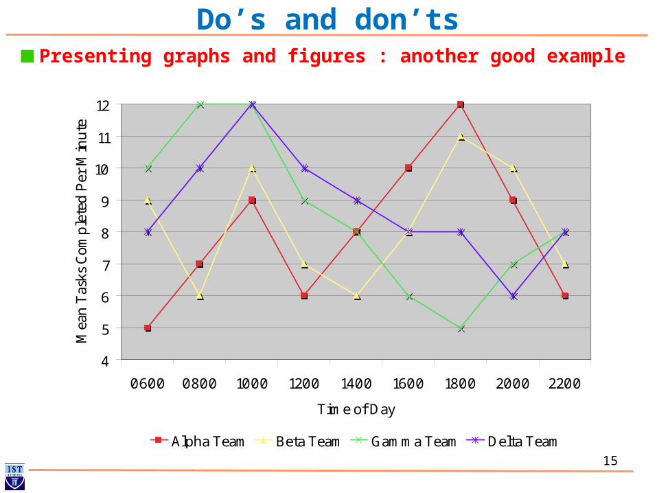
Do’s and don’tsPresenting graphs and figures : another good example
4
5
6
7
8
9
10
11
12
0600 0800 1000 1200 1400 1600 1800 2000 2200
Time of Day
Mea
n T
asks
Com
ple
ted P
er M
inute
Alpha Team Beta Team Gamma Team Delta Team

16
Do’s and don’tsPresenting graphs and figures: a bad example
Relation_373
Relation_372
Relation_371
Relation_370
Relation_369
Relation_363
Relation_362
Relation_361
Relation_360
Relation_359
Relation_358
Relation_357
Relation_356
Customer
Customer_IDCustomer_FirstNameCustomer_LastNameCustomer_CityCustomer_RegionCustomer_CountryCustomer_PhoneCustomer_FaxCustomer_PostalCodeCustomer_Address
Supplier
Supplier_IDComany_NameSupplier_FirstNameSupplier_CitySupplier_RegionSupplier_PostalCodeSupplier_CountrySupplier_PhoneSupplier_FaxSupplier_AFMSupplier_Address
Staff
Staff_IDStaff_FirstNameStaff_LastNameStaff_PositionStaff_SexStaff_BirthDateStaff_HireDateStaff_PostalCodeStaff_PhoneStaff_SalaryStaff_Address
WareHouse
WareHouse_IDOrder_IDCategories
Products
Product_IDProduct_NameSupplierCategoryProduct_Price
Orders
Order_IDCustomer_IDEmployee_IDOrder_DateShipped_DateShip_NameShip_AddressShip_PostalCodeShip_CountryShip_City
Categories
Categories_IDCategory_NameDescription
Shipper
Shipper_IDCompany_NameShipper_PhoneShipper_Fax
Returns
Return_IDOrder_IDCustomer_IDReturn_Date
Invoices
Invoice_IDInvoice_NumberInvoice_DateProduct_IDCustomer_ID
Order_Details
Order_Details_CodeProduct_IDOrder_ID
Sales
Sales_IDProduct_IDProduct_QualityCustomer_IDInvoice
Cart
Product_IDProduct_Stock
ERD
17
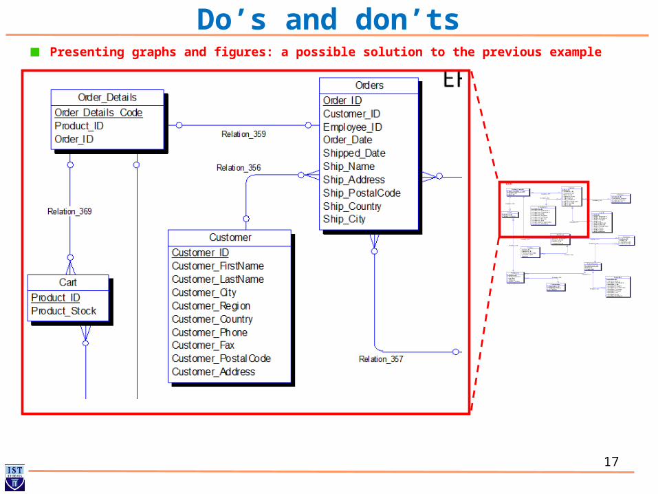
Do’s and don’tsPresenting graphs and figures: a possible solution to the previous example
Relation_373
Relation_372
Relation_371
Relation_370
Relation_369
Relation_363
Relation_362
Relation_361
Relation_360
Relation_359
Relation_358
Relation_357
Relation_356
Customer
Customer_IDCustomer_FirstNameCustomer_LastNameCustomer_CityCustomer_RegionCustomer_CountryCustomer_PhoneCustomer_FaxCustomer_PostalCodeCustomer_Address
Supplier
Supplier_IDComany_NameSupplier_FirstNameSupplier_CitySupplier_RegionSupplier_PostalCodeSupplier_CountrySupplier_PhoneSupplier_FaxSupplier_AFMSupplier_Address
Staff
Staff_IDStaff_FirstNameStaff_LastNameStaff_PositionStaff_SexStaff_BirthDateStaff_HireDateStaff_PostalCodeStaff_PhoneStaff_SalaryStaff_Address
WareHouse
WareHouse_IDOrder_IDCategories
Products
Product_IDProduct_NameSupplierCategoryProduct_Price
Orders
Order_IDCustomer_IDEmployee_IDOrder_DateShipped_DateShip_NameShip_AddressShip_PostalCodeShip_CountryShip_City
Categories
Categories_IDCategory_NameDescription
Shipper
Shipper_IDCompany_NameShipper_PhoneShipper_Fax
Returns
Return_IDOrder_IDCustomer_IDReturn_Date
Invoices
Invoice_IDInvoice_NumberInvoice_DateProduct_IDCustomer_ID
Order_Details
Order_Details_CodeProduct_IDOrder_ID
Sales
Sales_IDProduct_IDProduct_QualityCustomer_IDInvoice
Cart
Product_IDProduct_Stock
ERD
18
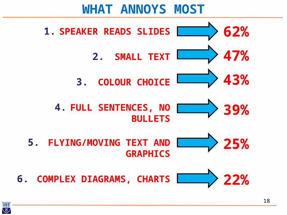
WHAT ANNOYS MOST
1. SPEAKER READS SLIDES
2. SMALL TEXT
3. COLOUR CHOICE
4. FULL SENTENCES, NO BULLETS
5. FLYING/MOVING TEXT AND GRAPHICS
6. COMPLEX DIAGRAMS, CHARTS
62%
47%
43%
39%
25%
22%
19
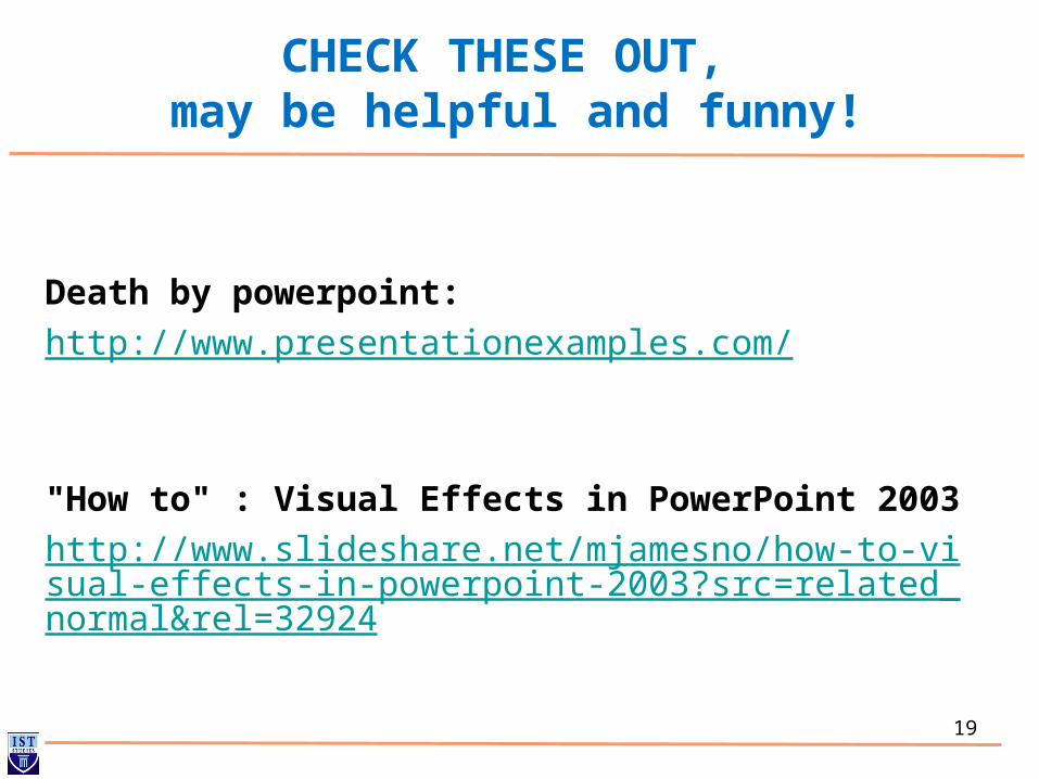
CHECK THESE OUT, may be helpful and funny!
Death by powerpoint:
http://www.presentationexamples.com/
"How to" : Visual Effects in PowerPoint 2003
http://www.slideshare.net/mjamesno/how-to-visual-effects-in-powerpoint-2003?src=related_normal&rel=32924
20
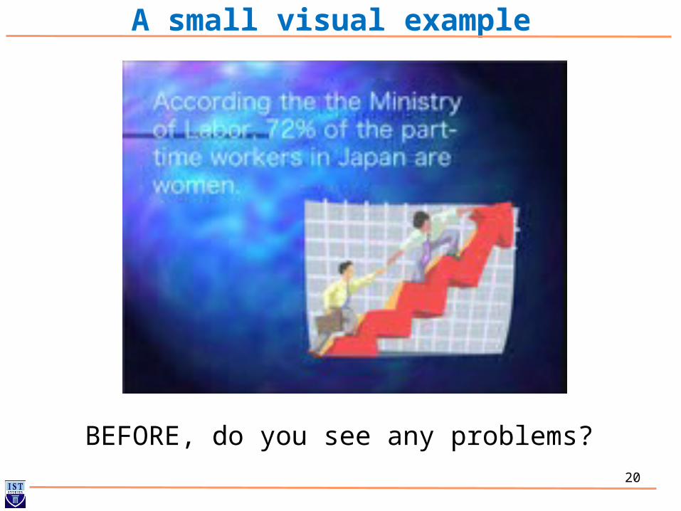
A small visual example
BEFORE, do you see any problems?
21
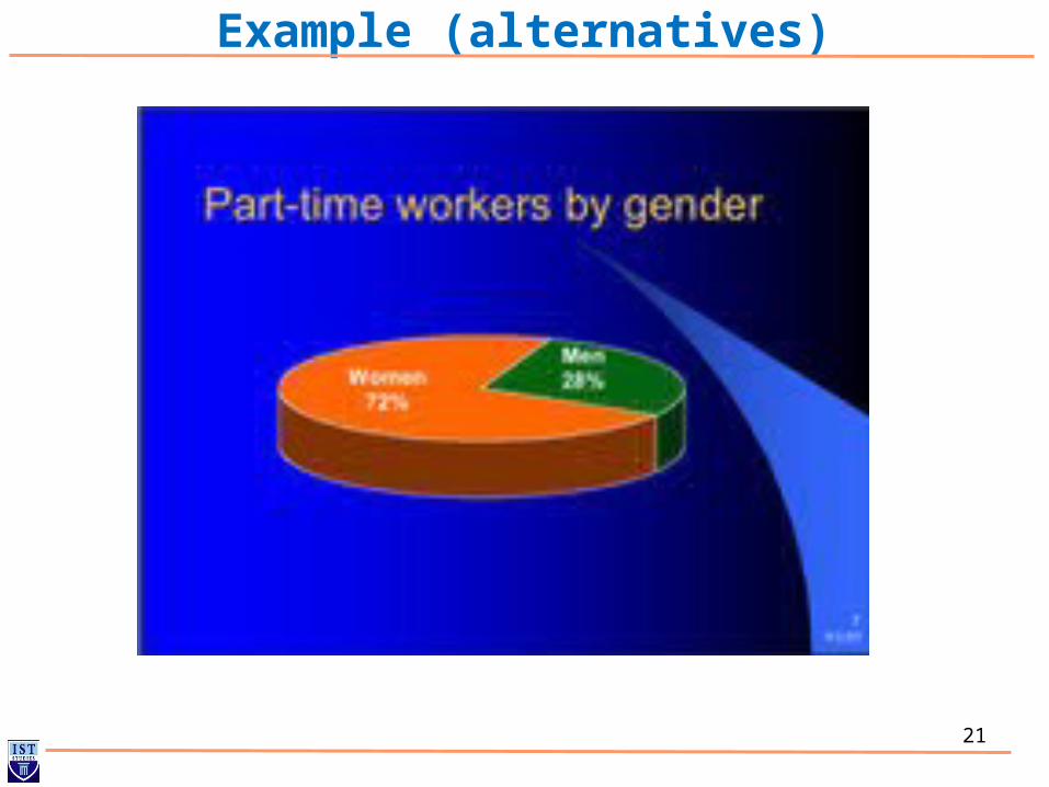
Example (alternatives)

22
Example (alternatives)
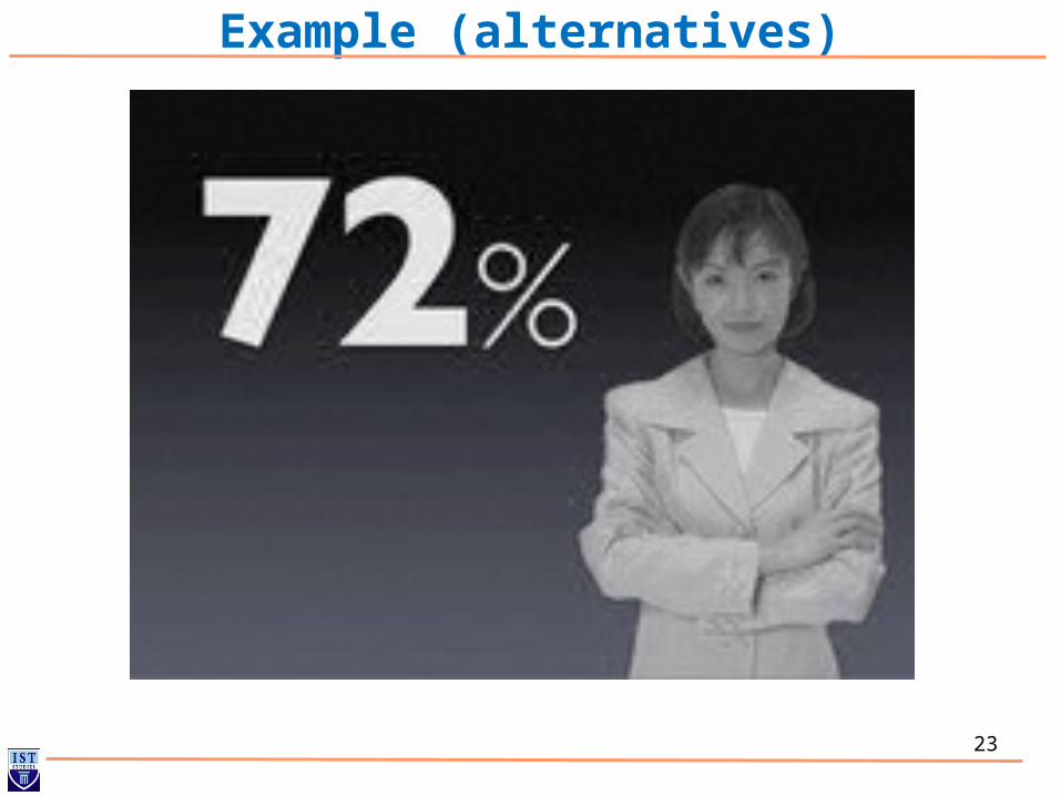
23
Example (alternatives)
24
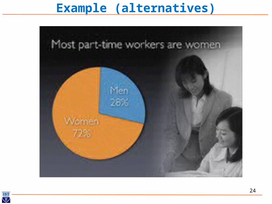
Example (alternatives)

25
Example (alternatives)