Introduction to Descriptive Statistics
35
Introduction to Descriptive Statistics 17.871 Spring 2012
-
Upload
vielka-tucker -
Category
Documents
-
view
95 -
download
3
description
Introduction to Descriptive Statistics. 17.871 Spring 2012. Key measures Describing data. Key distinction Population vs. Sample Notation. Mean. Variance, Standard Deviation. Variance, S.D. of a Sample. Degrees of freedom. Binary data. Normal distribution example. IQ SAT Height - PowerPoint PPT Presentation
Transcript of Introduction to Descriptive Statistics
Introduction to Descriptive Statistics17.871Spring 2012
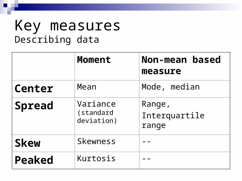
Key measuresDescribing data
Moment Non-mean based measure
Center Mean Mode, median
Spread Variance (standard deviation)
Range,Interquartile range
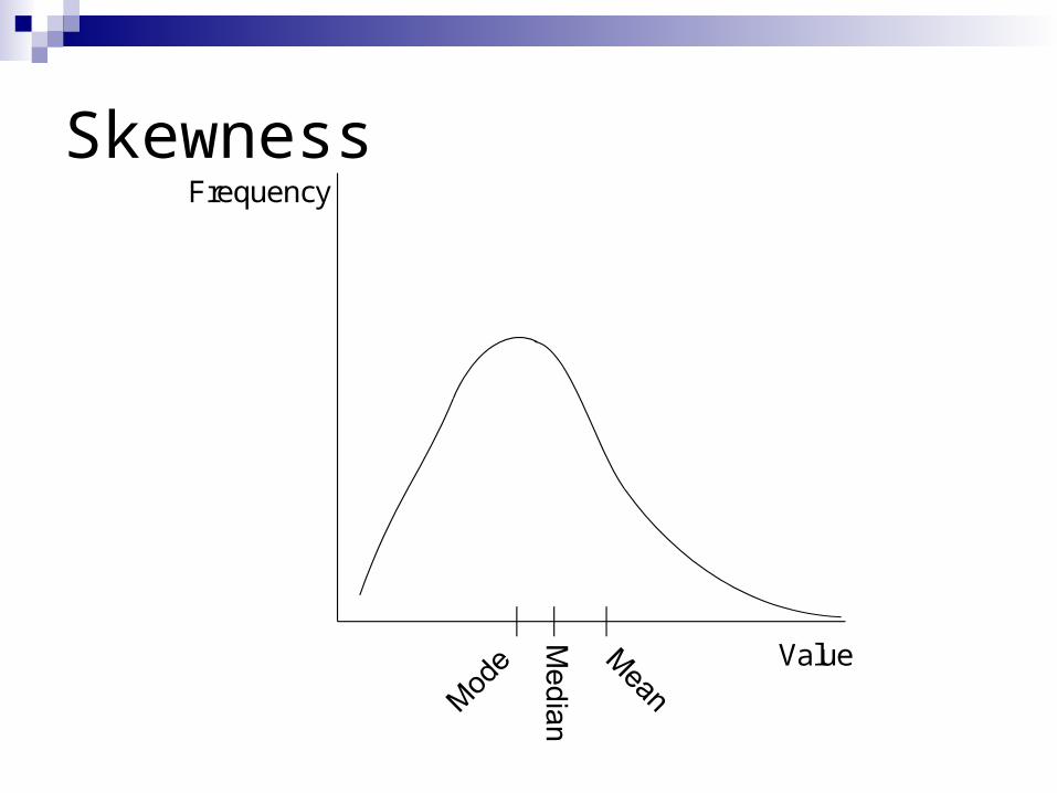
Skew Skewness --
Peaked Kurtosis --
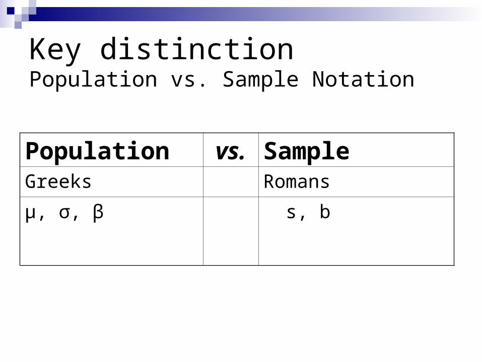
Key distinctionPopulation vs. Sample Notation
Population vs. SampleGreeks Romans
μ, σ, β s, b
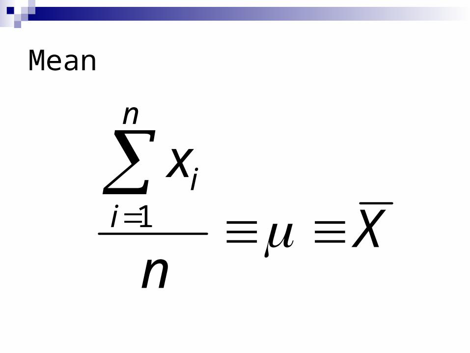
Mean
Xn
xn
ii
1
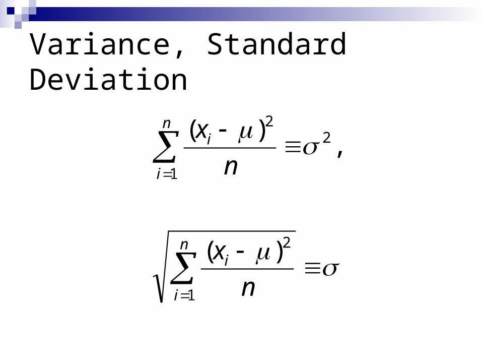
Variance, Standard Deviation
n
i
i
n
i
i
nx
nx
1
2
2
1
2
)(
,)(
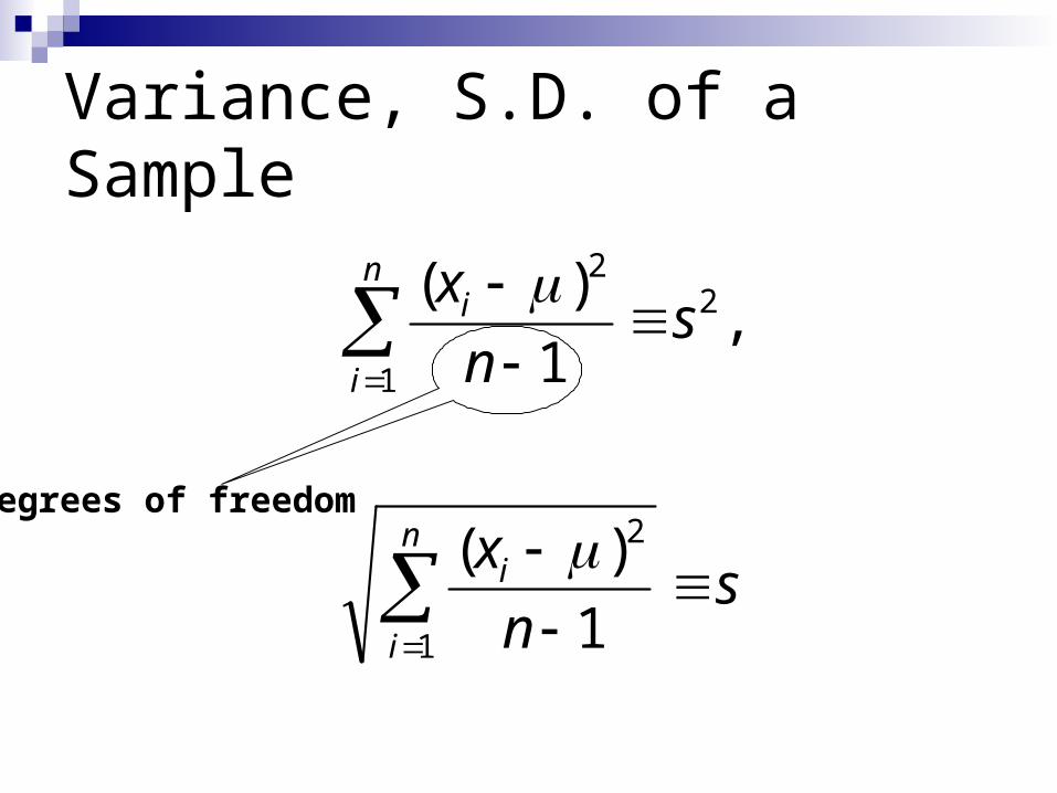
Variance, S.D. of a Sample
snx
snx
n
i
i
n
i
i
1
2
2
1
2
1)(
,1
)(
Degrees of freedom
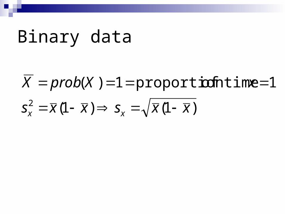
Binary data
)1()1(
1 timeof proportion1)(2 xxsxxs
xXprobX
xx
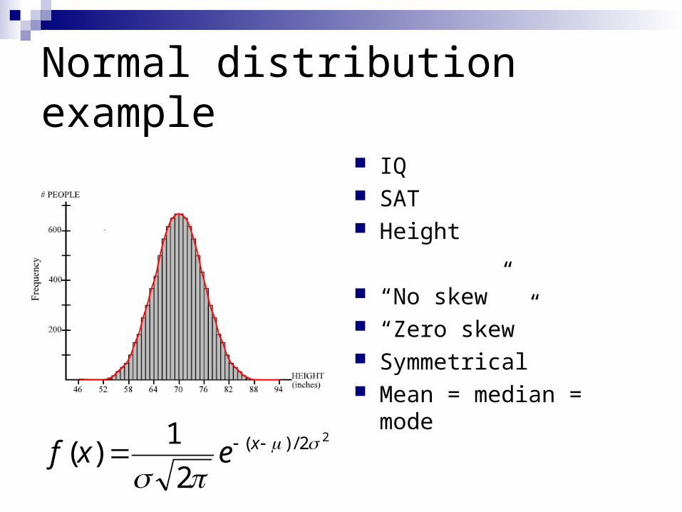
Normal distribution example
IQ SAT Height
“No skew” “Zero skew” Symmetrical Mean = median = mode Value
Frequency
22/)(
21)(
xexf
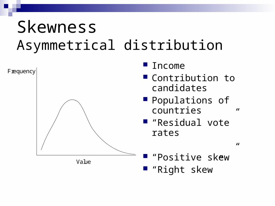
SkewnessAsymmetrical distribution
Income Contribution to
candidates Populations of
countries “Residual vote” rates
“Positive skew” “Right skew”
Value
Frequency
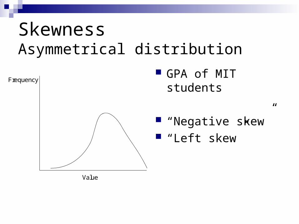
SkewnessAsymmetrical distribution
GPA of MIT students
“Negative skew” “Left skew”
Value
Frequency
Skewness
Value
Frequency
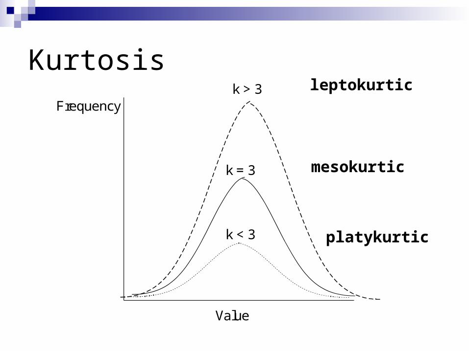
Kurtosis
Value
Frequencyk > 3
k = 3
k < 3
leptokurtic
platykurtic
mesokurtic
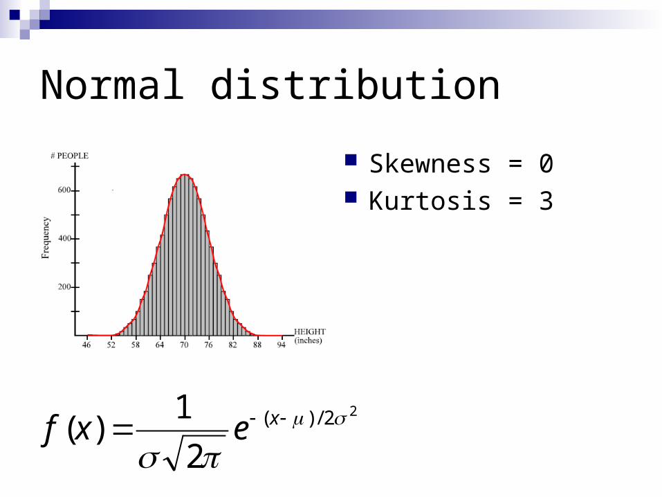
Normal distribution
Skewness = 0 Kurtosis = 3
22/)(
21)(
xexf
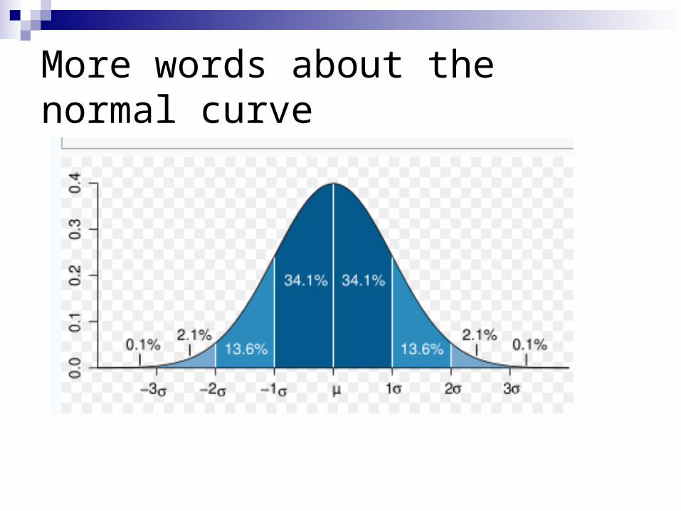
More words about the normal curve
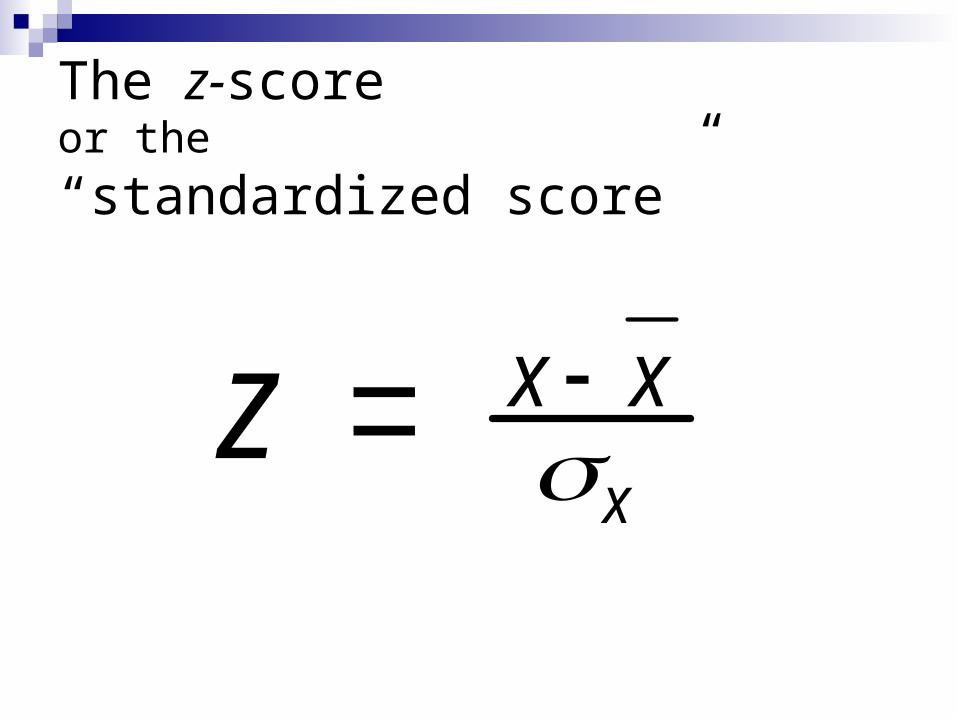
The z-scoreor the“standardized score”
z x xx
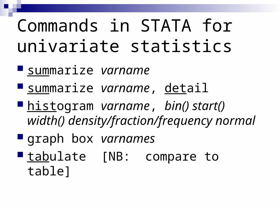
Commands in STATA for univariate statistics summarize varname summarize varname, detail histogram varname, bin() start() width()
density/fraction/frequency normal graph box varnames tabulate [NB: compare to table]
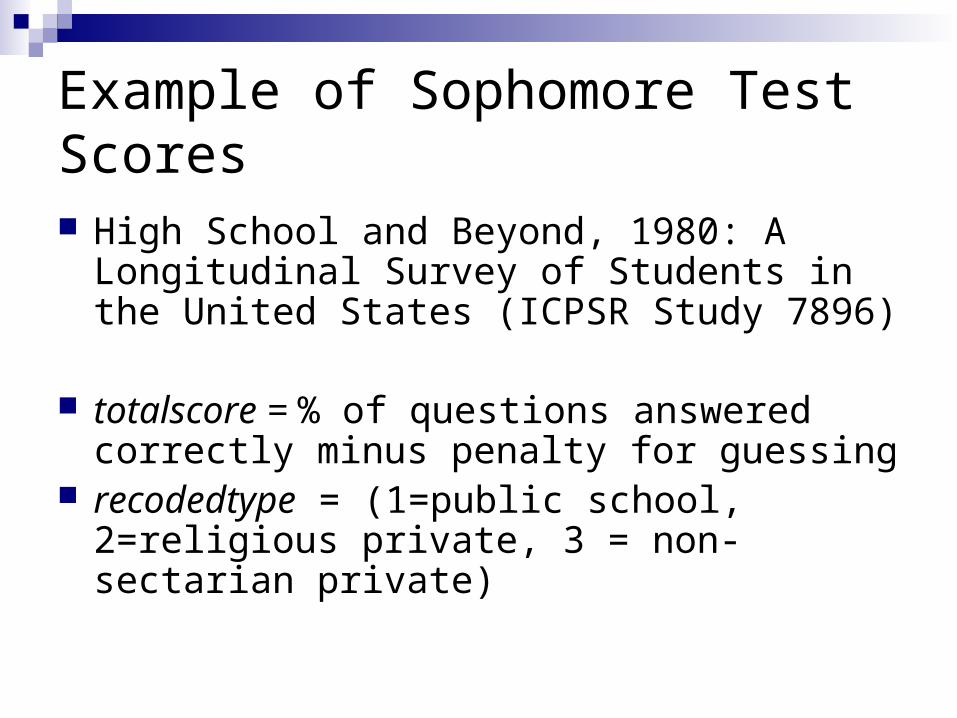
Example of Sophomore Test Scores High School and Beyond, 1980: A Longitudinal
Survey of Students in the United States (ICPSR Study 7896)
totalscore = % of questions answered correctly minus penalty for guessing
recodedtype = (1=public school, 2=religious private, 3 = non-sectarian private)
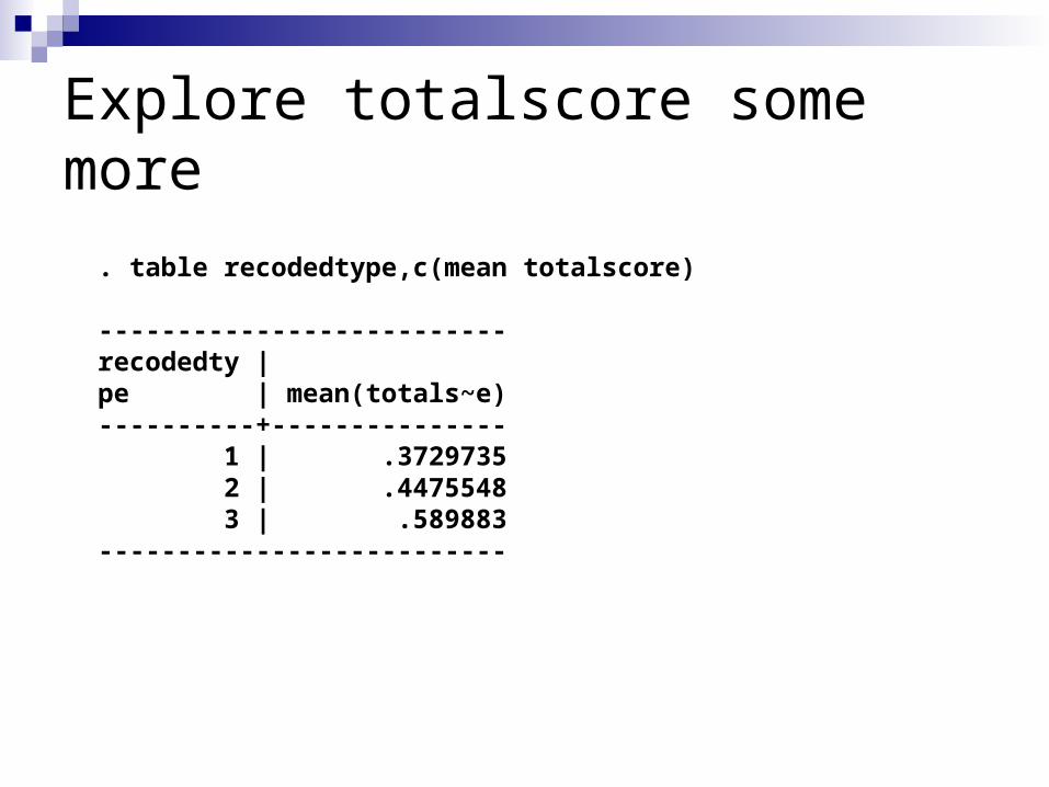
Explore totalscore some more
. table recodedtype,c(mean totalscore)
--------------------------recodedty |pe | mean(totals~e)----------+--------------- 1 | .3729735 2 | .4475548 3 | .589883--------------------------
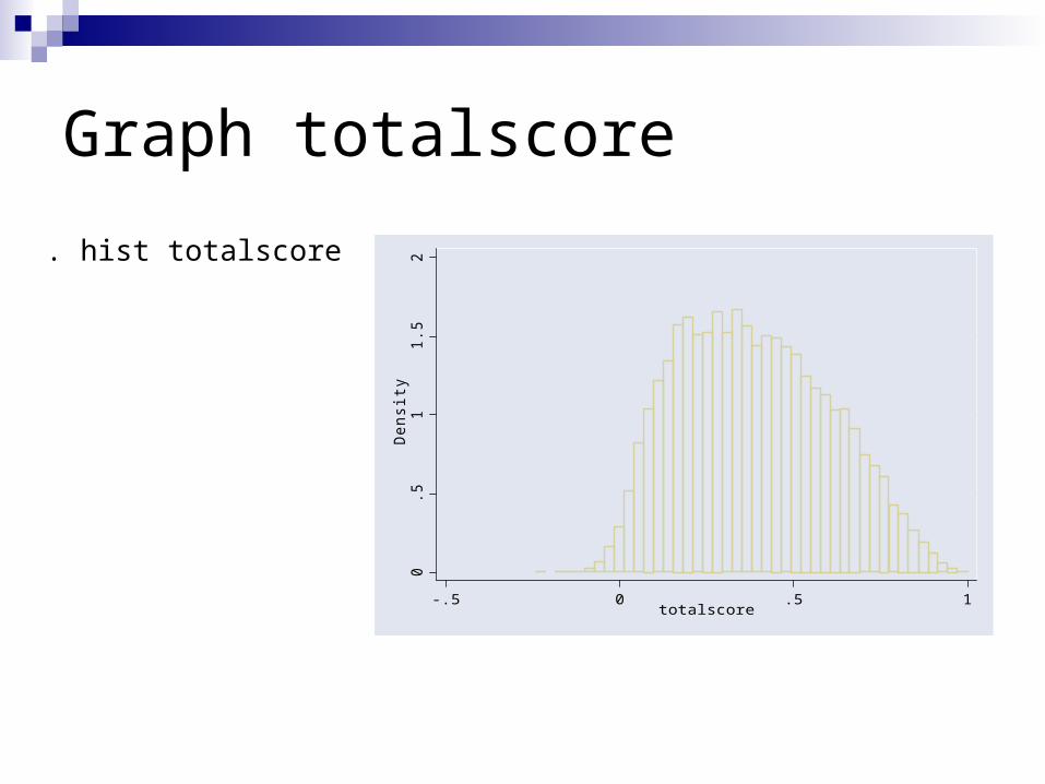
Graph totalscore
. hist totalscore
0.5
11.
52
Den
sity
-.5 0 .5 1totalscore
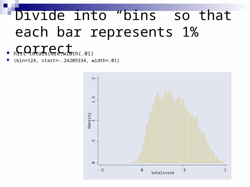
Divide into “bins” so that each bar represents 1% correct
hist totalscore,width(.01) (bin=124, start=-.24209334, width=.01)
0.5
11.
52
Den
sity
-.5 0 .5 1totalscore
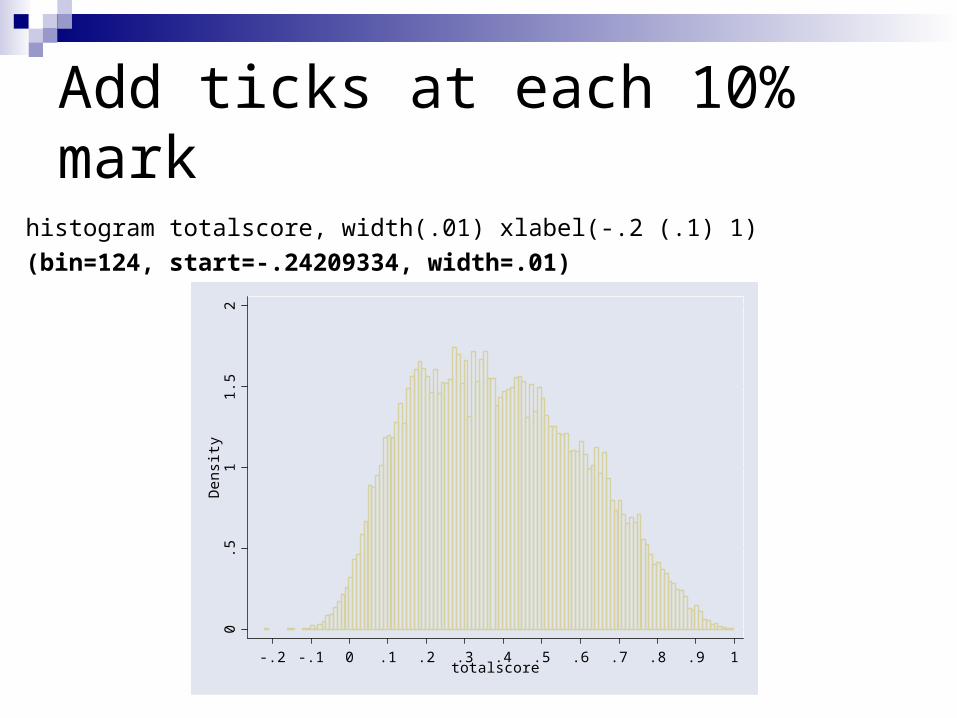
Add ticks at each 10% markhistogram totalscore, width(.01) xlabel(-.2 (.1) 1)(bin=124, start=-.24209334, width=.01)
0.5
11.
52
Den
sity
-.2 -.1 0 .1 .2 .3 .4 .5 .6 .7 .8 .9 1totalscore
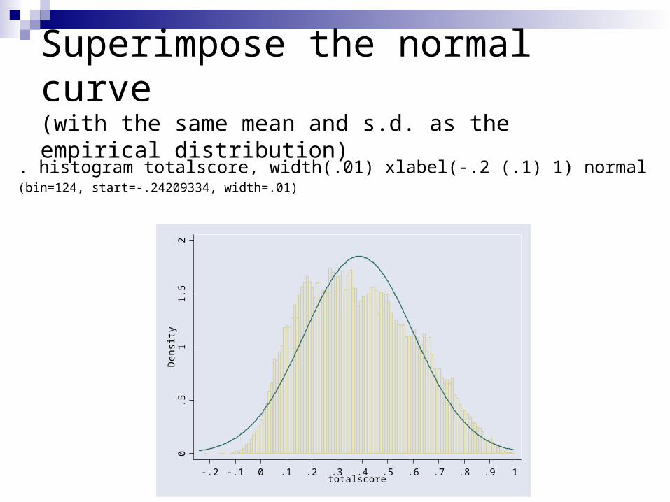
Superimpose the normal curve (with the same mean and s.d. as the empirical distribution)
. histogram totalscore, width(.01) xlabel(-.2 (.1) 1) normal
(bin=124, start=-.24209334, width=.01)
0.5
11.
52
Den
sity
-.2 -.1 0 .1 .2 .3 .4 .5 .6 .7 .8 .9 1totalscore
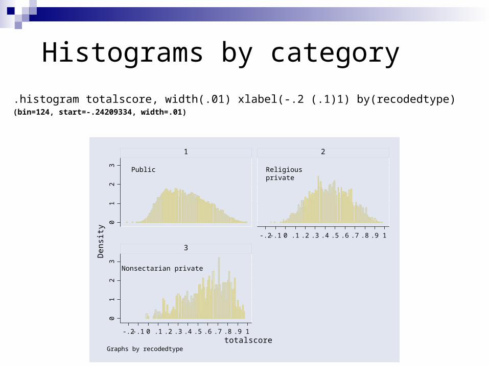
Histograms by category.histogram totalscore, width(.01) xlabel(-.2 (.1)1) by(recodedtype)(bin=124, start=-.24209334, width=.01)
01
23
01
23
-.2 -.1 0 .1 .2 .3 .4 .5 .6 .7 .8 .9 1
-.2 -.1 0 .1 .2 .3 .4 .5 .6 .7 .8 .9 1
1 2
3Den
sity
totalscoreGraphs by recodedtype
Public Religious private
Nonsectarian private
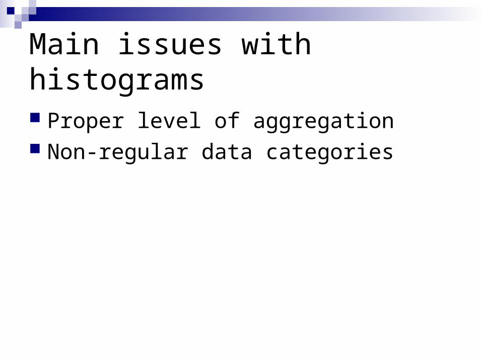
Main issues with histograms
Proper level of aggregation Non-regular data categories
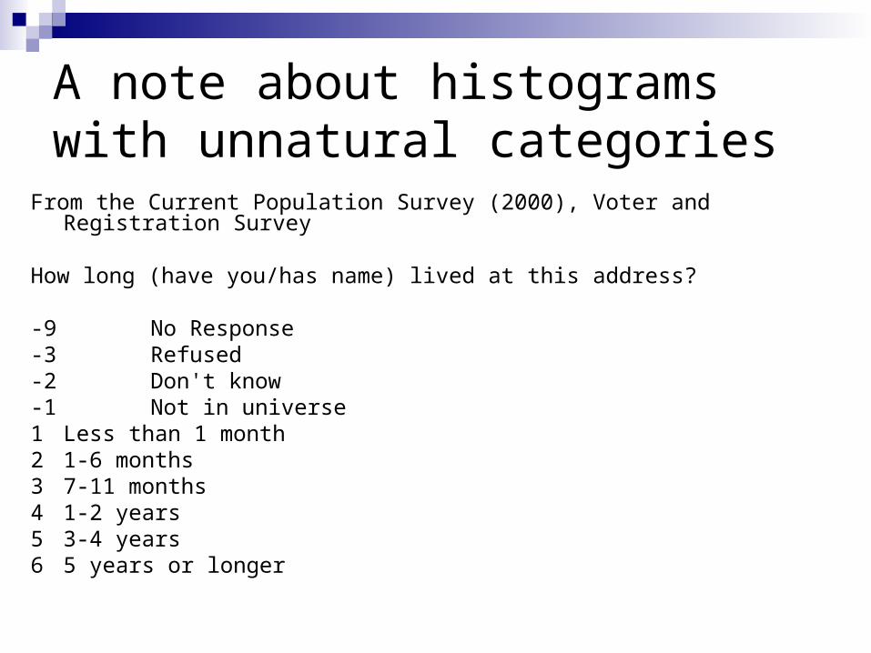
A note about histograms with unnatural categories
From the Current Population Survey (2000), Voter and Registration Survey
How long (have you/has name) lived at this address?
-9 No Response-3 Refused-2 Don't know-1 Not in universe1 Less than 1 month2 1-6 months3 7-11 months4 1-2 years5 3-4 years6 5 years or longer
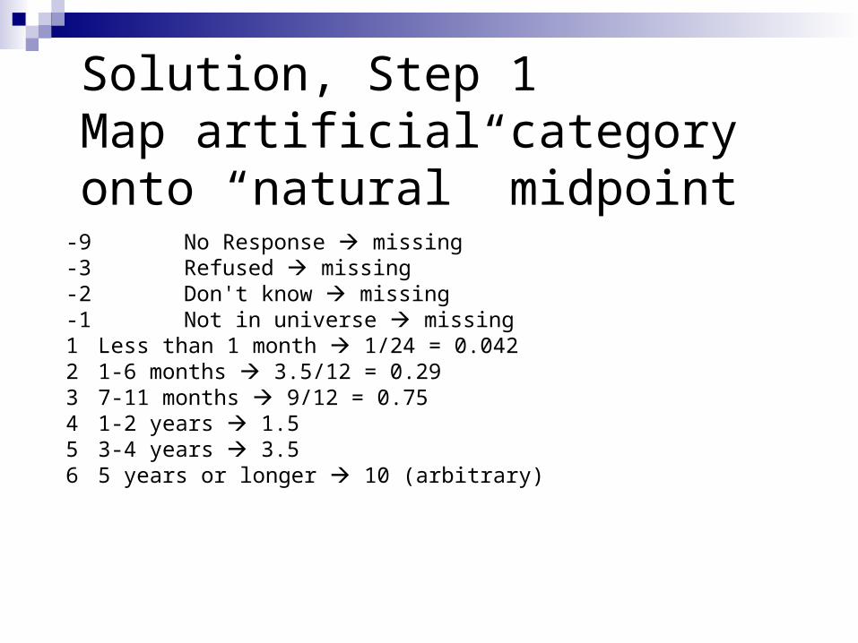
Solution, Step 1Map artificial category onto “natural” midpoint
-9 No Response missing-3 Refused missing-2 Don't know missing-1 Not in universe missing1 Less than 1 month 1/24 = 0.0422 1-6 months 3.5/12 = 0.293 7-11 months 9/12 = 0.754 1-2 years 1.55 3-4 years 3.56 5 years or longer 10 (arbitrary)
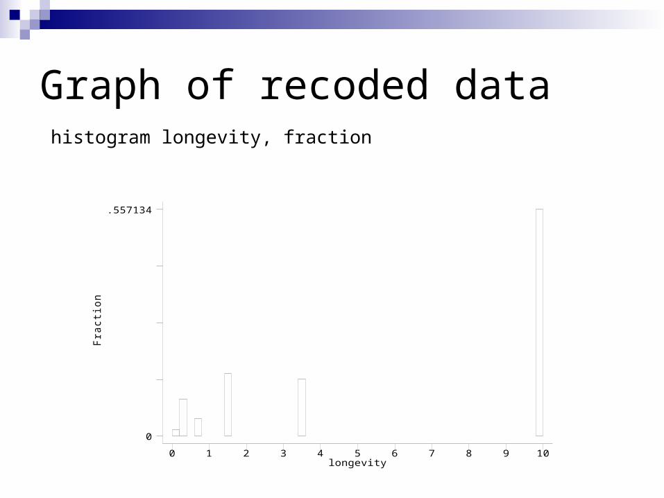
Graph of recoded dataFr
actio
n
longevity0 1 2 3 4 5 6 7 8 9 10
0
.557134
histogram longevity, fraction
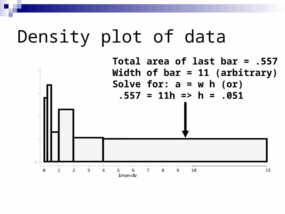
longevity0 1 2 3 4 5 6 7 8 9 10
0
15
Density plot of dataTotal area of last bar = .557Width of bar = 11 (arbitrary)Solve for: a = w h (or) .557 = 11h => h = .051
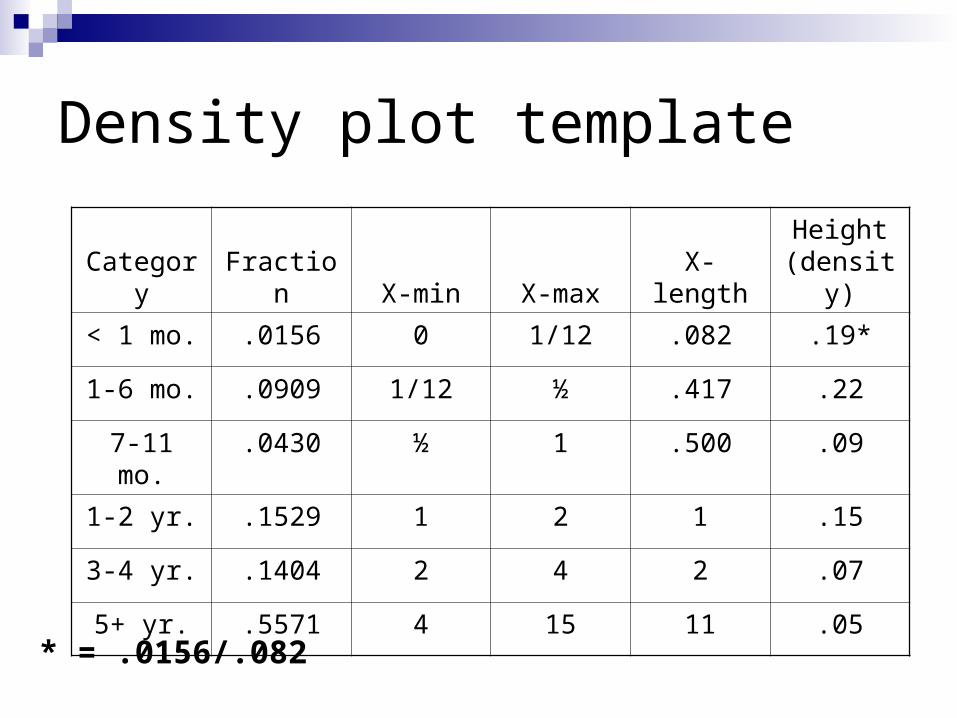
Density plot template
Category Fraction X-min X-max X-lengthHeight
(density)< 1 mo. .0156 0 1/12 .082 .19*
1-6 mo. .0909 1/12 ½ .417 .22
7-11 mo. .0430 ½ 1 .500 .09
1-2 yr. .1529 1 2 1 .15
3-4 yr. .1404 2 4 2 .07
5+ yr. .5571 4 15 11 .05
* = .0156/.082
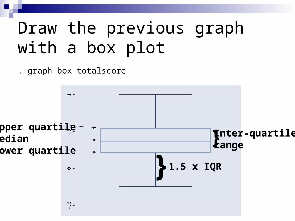
Draw the previous graph with a box plot. graph box totalscore
-.50
.51
Upper quartileMedianLower quartile
} Inter-quartilerange
} 1.5 x IQR
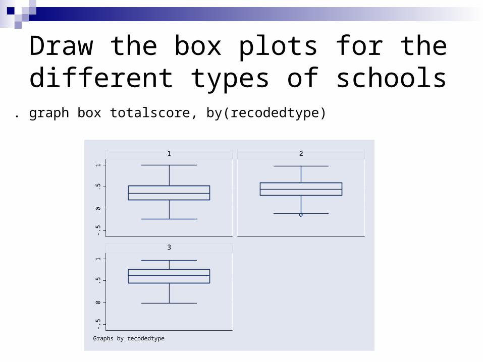
Draw the box plots for the different types of schools
. graph box totalscore, by(recodedtype)-.5
0.5
1-.5
0.5
1
1 2
3
Graphs by recodedtype
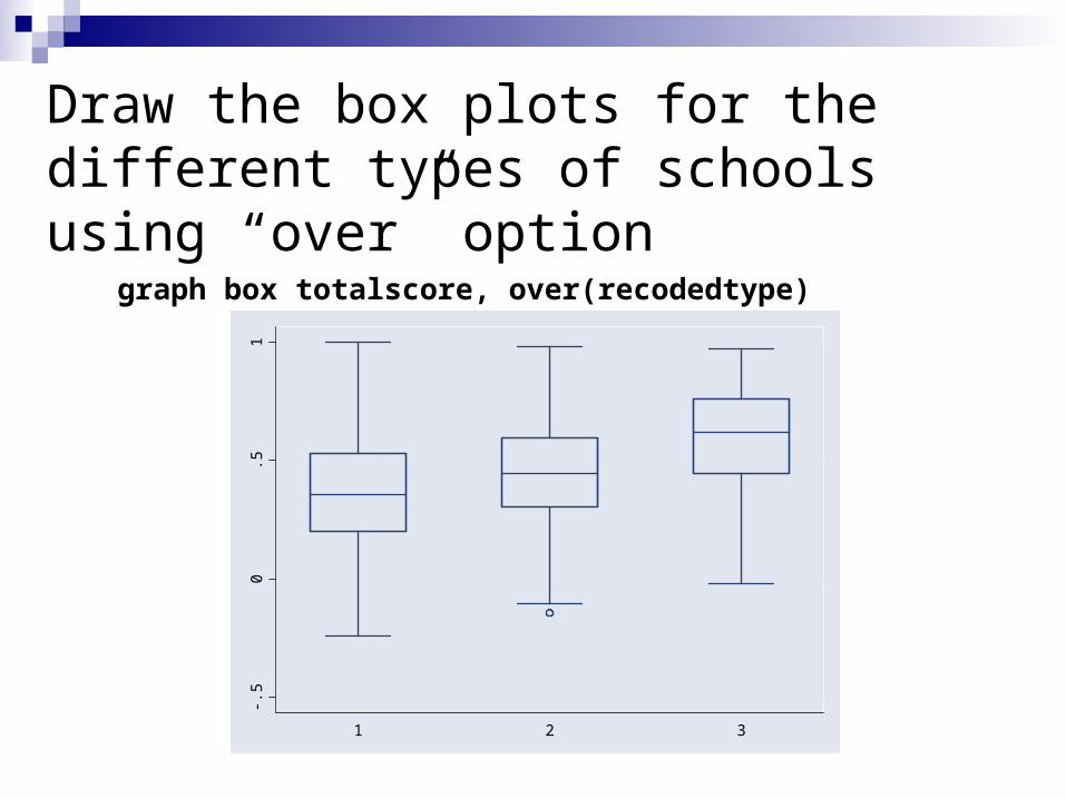
Draw the box plots for the different types of schools using “over” option
-.50
.51
1 2 3
graph box totalscore, over(recodedtype)
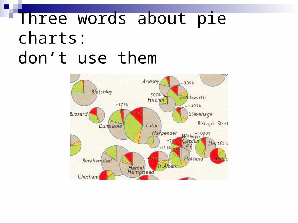
Three words about pie charts: don’t use them
So, what’s wrong with them
For non-time series data, hard to get a comparison among groups; the eye is very bad in judging relative size of circle slices
For time series, data, hard to grasp cross-time comparisons
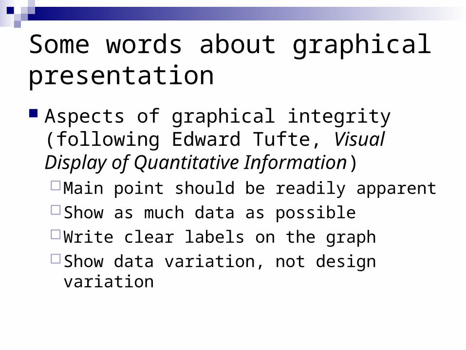
Some words about graphical presentation Aspects of graphical integrity (following
Edward Tufte, Visual Display of Quantitative Information)Main point should be readily apparentShow as much data as possibleWrite clear labels on the graphShow data variation, not design variation