Data Analysis and Statistical Methods Statistics 651suhasini/teaching651/lecture10MWF.pdf ·...
31
Data Analysis and Statistical Methods Statistics 651 http://www.stat.tamu.edu/~suhasini/teaching.html Lecture 10 (MWF) Checking for normality of the data using the QQplot Suhasini Subba Rao
Transcript of Data Analysis and Statistical Methods Statistics 651suhasini/teaching651/lecture10MWF.pdf ·...
Data Analysis and Statistical MethodsStatistics 651
http://www.stat.tamu.edu/~suhasini/teaching.html
Lecture 10 (MWF) Checking for normality of the data using the QQplot
Suhasini Subba Rao
Lecture 10 (MWF) QQplots
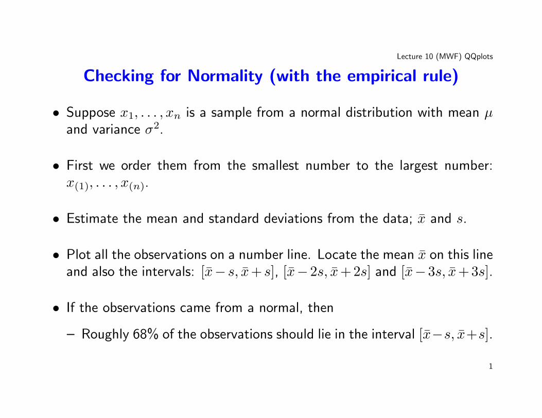
Checking for Normality (with the empirical rule)
• Suppose x1, . . . , xn is a sample from a normal distribution with mean µand variance σ2.
• First we order them from the smallest number to the largest number:x(1), . . . , x(n).
• Estimate the mean and standard deviations from the data; x̄ and s.
• Plot all the observations on a number line. Locate the mean x̄ on this lineand also the intervals: [x̄− s, x̄+ s], [x̄−2s, x̄+ 2s] and [x̄−3s, x̄+ 3s].
• If the observations came from a normal, then
– Roughly 68% of the observations should lie in the interval [x̄−s, x̄+s].
1
Lecture 10 (MWF) QQplots
– 95% of the observations should lie in the interval [x̄− 2s, x̄+ 2s].– 99.7% of the observations should lie in the interval [x̄− 3s, x̄+ 3s].
• Remember this means counting the number of points in each interval,and dividing it by the total number of observations.
2
Lecture 10 (MWF) QQplots
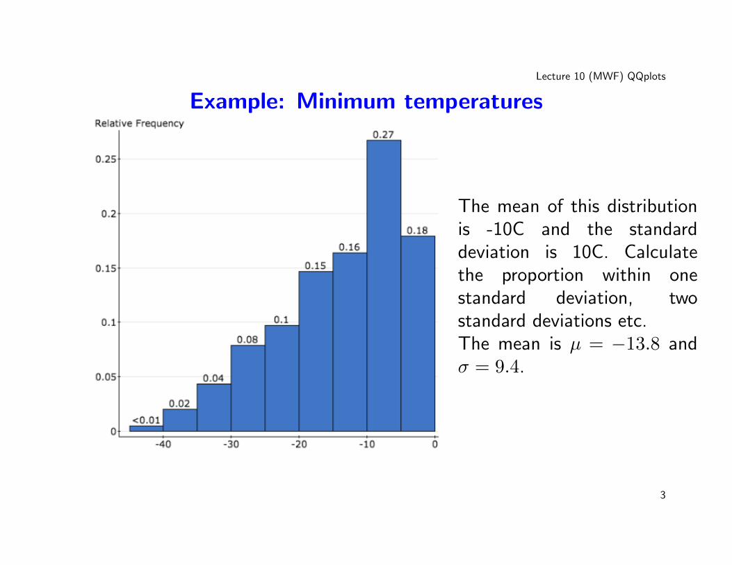
Example: Minimum temperatures
The mean of this distributionis -10C and the standarddeviation is 10C. Calculatethe proportion within onestandard deviation, twostandard deviations etc.The mean is µ = −13.8 andσ = 9.4.
3
Lecture 10 (MWF) QQplots
• This is an extremely rough way to check for normality.
• There can exist weird non-normal distributions where the following:
– Roughly 68% of the observations should lie in the interval [x̄−s, x̄+s].– 95% of the observations should lie in the interval [x̄− 2s, x̄+ 2s].– 99.7% of the observations should lie in the interval [x̄− 3s, x̄+ 3s].
could be true.
4
Lecture 10 (MWF) QQplots
Motivating the QQplot• A QQplots orders the data from the smallest to the largest and plots the
data against corresponding normal quantile. This allows on to check fornormality of the data. Precisely:
– Data X1, . . . , Xn ordered from smallest to largest X(1), . . . , X(n).– Plot X(i) against the i/n quantile of the normal distribution (omitting
the first and last observations).
• If the data comes from a normal distribution (with the mean and varianceestimated from the data) the data (empirical quantiles) will match thenormal quantiles, and plot should lie on a straightline (on the x = yline).
• A QQplot has nothing to do with linear regression. The line you see inthe plot is not the line of best fit.
5
Lecture 10 (MWF) QQplots
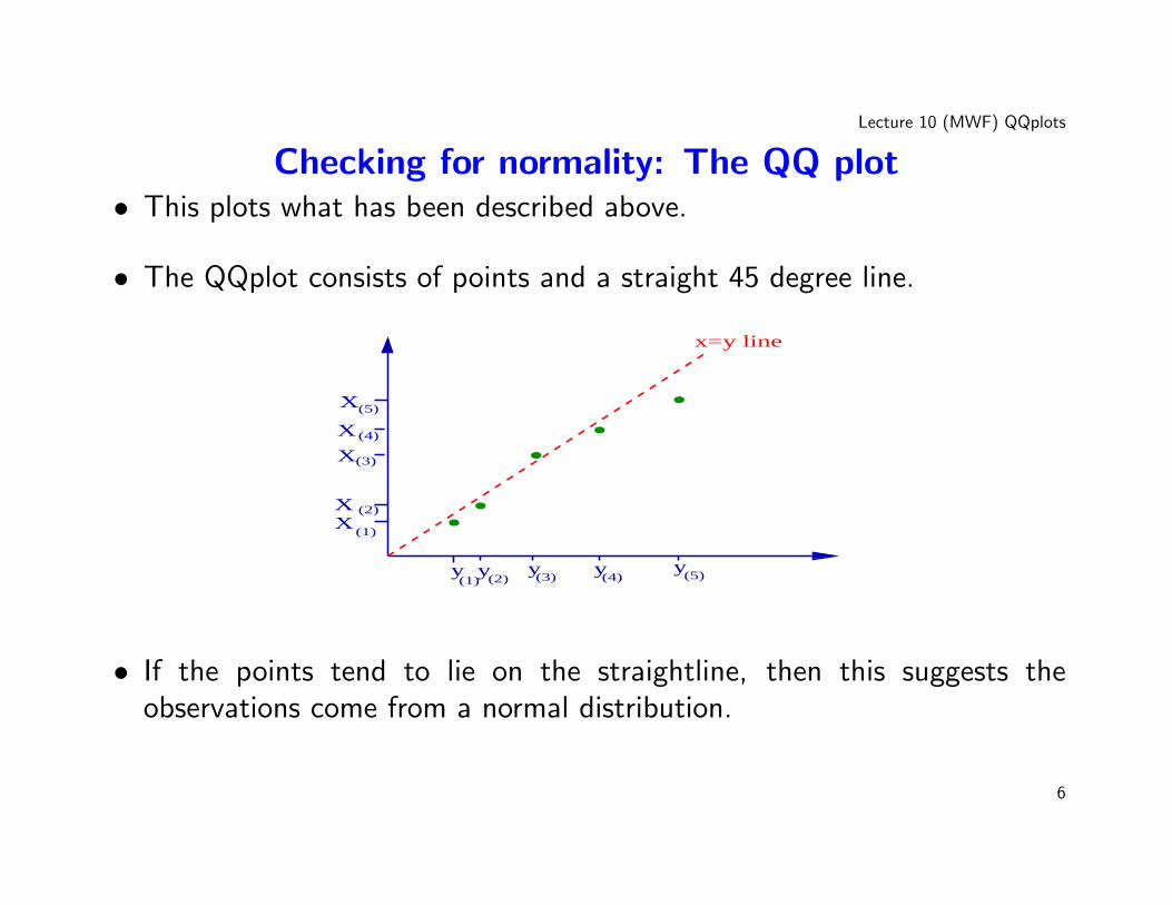
Checking for normality: The QQ plot• This plots what has been described above.
• The QQplot consists of points and a straight 45 degree line.
XX
X
X
X
(1)
(2)
(3)
(4)
y y y y y(1) (2) (3) (4)
(5)
(5)
... . .
x=y line
• If the points tend to lie on the straightline, then this suggests theobservations come from a normal distribution.
6
Lecture 10 (MWF) QQplots
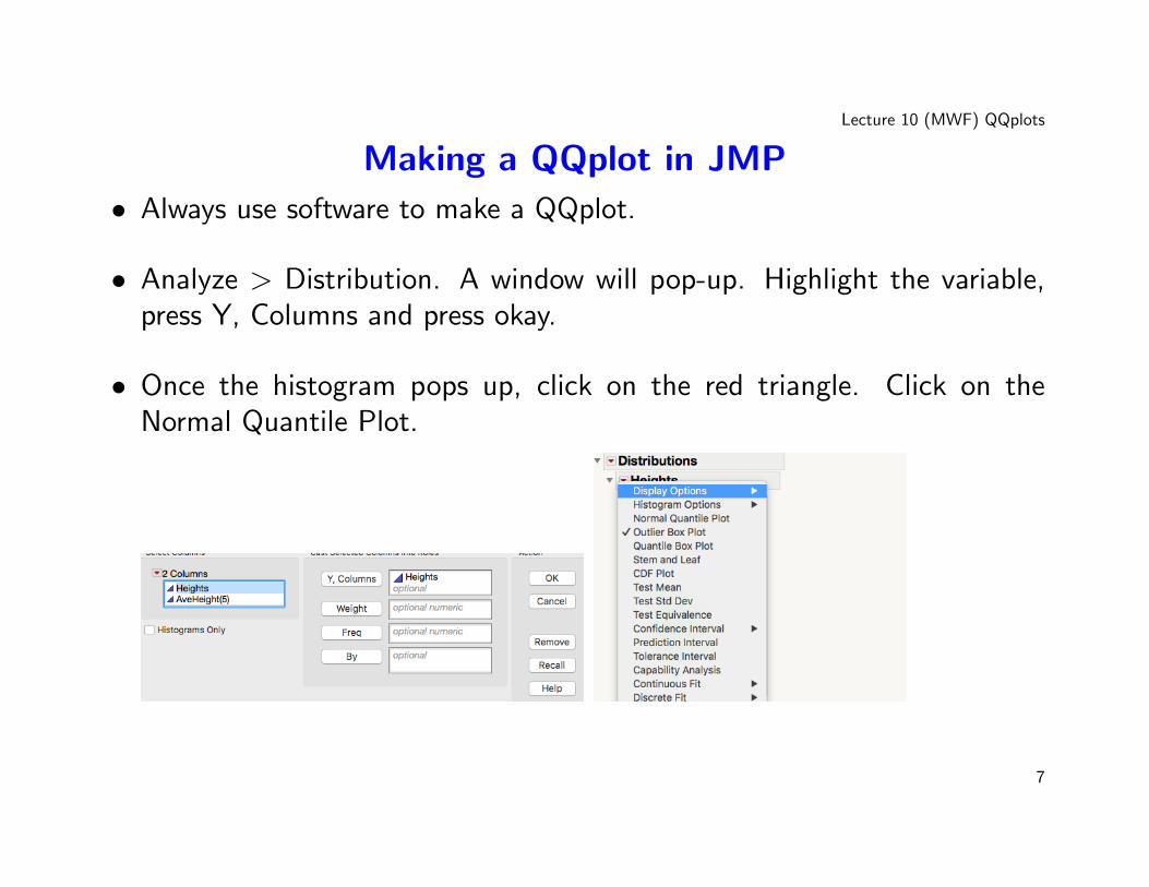
Making a QQplot in JMP
• Always use software to make a QQplot.
• Analyze > Distribution. A window will pop-up. Highlight the variable,press Y, Columns and press okay.
• Once the histogram pops up, click on the red triangle. Click on theNormal Quantile Plot.
7
Lecture 10 (MWF) QQplots
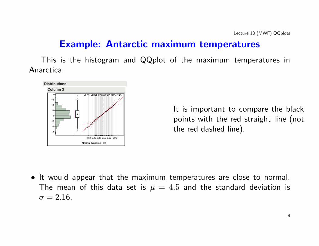
Example: Antarctic maximum temperatures
This is the histogram and QQplot of the maximum temperatures inAnarctica.
It is important to compare the blackpoints with the red straight line (notthe red dashed line).
• It would appear that the maximum temperatures are close to normal.The mean of this data set is µ = 4.5 and the standard deviation isσ = 2.16.
8
Lecture 10 (MWF) QQplots
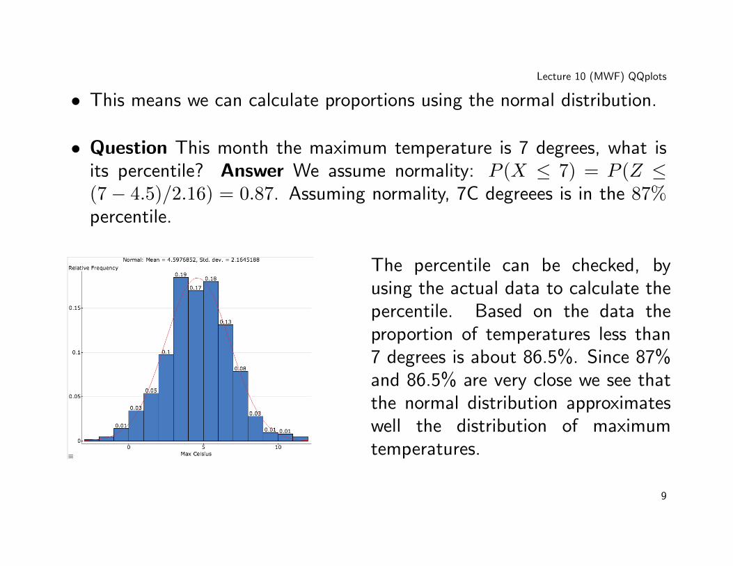
• This means we can calculate proportions using the normal distribution.
• Question This month the maximum temperature is 7 degrees, what isits percentile? Answer We assume normality: P (X ≤ 7) = P (Z ≤(7− 4.5)/2.16) = 0.87. Assuming normality, 7C degreees is in the 87%percentile.
The percentile can be checked, byusing the actual data to calculate thepercentile. Based on the data theproportion of temperatures less than7 degrees is about 86.5%. Since 87%and 86.5% are very close we see thatthe normal distribution approximateswell the distribution of maximumtemperatures.
9
Lecture 10 (MWF) QQplots
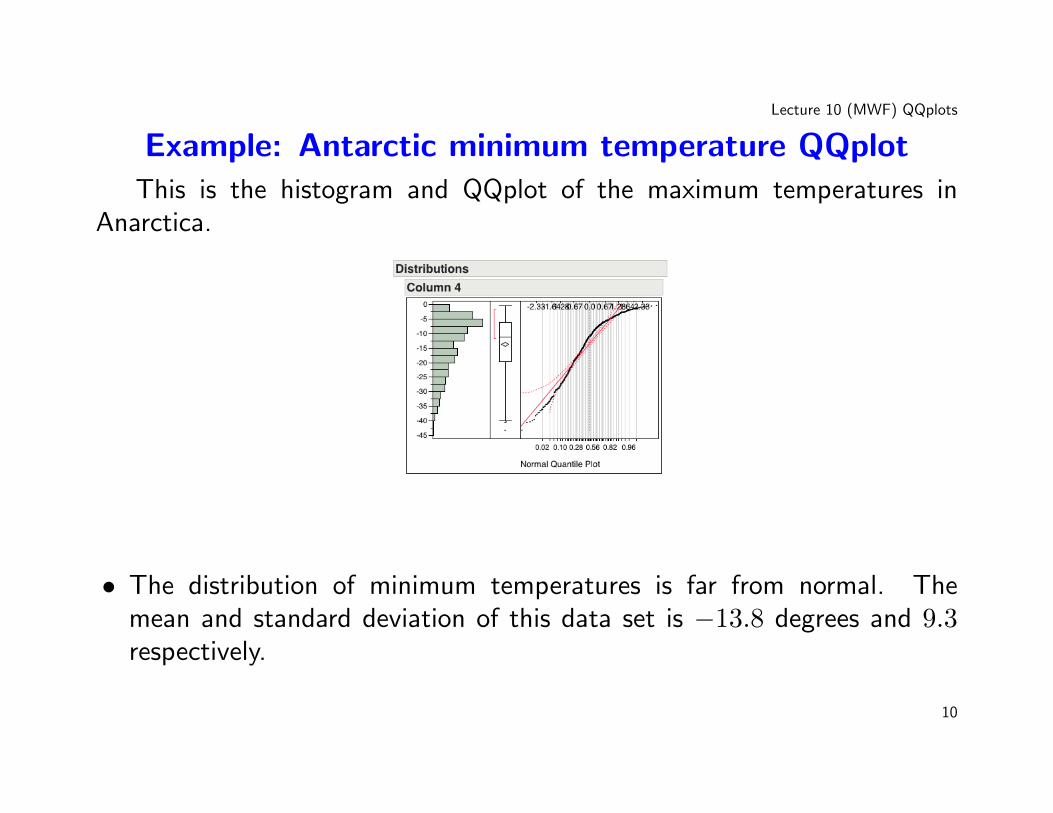
Example: Antarctic minimum temperature QQplotThis is the histogram and QQplot of the maximum temperatures in
Anarctica.
• The distribution of minimum temperatures is far from normal. Themean and standard deviation of this data set is −13.8 degrees and 9.3respectively.
10
Lecture 10 (MWF) QQplots
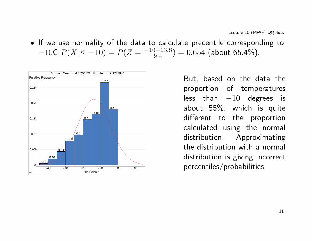
• If we use normality of the data to calculate precentile corresponding to−10C P (X ≤ −10) = P (Z = −10+13.8
9.4 ) = 0.654 (about 65.4%).
But, based on the data theproportion of temperaturesless than −10 degrees isabout 55%, which is quitedifferent to the proportioncalculated using the normaldistribution. Approximatingthe distribution with a normaldistribution is giving incorrectpercentiles/probabilities.
11
Lecture 10 (MWF) QQplots
Interpretating a QQ-plot
• Some experienced statisticans have shaman like powers when it comesto interpretating QQ-plots.
• You don’t need them, but it is good to have a feel of them.
• There are three main features you need to look for;
– Left Skew. This means the distribution is not symmetric. Find themode (the heightest point of the distribution). The right of the modeshould be shorter than the left of the mode.
– Right Skew. This means the distribution is not symmetric. Find themode (the heightest point of the distribution). The right of the modeshould be longer than the left of the mode.
– Heavy tails. This means that the probability of large numbers ifmuch more likely than a normal distribution. For example for a
12
Lecture 10 (MWF) QQplots
normal distribution most the observations 98% lie within the interval[x̄− 3s, x̄+ 3s]. For a heavy tail distribution a far smaller proportionlie in this interval.
13
Lecture 10 (MWF) QQplots
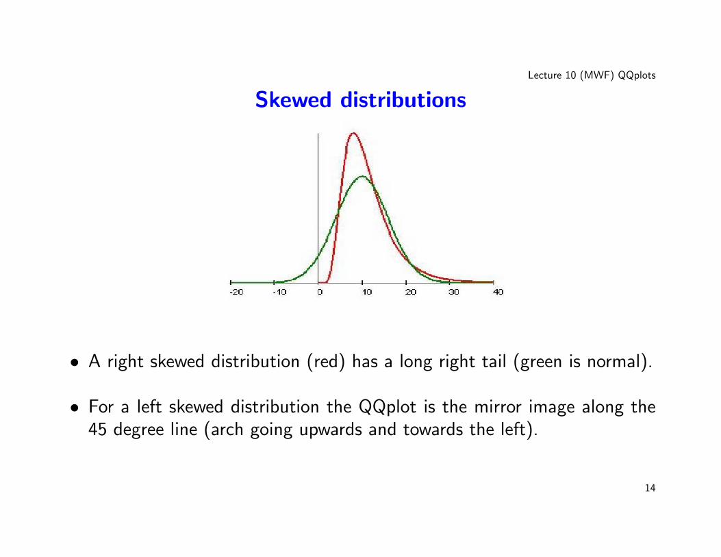
Skewed distributions
• A right skewed distribution (red) has a long right tail (green is normal).
• For a left skewed distribution the QQplot is the mirror image along the45 degree line (arch going upwards and towards the left).
14
Lecture 10 (MWF) QQplots
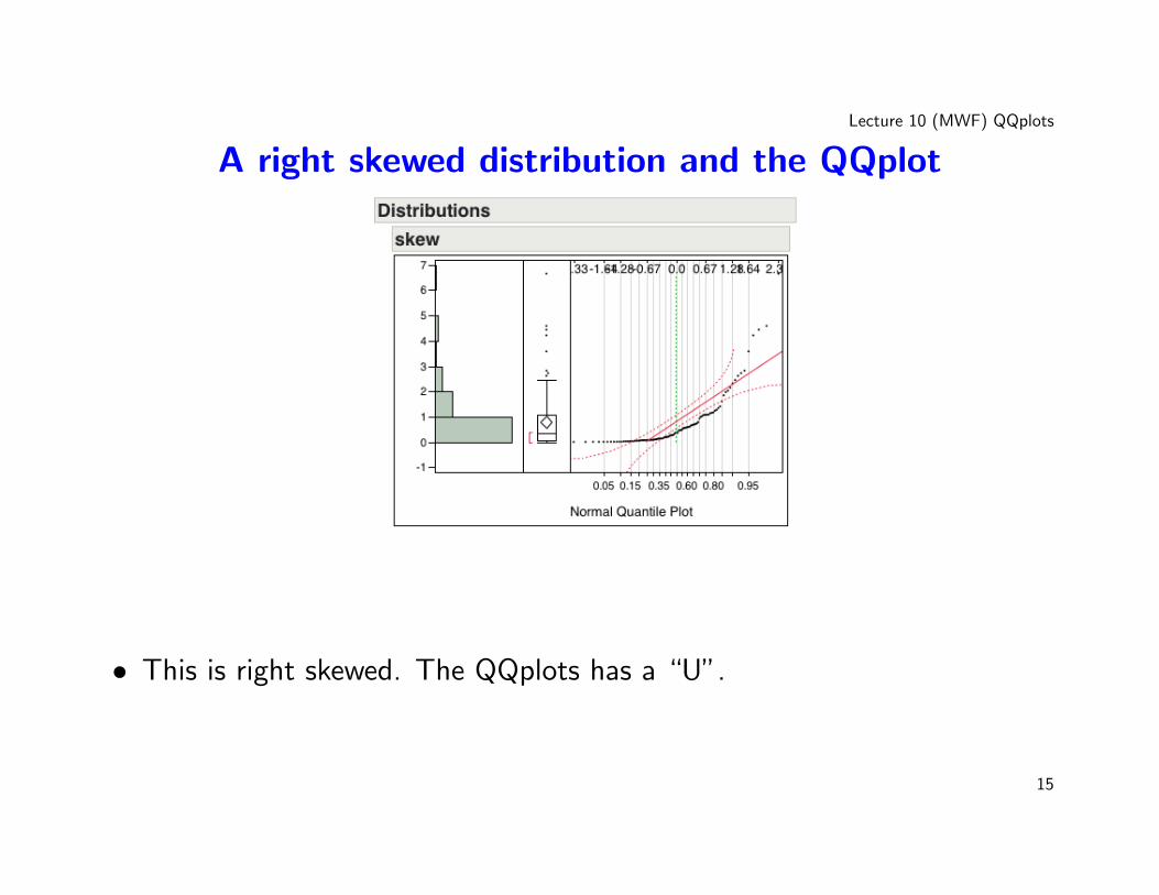
A right skewed distribution and the QQplot
• This is right skewed. The QQplots has a “U”.
15
Lecture 10 (MWF) QQplots
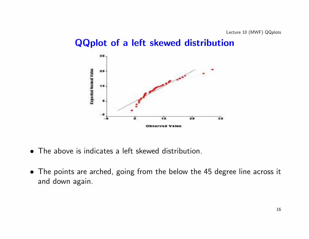
QQplot of a left skewed distribution
• The above is indicates a left skewed distribution.
• The points are arched, going from the below the 45 degree line across itand down again.
16
Lecture 10 (MWF) QQplots
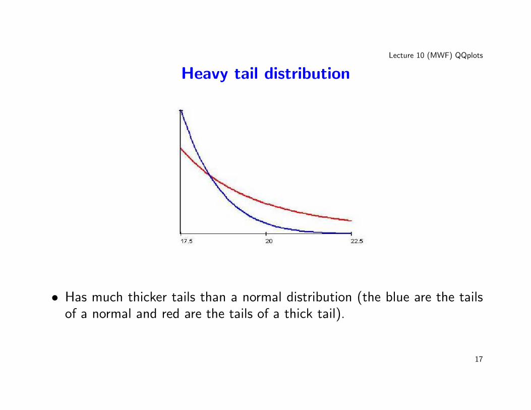
Heavy tail distribution
• Has much thicker tails than a normal distribution (the blue are the tailsof a normal and red are the tails of a thick tail).
17
Lecture 10 (MWF) QQplots
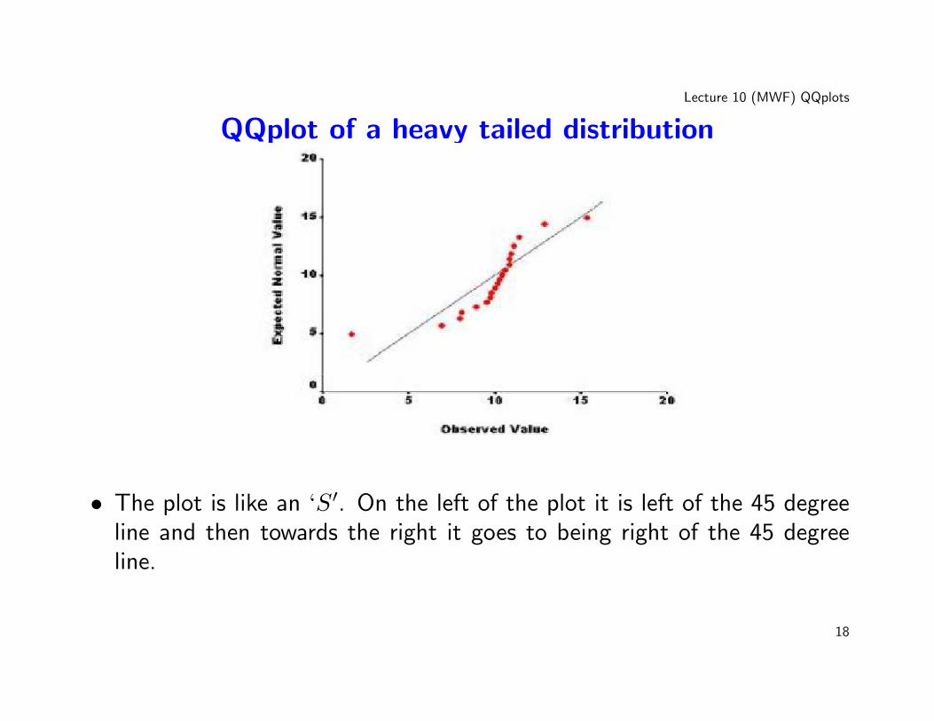
QQplot of a heavy tailed distribution
• The plot is like an ‘S′. On the left of the plot it is left of the 45 degreeline and then towards the right it goes to being right of the 45 degreeline.
18
Lecture 10 (MWF) QQplots
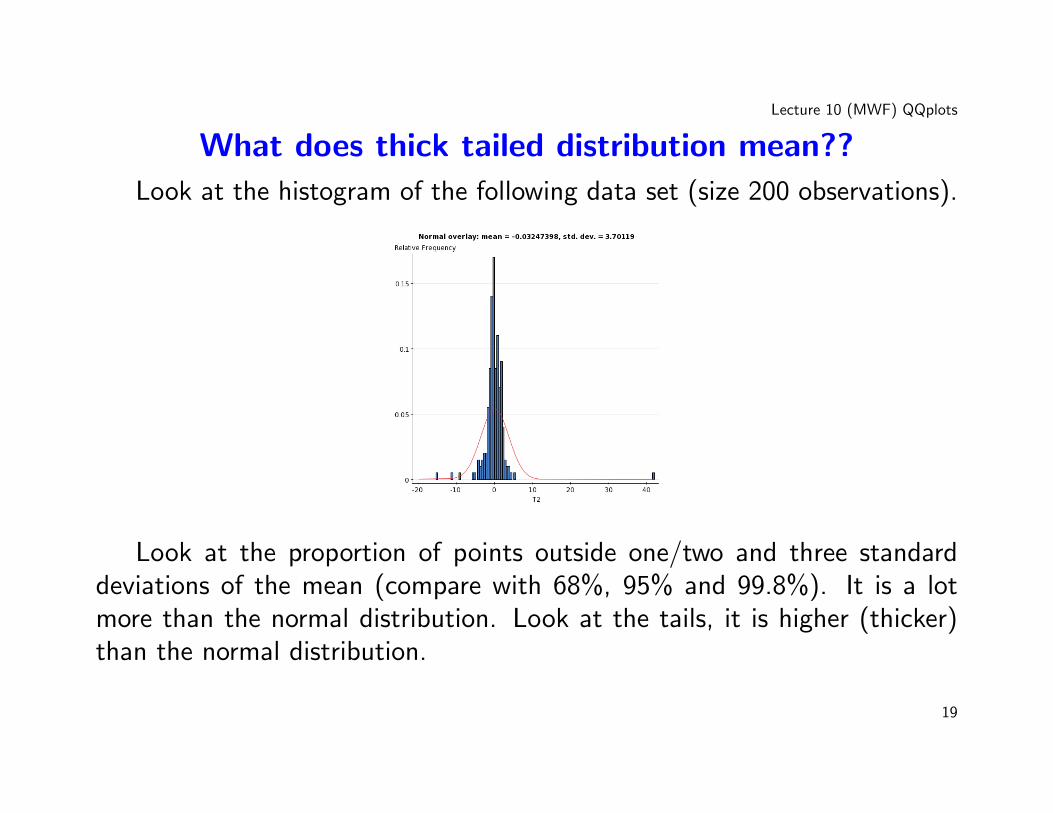
What does thick tailed distribution mean??
Look at the histogram of the following data set (size 200 observations).
Look at the proportion of points outside one/two and three standarddeviations of the mean (compare with 68%, 95% and 99.8%). It is a lotmore than the normal distribution. Look at the tails, it is higher (thicker)than the normal distribution.
19
Lecture 10 (MWF) QQplots
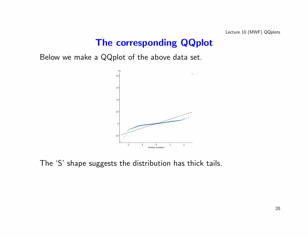
The corresponding QQplot
Below we make a QQplot of the above data set.
The ‘S’ shape suggests the distribution has thick tails.
20
Lecture 10 (MWF) QQplots
QQplots: Some general warnings
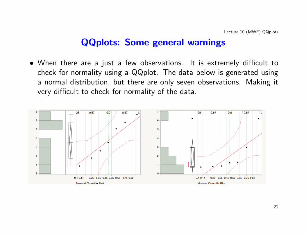
• When there are a just a few observations. It is extremely difficult tocheck for normality using a QQplot. The data below is generated usinga normal distribution, but there are only seven observations. Making itvery difficult to check for normality of the data.
21
Lecture 10 (MWF) QQplots
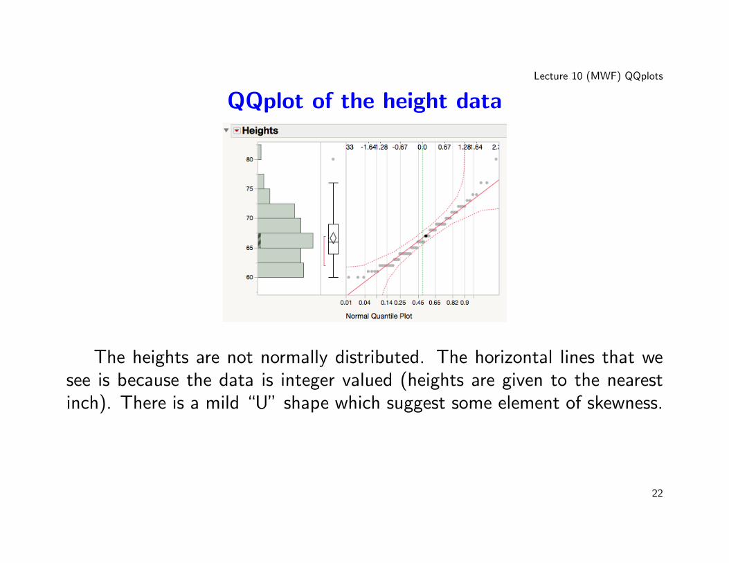
QQplot of the height data
The heights are not normally distributed. The horizontal lines that wesee is because the data is integer valued (heights are given to the nearestinch). There is a mild “U” shape which suggest some element of skewness.
22
Lecture 10 (MWF) QQplots
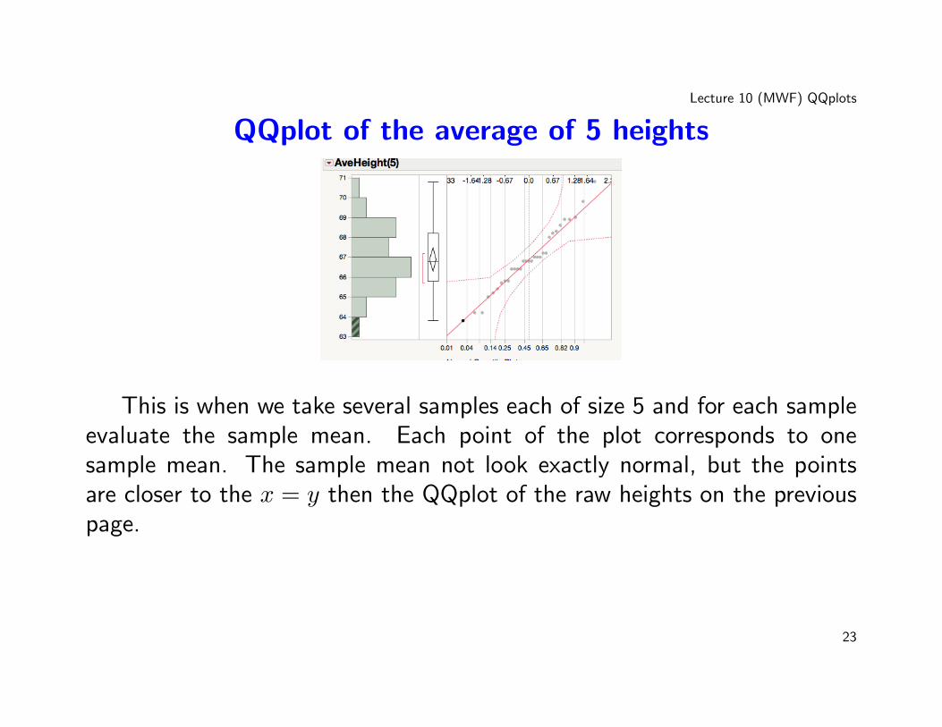
QQplot of the average of 5 heights
This is when we take several samples each of size 5 and for each sampleevaluate the sample mean. Each point of the plot corresponds to onesample mean. The sample mean not look exactly normal, but the pointsare closer to the x = y then the QQplot of the raw heights on the previouspage.
23
Lecture 10 (MWF) QQplots
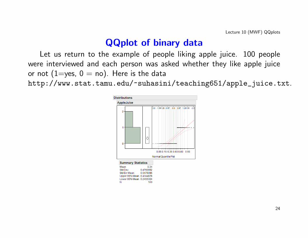
QQplot of binary dataLet us return to the example of people liking apple juice. 100 people
were interviewed and each person was asked whether they like apple juiceor not (1=yes, 0 = no). Here is the datahttp://www.stat.tamu.edu/~suhasini/teaching651/apple_juice.txt.
24
Lecture 10 (MWF) QQplots
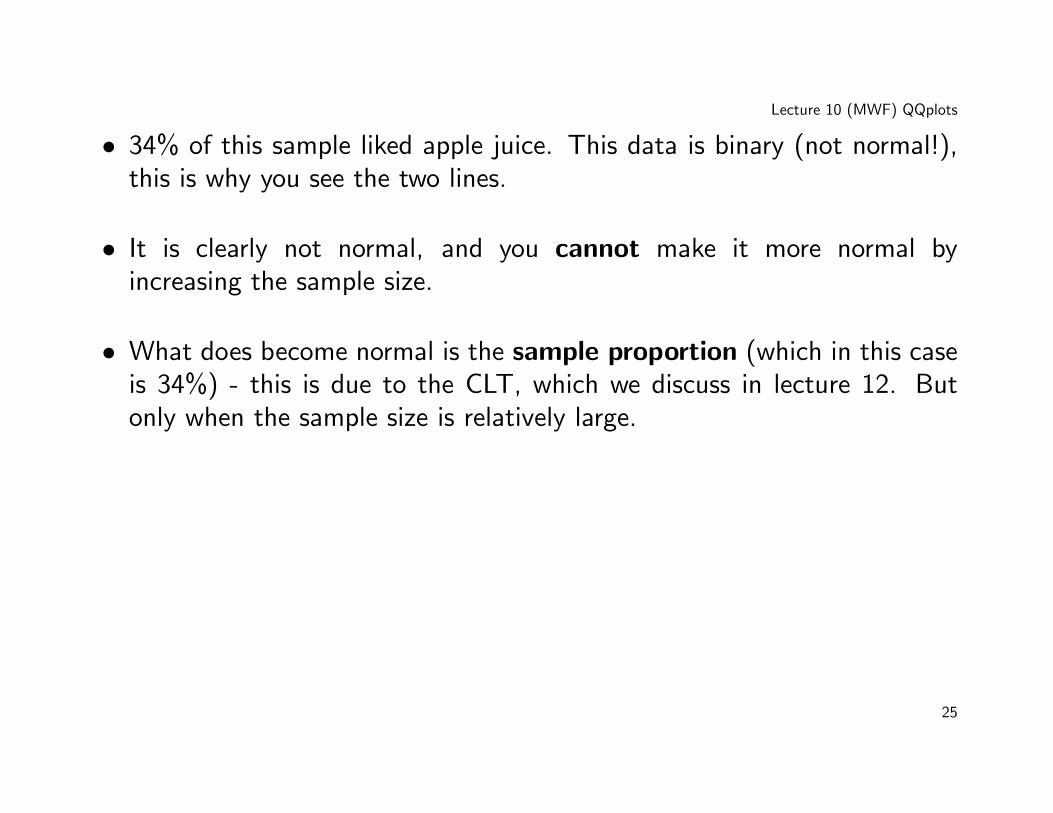
• 34% of this sample liked apple juice. This data is binary (not normal!),this is why you see the two lines.
• It is clearly not normal, and you cannot make it more normal byincreasing the sample size.
• What does become normal is the sample proportion (which in this caseis 34%) - this is due to the CLT, which we discuss in lecture 12. Butonly when the sample size is relatively large.
25
Lecture 10 (MWF) QQplots
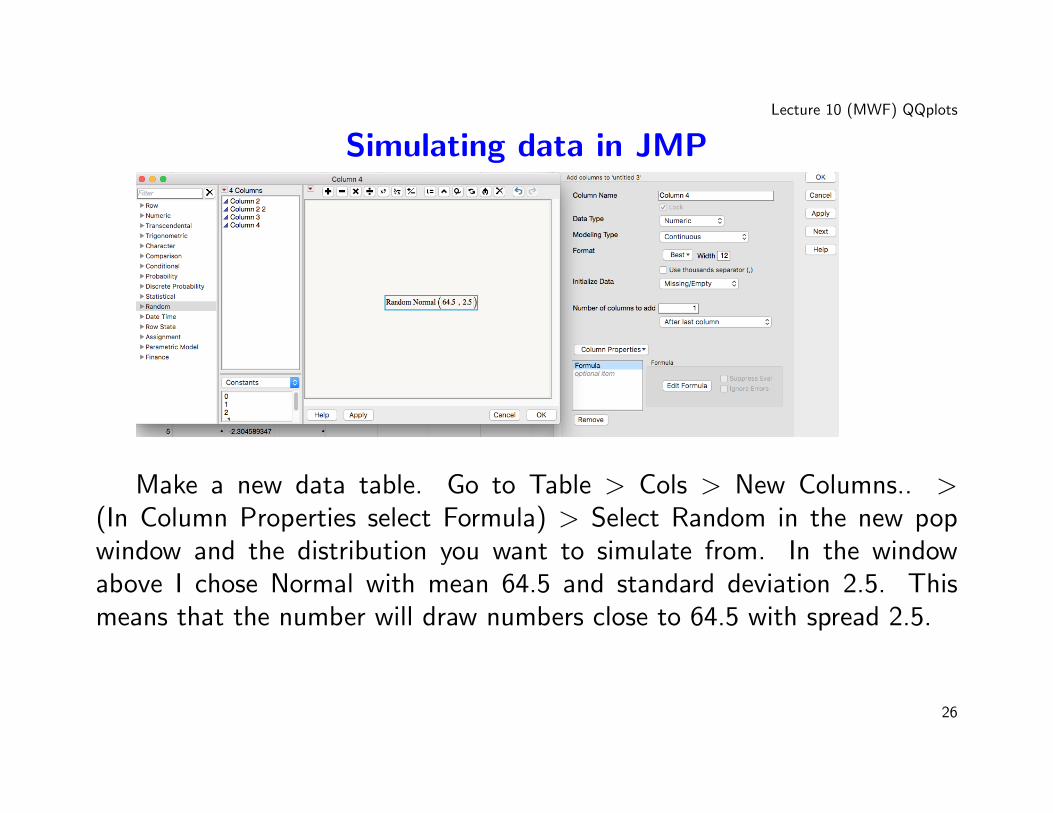
Simulating data in JMP
Make a new data table. Go to Table > Cols > New Columns.. >(In Column Properties select Formula) > Select Random in the new popwindow and the distribution you want to simulate from. In the windowabove I chose Normal with mean 64.5 and standard deviation 2.5. Thismeans that the number will draw numbers close to 64.5 with spread 2.5.
26
Lecture 10 (MWF) QQplots
Transforming Data
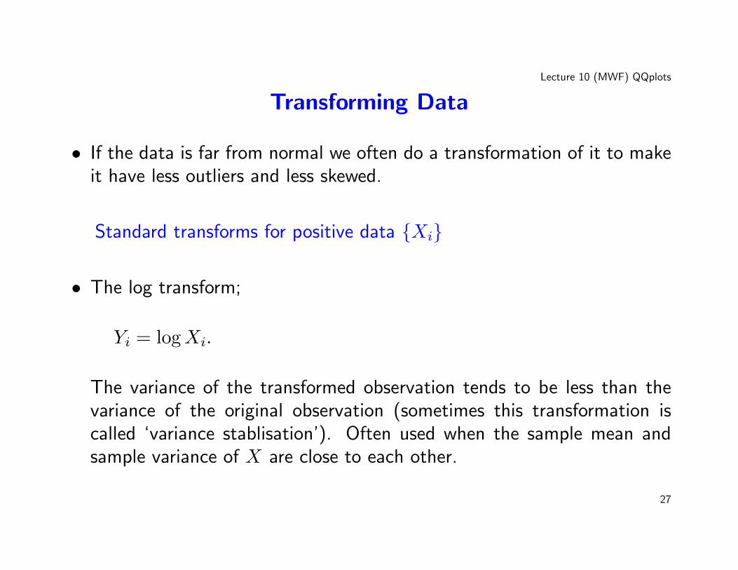
• If the data is far from normal we often do a transformation of it to makeit have less outliers and less skewed.
Standard transforms for positive data {Xi}
• The log transform;
Yi = logXi.
The variance of the transformed observation tends to be less than thevariance of the original observation (sometimes this transformation iscalled ‘variance stablisation’). Often used when the sample mean andsample variance of X are close to each other.
27
Lecture 10 (MWF) QQplots
• The power transform;
Yi = Xβi β 6= 0.
This transformation tends to control outliers and ‘unskews’ the data.
• The Box-Cox transform Xi;
Yi =Xλi − 1
λλ 6= 0.
28
Lecture 10 (MWF) QQplots
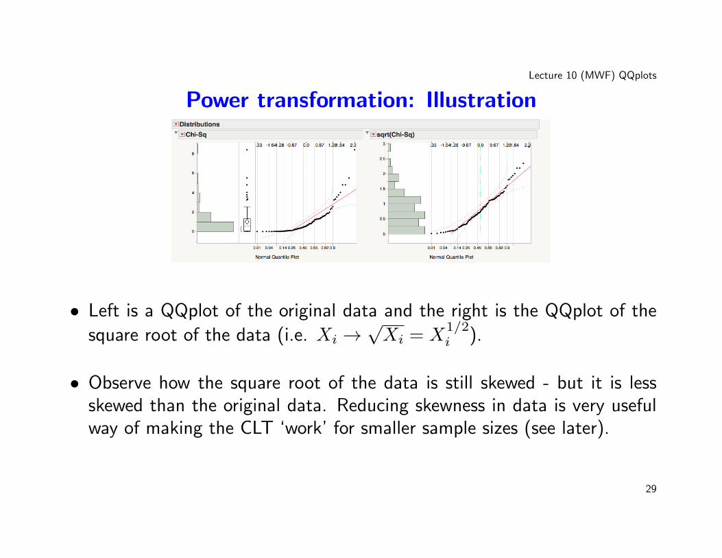
Power transformation: Illustration
• Left is a QQplot of the original data and the right is the QQplot of the
square root of the data (i.e. Xi →√Xi = X
1/2i ).
• Observe how the square root of the data is still skewed - but it is lessskewed than the original data. Reducing skewness in data is very usefulway of making the CLT ‘work’ for smaller sample sizes (see later).
29
Lecture 10 (MWF) QQplots
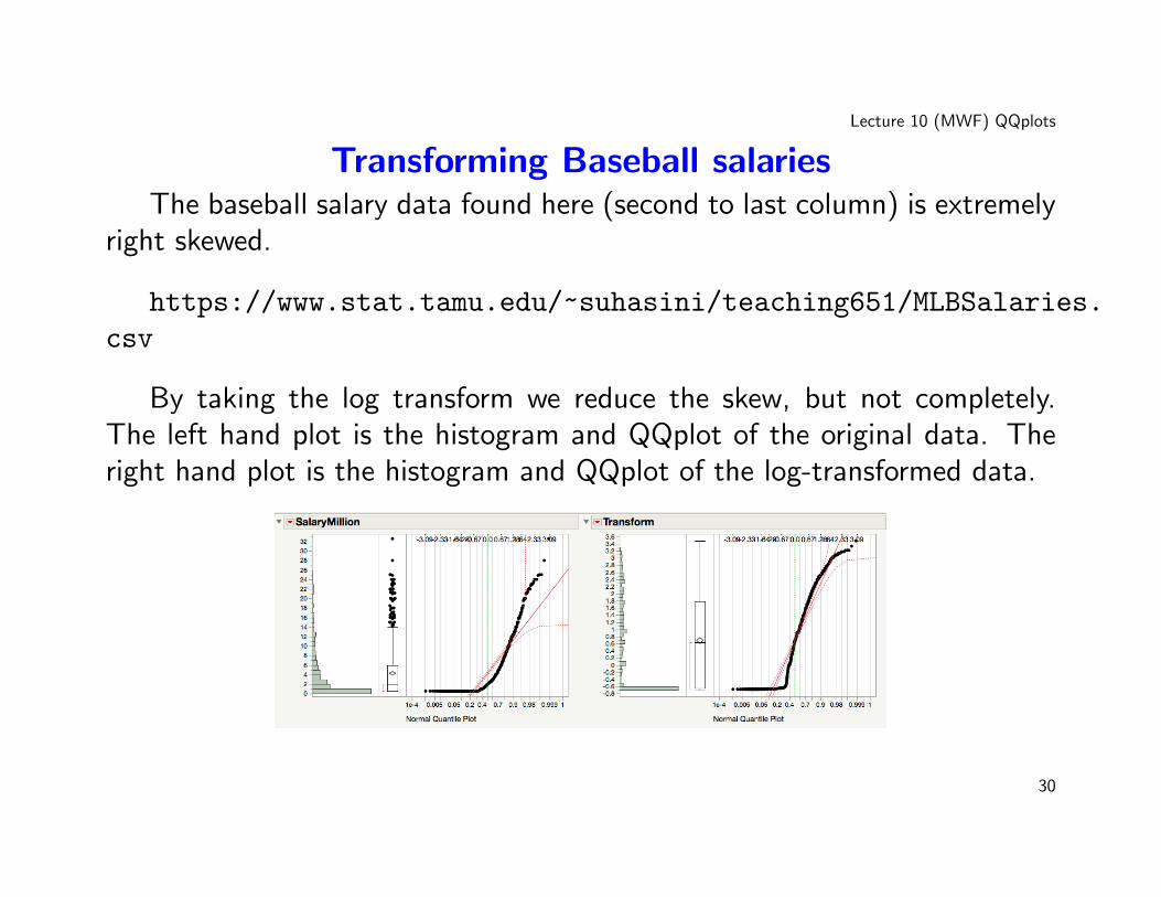
Transforming Baseball salariesThe baseball salary data found here (second to last column) is extremely
right skewed.
https://www.stat.tamu.edu/~suhasini/teaching651/MLBSalaries.
csv
By taking the log transform we reduce the skew, but not completely.The left hand plot is the histogram and QQplot of the original data. Theright hand plot is the histogram and QQplot of the log-transformed data.
30