Capability Analysis8 . Pareto Diagrams . A Pareto diagram is a special type of bar chart displays...
74
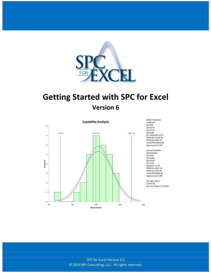
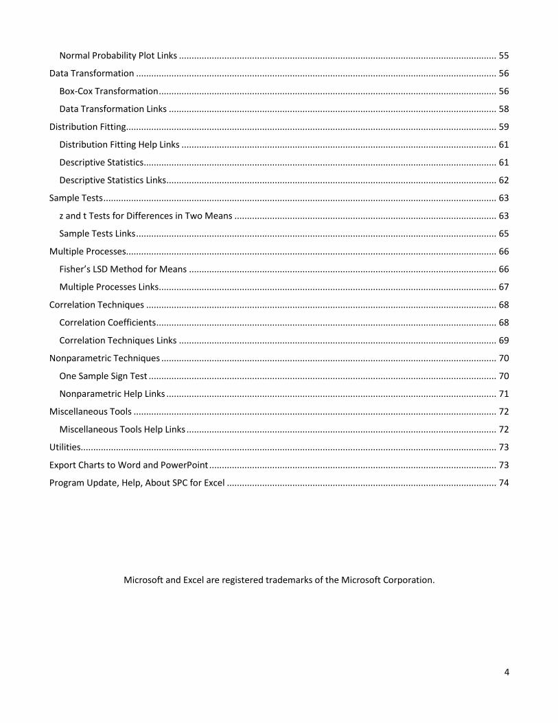
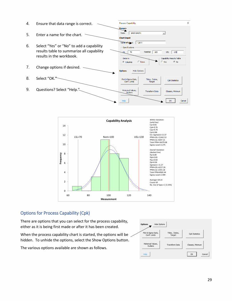
Getting Started with SPC for Excel Version 6 LSL=70 USL=130 Nom=100 0 1 2 3 4 5 6 7 8 60 80 100 120 140 Frequency Measurement Capability Analysis Within Variation: (solid line) Cp=0.81 Cpk=0.76 Cpu=0.76 Cpl=0.86 Est. Sigma(σ)=12.37 PPM>USL=11442.53 PPM<LSL=5037.15 Total PPM=16479.68 Sigma Level=2.275 Overall Variation: (dashed line) Pp=0.89 Ppk=0.83 Ppu=0.83 Ppl=0.94 Sigma(s)= 11.27 PPM>USL=6227.26 PPM<LSL=2355.18 Total PPM=8582.44 Sigma Level=2.499 Average=101.8 Count=30 No. Out of Spec=1 (3.33%) SPC for Excel Version 6.0 © 2019 BPI Consulting, LLC. All rights reserved.
Transcript of Capability Analysis8 . Pareto Diagrams . A Pareto diagram is a special type of bar chart displays...
Getting Started with SPC for Excel
Version 6
LSL=70 USL=130Nom=100
0
1
2
3
4
5
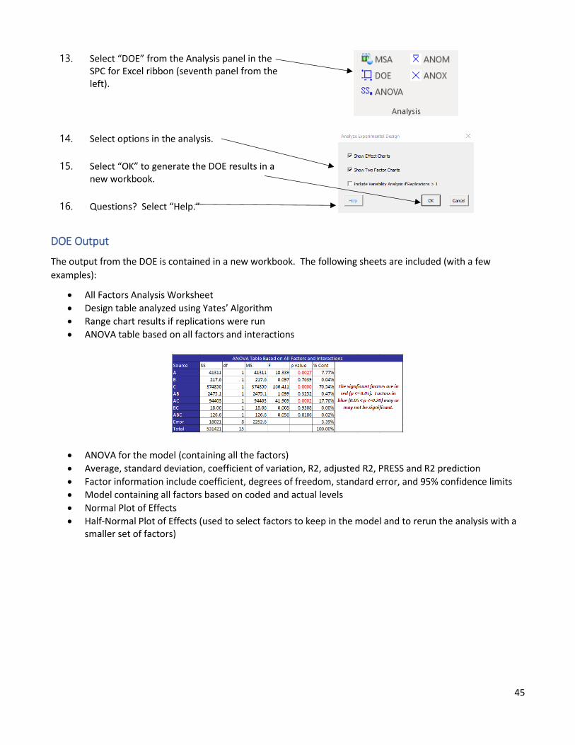
6
7
8
60 80 100 120 140
Fre
qu
en
cy
Measurement
Capability AnalysisWithin Variation:(solid line)Cp=0.81Cpk=0.76Cpu=0.76Cpl=0.86Est. Sigma(σ)=12.37PPM>USL=11442.53PPM<LSL=5037.15Total PPM=16479.68Sigma Level=2.275
Overall Variation:(dashed line)Pp=0.89Ppk=0.83Ppu=0.83Ppl=0.94Sigma(s)= 11.27PPM>USL=6227.26PPM<LSL=2355.18Total PPM=8582.44Sigma Level=2.499
Average=101.8Count=30No. Out of Spec=1 (3.33%)
SPC for Excel Version 6.0
© 2019 BPI Consulting, LLC. All rights reserved.
2
Contents
Introduction to SPC for Excel ......................................................................................................................................5
Using the “Getting Started” Guide .........................................................................................................................5
Overview of How the Software Works ...................................................................................................................5
Navigating the SPC for Excel Ribbon ......................................................................................................................6
Opening SPC for Excel the First Time .....................................................................................................................6
Pareto Diagrams .........................................................................................................................................................8
Frequency Pareto Diagram .....................................................................................................................................8
Pareto Diagram Links ..............................................................................................................................................9
Histograms ............................................................................................................................................................... 10
Basic Histogram ................................................................................................................................................... 10
Options for Histograms ....................................................................................................................................... 11
Histogram Links ................................................................................................................................................... 13
Control Charts .......................................................................................................................................................... 14
Data Entry ............................................................................................................................................................ 14
Individuals Control Chart ..................................................................................................................................... 15
Options for Control Charts .................................................................................................................................. 16
Updating a Control Chart with New Data ............................................................................................................ 18
Changing Options for a Control Chart ................................................................................................................. 18
Editing an Existing Control Chart ......................................................................................................................... 19
Actions on Existing Control Charts ...................................................................................................................... 20
Splitting Control Limits .................................................................................................................................... 20
Removing Points from the Calculations .......................................................................................................... 22
Adding Comments ........................................................................................................................................... 22
Remove All Points Beyond the Control Limits from the Calculations ............................................................. 23
Add Back All Points Beyond the Control Limits to the Calculations ................................................................ 23
Actions on Control Charts Links: ...................................................................................................................... 23
Attribute Control Charts .................................................................................................................................. 24
Variable Control Charts ................................................................................................................................... 24
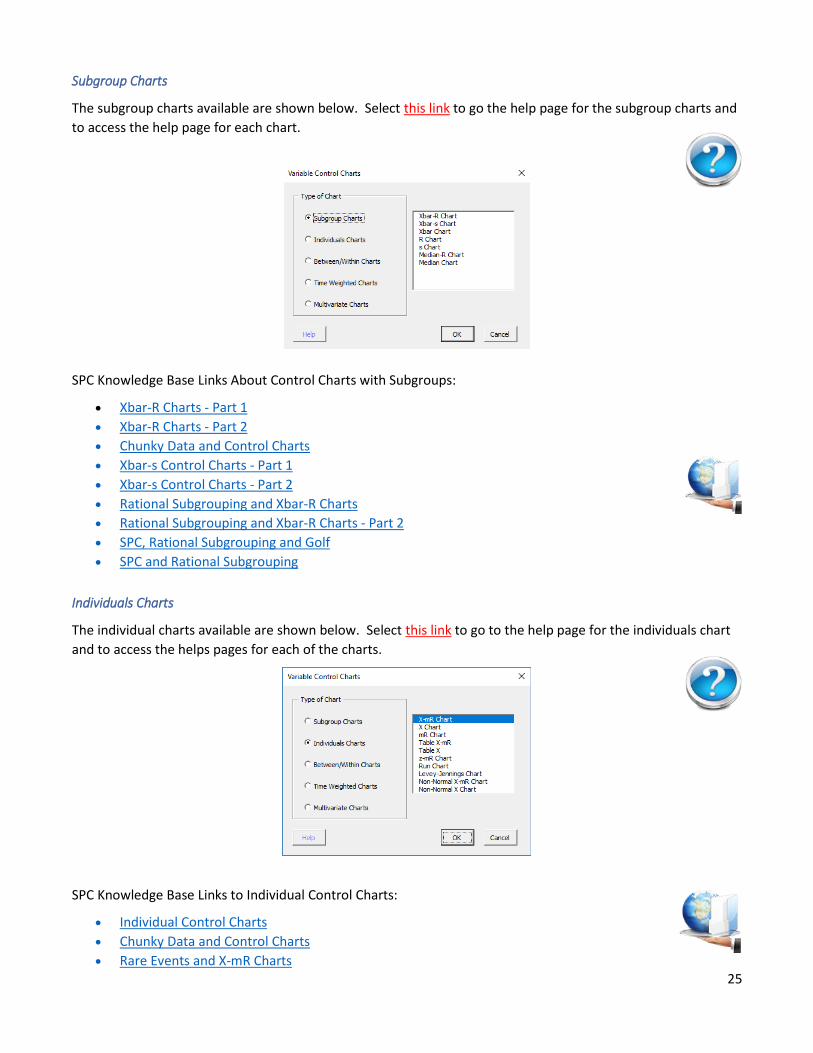
Subgroup Charts .......................................................................................................................................... 25
Individuals Charts ........................................................................................................................................ 25
Between/Within Charts ............................................................................................................................... 26
Time Weighted Charts ................................................................................................................................. 26
Multivariate Charts .............................................................................................................................................. 27
3
Process Capability .................................................................................................................................................... 28
Cpk – Process Capability Analysis ........................................................................................................................ 28
Options for Process Capability (Cpk) ................................................................................................................... 29
Process Capability Links ....................................................................................................................................... 31
Updating Charts/Changing Options ......................................................................................................................... 32
Help Links for updating/changing options .......................................................................................................... 32
Scatter Diagrams ..................................................................................................................................................... 33
Options for Scatter Diagrams .............................................................................................................................. 34
Scatter Diagram Links .......................................................................................................................................... 34
Fishbone (Cause and Effect) Diagrams .................................................................................................................... 35
Fishbone Diagram Links ....................................................................................................................................... 35
Regression ............................................................................................................................................................... 36
Regression Output ............................................................................................................................................... 37
Revising a Regression .......................................................................................................................................... 37
Regression Links .................................................................................................................................................. 37
Measurement Systems Analysis/Gage R&R ............................................................................................................ 38
Setting Up a Basic EMP Study .............................................................................................................................. 38
Options in the Gage R&R Techniques ................................................................................................................. 40
Gage R&R Output .................................................................................................... Error! Bookmark not defined.
Updating a Gage R&R Study ................................................................................................................................ 41
Measurement System Analysis/Gage R&R Links ................................................................................................. 42
Design of Experiments (DOE) .................................................................................................................................. 43
Two Level Full Factorial Design ........................................................................................................................... 43
DOE Output ......................................................................................................................................................... 45
DOE Links ............................................................................................................................................................. 46
Analysis of Variance (ANOVA) ................................................................................................................................. 47
Crossed Design with Fixed Factors ...................................................................................................................... 47
ANOVA Output .................................................................................................................................................... 48
ANOVA Links ........................................................................................................................................................ 49
ANOM (Analysis of Means) ...................................................................................................................................... 50
ANOM Links ......................................................................................................................................................... 51
ANOX (Analysis of Individual Values) ...................................................................................................................... 52
ANOX Links .......................................................................................................................................................... 53
Normal Probability Plot ........................................................................................................................................... 54
4
Normal Probability Plot Links .............................................................................................................................. 55
Data Transformation ............................................................................................................................................... 56
Box-Cox Transformation ...................................................................................................................................... 56
Data Transformation Links .................................................................................................................................. 58
Distribution Fitting ................................................................................................................................................... 59
Distribution Fitting Help Links ............................................................................................................................. 61
Descriptive Statistics ............................................................................................................................................ 61
Descriptive Statistics Links ................................................................................................................................... 62
Sample Tests ............................................................................................................................................................ 63
z and t Tests for Differences in Two Means ........................................................................................................ 63
Sample Tests Links ............................................................................................................................................... 65
Multiple Processes................................................................................................................................................... 66
Fisher’s LSD Method for Means .......................................................................................................................... 66
Multiple Processes Links ...................................................................................................................................... 67
Correlation Techniques ........................................................................................................................................... 68
Correlation Coefficients ....................................................................................................................................... 68
Correlation Techniques Links .............................................................................................................................. 69
Nonparametric Techniques ..................................................................................................................................... 70
One Sample Sign Test .......................................................................................................................................... 70
Nonparametric Help Links ................................................................................................................................... 71
Miscellaneous Tools ................................................................................................................................................ 72
Miscellaneous Tools Help Links ........................................................................................................................... 72
Utilities..................................................................................................................................................................... 73
Export Charts to Word and PowerPoint .................................................................................................................. 73
Program Update, Help, About SPC for Excel ........................................................................................................... 74
Microsoft and Excel are registered trademarks of the Microsoft Corporation.
5
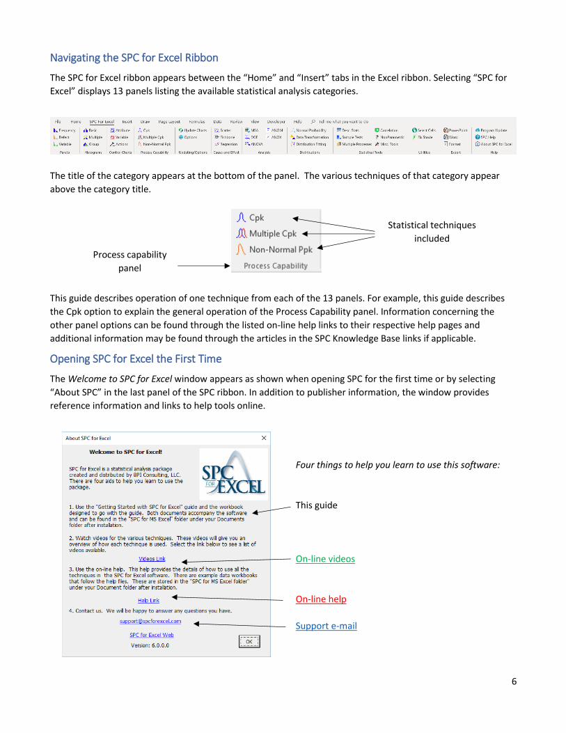
Introduction to SPC for Excel
SPC for Excel (SPC) is an add-in to Microsoft® Excel® that provides flexible, pre-configured statistical analysis
tools that can free the user to generate rapid and meaningful results without having to perform extensive Excel
development.
Using the “Getting Started” Guide
To use the features of SPC, you are expected to have some background knowledge of the statistical
techniques you want to use. The topics within this guide describe the most commonly-used features
of SPC to illustrate its operation within Excel. The topics within this guide appear in the order of
their tool appearance in the SPC ribbon layout. Internet links to each topic’s help file are shown in
red underlined text such as this link and indicated in the right margin using the question mark icon shown.
Pressing “control” and clicking on the link will open your default browser and display the linked help file from
the SPC for Excel website (www.spcforexcel.com).
This guide cannot cover all options and techniques built into SPC software. For more information
look for links to the SPC Knowledge Base noted throughout this guide in blue underlined text
similar to this text and marked in the right margin by the server icon. More than 150 articles
describe the various techniques and tools available through SPC. There are also on-line videos that
give an overview of how to use the named technique indicated as noted by links similar to this text.
The data used in the guide examples are from the workbook file “SPC-for-Excel-Example-Data-for-Getting-
Started.xlsx.” This workbook file offers sample data and notes to help you learn how to use SPC. To begin, open
the workbook file and go to the tab for the statistical technique you want to use. Follow along with the steps in
this guide. This workbook file is included with the software download and may be found in the folder where you
unzipped the program. You can also find the workbook file on-line using this link.
Overview of How the Software Works
SPC is designed for ease of use. The following steps are common to most of the techniques in the software:
• Enter the data into an Excel worksheet.
• Select the statistical technique you want to use from the SPC ribbon.
• Enter any required information (e.g., chart name).
• Select “OK” and SPC performs analysis and presents graphic results.
Many of the techniques (including control charts) are updated easily with new data.
6
Navigating the SPC for Excel Ribbon
The SPC for Excel ribbon appears between the “Home” and “Insert” tabs in the Excel ribbon. Selecting “SPC for
Excel” displays 13 panels listing the available statistical analysis categories.
The title of the category appears at the bottom of the panel. The various techniques of that category appear
above the category title.
This guide describes operation of one technique from each of the 13 panels. For example, this guide describes
the Cpk option to explain the general operation of the Process Capability panel. Information concerning the
other panel options can be found through the listed on-line help links to their respective help pages and
additional information may be found through the articles in the SPC Knowledge Base links if applicable.
Opening SPC for Excel the First Time
The Welcome to SPC for Excel window appears as shown when opening SPC for the first time or by selecting
“About SPC” in the last panel of the SPC ribbon. In addition to publisher information, the window provides
reference information and links to help tools online.
Four things to help you learn to use this software:
This guide
On-line videos
On-line help
Support e-mail
Process capability
panel
Statistical techniques
included
7
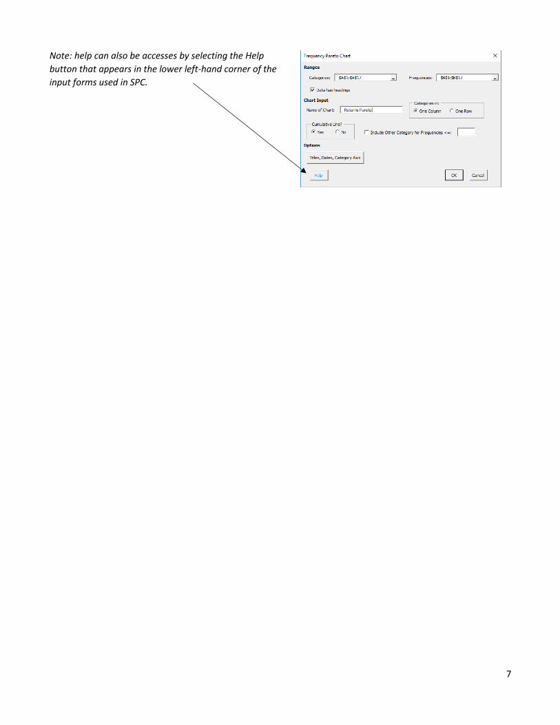
Note: help can also be accesses by selecting the Help
button that appears in the lower left-hand corner of the
input forms used in SPC.
8
Pareto Diagrams
A Pareto diagram is a special type of bar chart displays the "vital few" separate from the "trivial many." The
diagram is based on the 80/20 rule: e.g., 20% of our customers buy 80% of our products. The horizontal (x) axis
most often represents problems or causes of problems (the “categories”). The vertical (y) axis most often
represents frequency or cost (the “frequencies”). The problem or cause that occurs most frequently (or costs the
most) is listed first on the x axis. The second most frequently occurring problem or cause is listed second and so
on. A bar is generated for each cause or problem. The height of the bar is the frequency with which that
problem or cause occurred. A cumulative percentage line is sometimes added to the Pareto diagram.
SPC offers three different options for a Pareto diagram:
• Frequency: creates a Pareto chart based on categories and frequencies.
• Defect: creates a Pareto chart from a list of defects.
• Variable: creates a Pareto chart for defects for each variable (such as day, afternoon, and night shift).
Frequency Pareto Diagram
The “Frequency” Pareto diagram option totals the frequencies for the categories and creates the chart. Enter
the data into a worksheet – it can be done anywhere on the worksheet. The data can be in columns or rows.
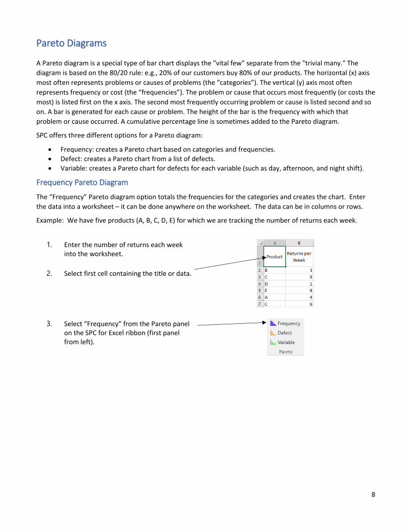
Example: We have five products (A, B, C, D, E) for which we are tracking the number of returns each week.
1. Enter the number of returns each week into the worksheet.
2. Select first cell containing the title or data.
3. Select “Frequency” from the Pareto panel on the SPC for Excel ribbon (first panel from left).
9
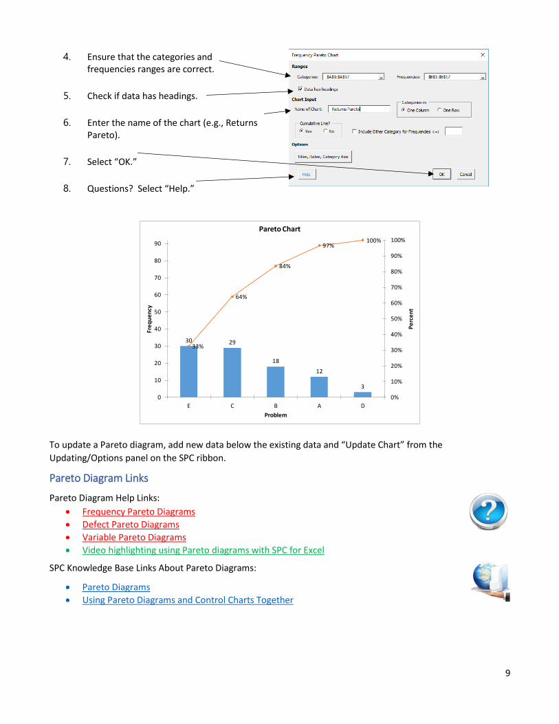
4. Ensure that the categories and frequencies ranges are correct.
5. Check if data has headings.
6. Enter the name of the chart (e.g., Returns Pareto).
7. Select “OK.”
8. Questions? Select “Help.”
To update a Pareto diagram, add new data below the existing data and “Update Chart” from the
Updating/Options panel on the SPC ribbon.
Pareto Diagram Links
Pareto Diagram Help Links:
• Frequency Pareto Diagrams
• Defect Pareto Diagrams
• Variable Pareto Diagrams
• Video highlighting using Pareto diagrams with SPC for Excel
SPC Knowledge Base Links About Pareto Diagrams:
• Pareto Diagrams
• Using Pareto Diagrams and Control Charts Together
30 29
18
12
3
33%
64%
84%
97%100%
0%
10%
20%
30%
40%
50%
60%
70%
80%
90%
100%
0
10
20
30
40
50
60
70
80
90
E C B A DP
erc
en
t
Fre
qu
en
cy
Problem
Pareto Chart
10
Histograms
A histogram is a bar chart of the results over a given time period. The histogram represents a snapshot in time
of the variation in your process. It will give you an idea of the most frequently occurring value or range of
values, how much variation there is in the data, the shape of the data (distribution), and the relationship of the
data to specifications.
The SPC for Excel software has three different options for a histogram:
• Basic: creates a single histogram from the data.
• Multiple: creates multiple histograms at one time from data in a table.
• Group: creates multiple histograms on one chart to compare the variation in multiple processes.
Basic Histogram
The basic histogram option creates a frequency histogram based on the data entered into the worksheet. There
are options to add specifications, to add a normal or non-normal curve, to show the descriptive statistics, and to
change the number of classes or class width.
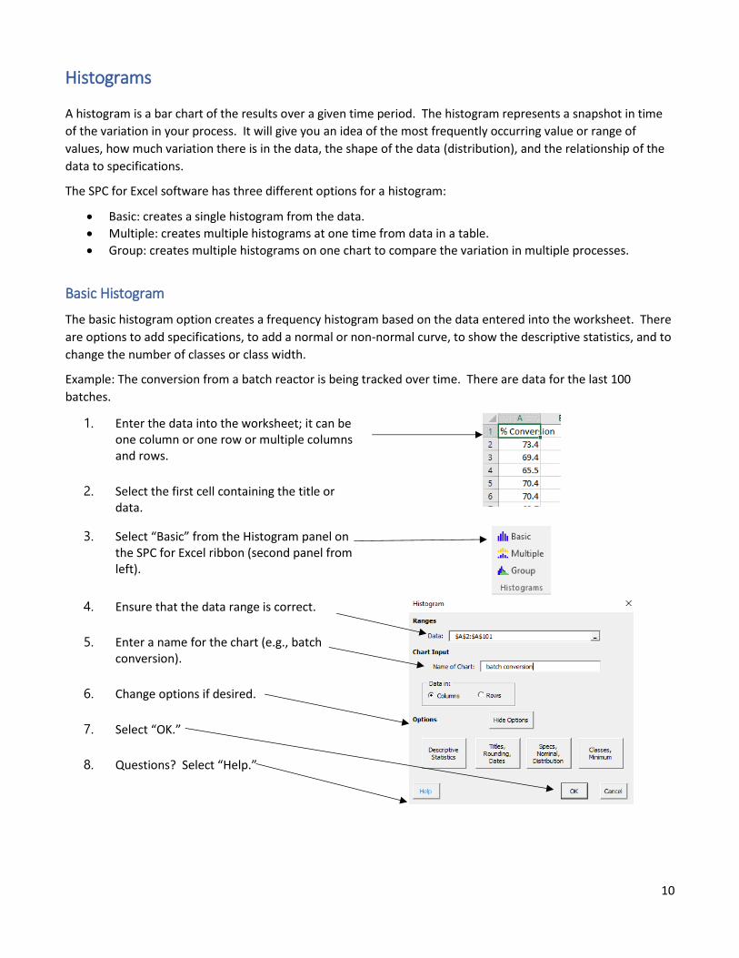
Example: The conversion from a batch reactor is being tracked over time. There are data for the last 100
batches.
1. Enter the data into the worksheet; it can be one column or one row or multiple columns and rows.
2. Select the first cell containing the title or data.
3. Select “Basic” from the Histogram panel on the SPC for Excel ribbon (second panel from left).
4. Ensure that the data range is correct.
5. Enter a name for the chart (e.g., batch conversion).
6. Change options if desired.
7. Select “OK.”
8. Questions? Select “Help.”
11
Options for Histograms
To access histogram options, select “Show Options” within the histogram parameter entry form. Options can
also be changed on an existing chart by selecting “Options” from the Updating/Options panel on the SPC for
Excel ribbon. Select the name of the chart and it will bring up the form shown previously. The options for the
basic histogram are shown as follows.
Descriptive Statistics
• Options to show all, none or select which statistics to show on the histogram.
• Options for the labels on the classes or bars (none, number, percent or both).
Titles, Rounding, Dates
• Enter title and axis labels.
• Enter dates of data collection (optional).
• Control rounding for descriptive statistics by entering the number of digits to right of decimal.
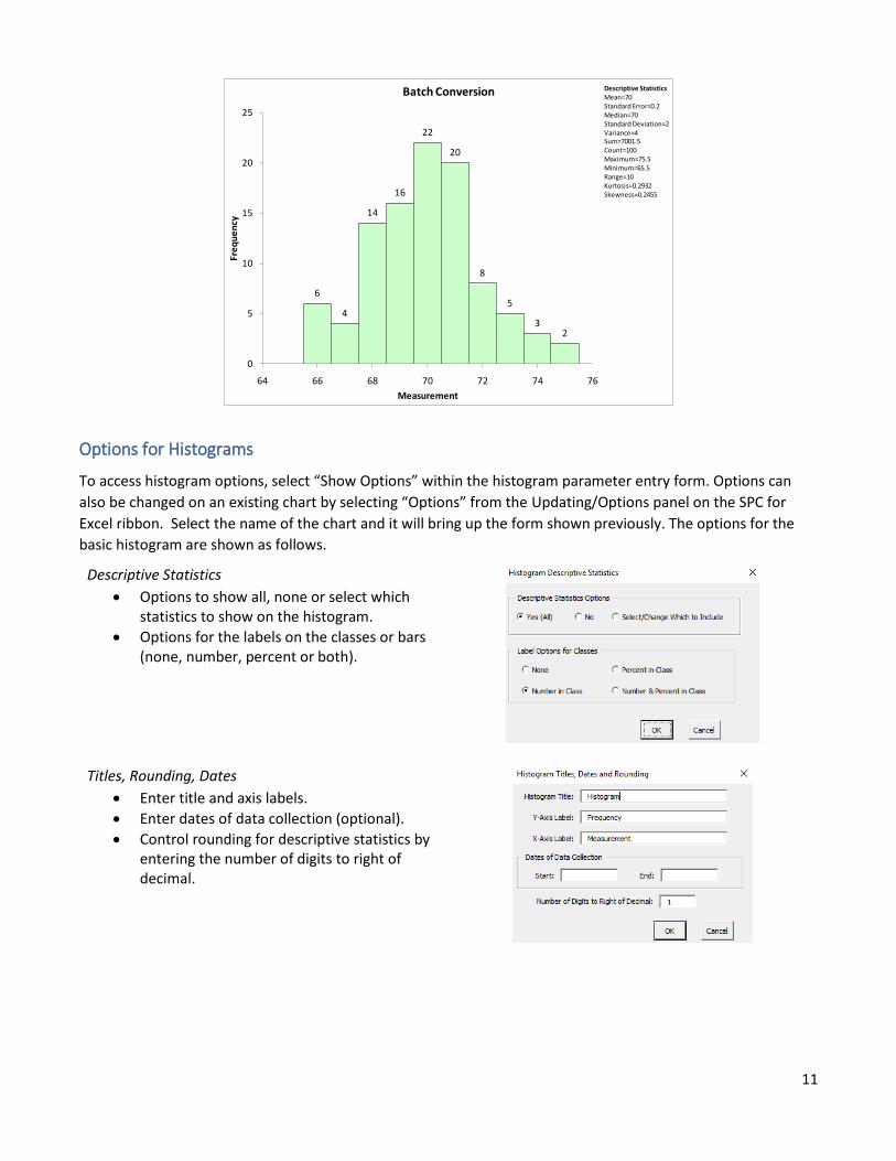
6
4
14
16
22
20
8
5
32
0
5
10
15
20
25
64 66 68 70 72 74 76
Fre
qu
en
cy
Measurement
Batch Conversion Descriptive StatisticsMean=70Standard Error=0.2Median=70Standard Deviation=2Variance=4Sum=7001.5Count=100Maximum=75.5Minimum=65.5Range=10Kurtosis=0.2932Skewness=0.2455
12
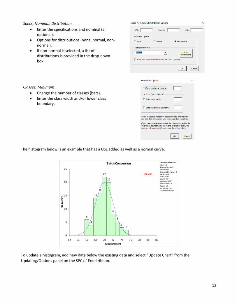
Specs, Nominal, Distribution
• Enter the specifications and nominal (all optional).
• Options for distributions (none, normal, non-normal).
• If non-normal is selected, a list of distributions is provided in the drop-down box.
Classes, Minimum
• Change the number of classes (bars).
• Enter the class width and/or lower class boundary.
The histogram below is an example that has a USL added as well as a normal curve.
To update a histogram, add new data below the existing data and select “Update Chart” from the
Updating/Options panel on the SPC of Excel ribbon.
6
4
14
16
22
20
8
5
32
USL=80
0
5
10
15
20
25
62 64 66 68 70 72 74 76 78 80 82
Fre
qu
en
cy
Measurement
Batch Conversion Descriptive StatisticsMean=70Standard Error=0.2Median=70Standard Deviation=2Variance=4Sum=7001.5Count=100Maximum=75.5Minimum=65.5Range=10Kurtosis=0.2932Skewness=0.2455

13
Histogram Links
Histogram Help Links:
• Basic Histogram
• Multiple Histogram
• Group Histogram
• Video highlighting using histograms in SPC for Excel
SPC Knowledge Base Links About Histograms
• SPC Knowledge Base Article: Histograms – Part 1
• SPC Knowledge Base Article: Histograms – Part 2
14
Control Charts
A control chart displays the variation in a variable over time. A control chart will tell you if the process is in
statistical control, meaning that only common causes of variation are present in the process. Common causes of
variation are the natural variation in the process. A control chart will be out of statistical control if special
causes are present in the process – things that are not supposed to be there and need to be addressed.
A variable (such as daily downtime or a part measurement) is plotted over time. An average is calculated and
added to the chart. The control limits are then added. The upper control limit (UCL) is the largest value you
would expect if you just have common causes present in the process. The lower control limit (LCL) is the
smallest value you would expect if you just have common causes present in the process. As long as there are no
points beyond the control limits and there are no patterns in the data, then the process is said to be in statistical
control.
Data Entry
SPC for Excel has over 25 different control chart options. There are attribute control charts as well as variable
control charts. The data entry is very similar for all the charts. There are usually two data ranges that are
required for a control chart: the subgroup/sample identifiers and the data. The data can be anywhere in a
worksheet and can be in columns or rows. For example, suppose you are measuring a contaminant in a stream
each day. The data entry for an individuals (X-mR) chart is shown below.
Sample identifiers entered in
column K.
The software uses these to
identify each sample, define
control limits, split control limits,
remove points from calculations,
etc.
Data: individuals results entered in
column L
Suppose you are measuring bag weights and take four bag weights at the start of each hour. The data entry for
the X̅-R chart is shown below.
Subgroup identifiers in
column A.
Data in columns B to E for a
subgroup size of 4.
15
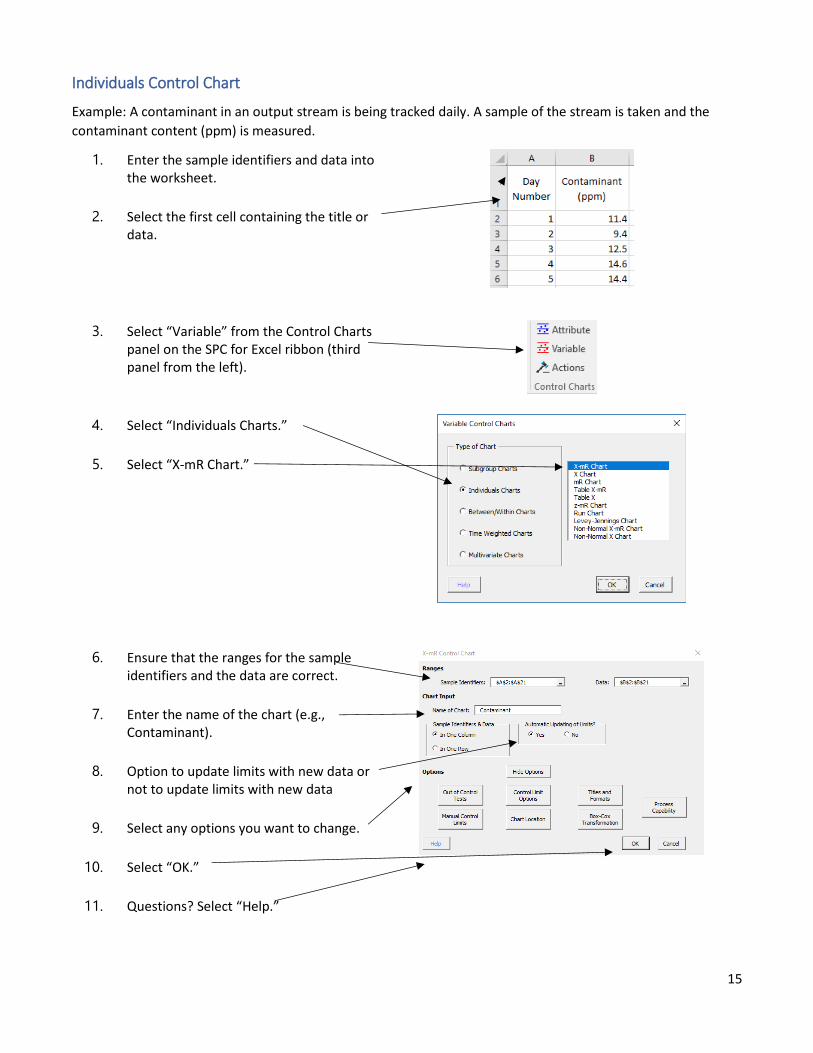
Individuals Control Chart
Example: A contaminant in an output stream is being tracked daily. A sample of the stream is taken and the
contaminant content (ppm) is measured.
1. Enter the sample identifiers and data into the worksheet.
2. Select the first cell containing the title or data.
3. Select “Variable” from the Control Charts panel on the SPC for Excel ribbon (third panel from the left).
4. Select “Individuals Charts.”
5. Select “X-mR Chart.”
6. Ensure that the ranges for the sample identifiers and the data are correct.
7. Enter the name of the chart (e.g., Contaminant).
8. Option to update limits with new data or not to update limits with new data
9. Select any options you want to change.
10. Select “OK.”
11. Questions? Select “Help.”
16
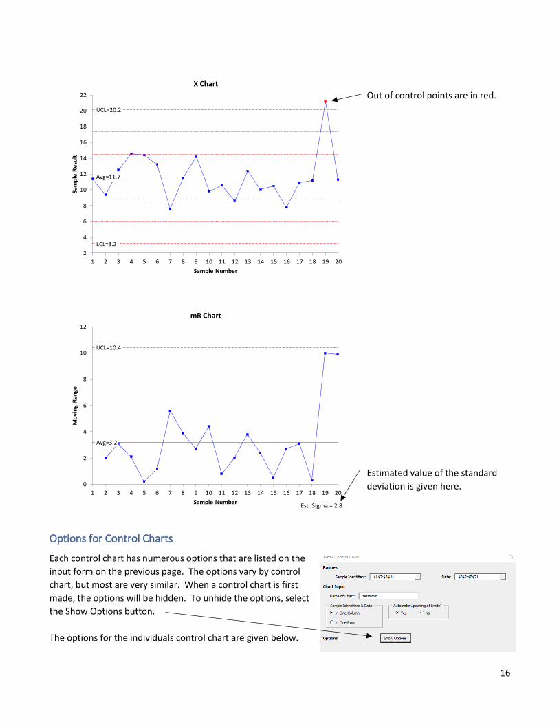
Out of control points are in red.
Estimated value of the standard
deviation is given here.
Options for Control Charts
Each control chart has numerous options that are listed on the
input form on the previous page. The options vary by control
chart, but most are very similar. When a control chart is first
made, the options will be hidden. To unhide the options, select
the Show Options button.
The options for the individuals control chart are given below.
Avg=11.7
UCL=20.2
LCL=3.2
2
4
6
8
10
12
14
16
18
20
22
1 2 3 4 5 6 7 8 9 10 11 12 13 14 15 16 17 18 19 20
Sam
ple
Re
sult
Sample Number
X Chart
Avg=3.2
UCL=10.4
0
2
4
6
8
10
12
1 2 3 4 5 6 7 8 9 10 11 12 13 14 15 16 17 18 19 20
Mo
vin
g R
ange
Sample Number
mR Chart
Est. Sigma = 2.8
17
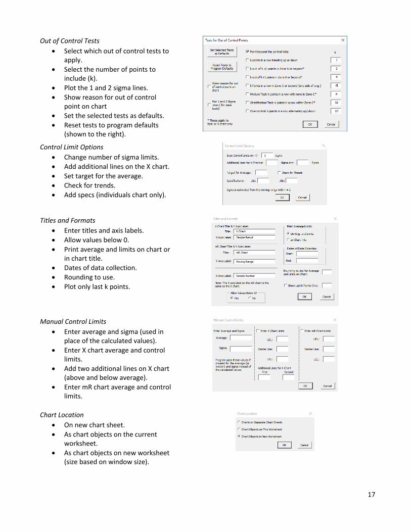
Out of Control Tests
• Select which out of control tests to apply.
• Select the number of points to include (k).
• Plot the 1 and 2 sigma lines.
• Show reason for out of control point on chart
• Set the selected tests as defaults.
• Reset tests to program defaults (shown to the right).
Control Limit Options
• Change number of sigma limits.
• Add additional lines on the X chart.
• Set target for the average.
• Check for trends.
• Add specs (individuals chart only).
Titles and Formats
• Enter titles and axis labels.
• Allow values below 0.
• Print average and limits on chart or in chart title.
• Dates of data collection.
• Rounding to use.
• Plot only last k points.
Manual Control Limits
• Enter average and sigma (used in place of the calculated values).
• Enter X chart average and control limits.
• Add two additional lines on X chart (above and below average).
• Enter mR chart average and control limits.
Chart Location
• On new chart sheet.
• As chart objects on the current worksheet.
• As chart objects on new worksheet (size based on window size).
18
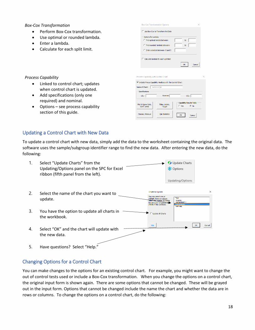
Box-Cox Transformation
• Perform Box-Cox transformation.
• Use optimal or rounded lambda.
• Enter a lambda.
• Calculate for each split limit.
Process Capability
• Linked to control chart; updates when control chart is updated.
• Add specifications (only one required) and nominal.
• Options – see process capability section of this guide.
Updating a Control Chart with New Data
To update a control chart with new data, simply add the data to the worksheet containing the original data. The
software uses the sample/subgroup identifier range to find the new data. After entering the new data, do the
following:
1. Select “Update Charts” from the Updating/Options panel on the SPC for Excel ribbon (fifth panel from the left).
2. Select the name of the chart you want to update.
3. You have the option to update all charts in the workbook.
4. Select “OK” and the chart will update with the new data.
5. Have questions? Select “Help.”
Changing Options for a Control Chart
You can make changes to the options for an existing control chart. For example, you might want to change the
out of control tests used or include a Box-Cox transformation. When you change the options on a control chart,
the original input form is shown again. There are some options that cannot be changed. These will be grayed
out in the input form. Options that cannot be changed include the name the chart and whether the data are in
rows or columns. To change the options on a control chart, do the following:
19
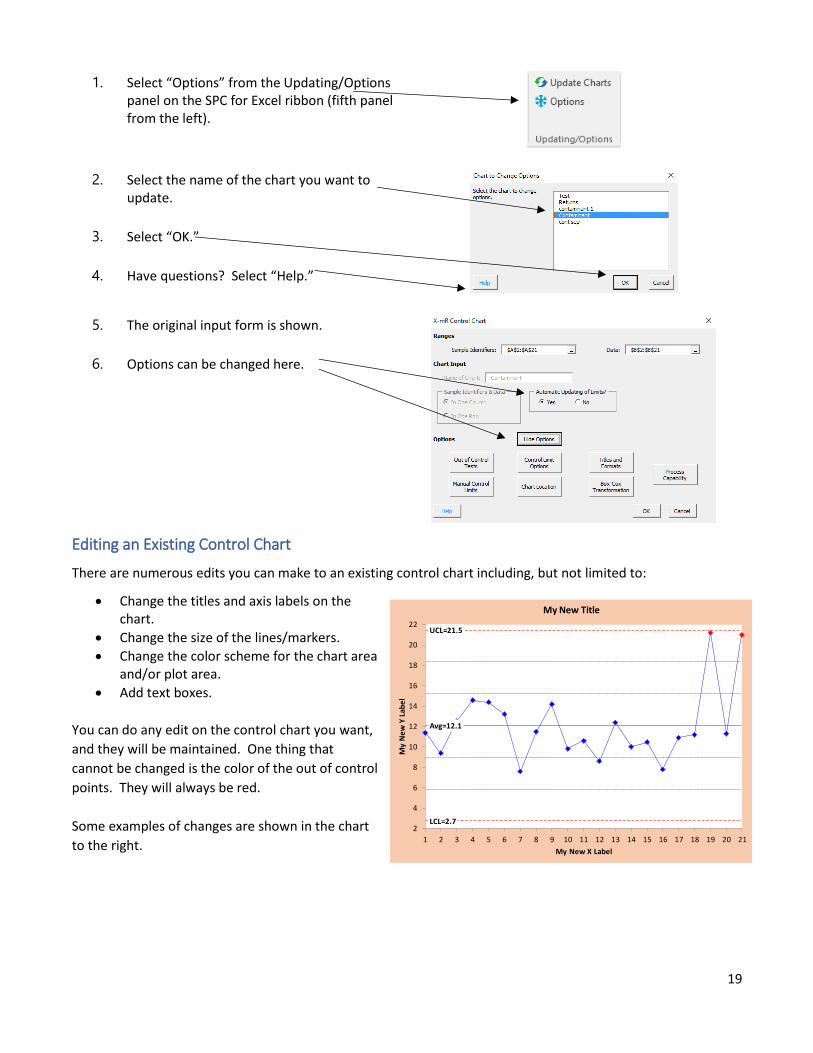
1. Select “Options” from the Updating/Options panel on the SPC for Excel ribbon (fifth panel from the left).
2. Select the name of the chart you want to update.
3. Select “OK.”
4. Have questions? Select “Help.”
5. The original input form is shown.
6. Options can be changed here.
Editing an Existing Control Chart
There are numerous edits you can make to an existing control chart including, but not limited to:
• Change the titles and axis labels on the chart.
• Change the size of the lines/markers.
• Change the color scheme for the chart area and/or plot area.
• Add text boxes.
You can do any edit on the control chart you want,
and they will be maintained. One thing that
cannot be changed is the color of the out of control
points. They will always be red.
Some examples of changes are shown in the chart
to the right.
Avg=12.1
UCL=21.5
LCL=2.72
4
6
8
10
12
14
16
18
20
22
1 2 3 4 5 6 7 8 9 10 11 12 13 14 15 16 17 18 19 20 21
My
Ne
w Y
Lab
el
My New X Label
My New Title
20
Actions on Existing Control Charts
There are a number of actions that you can take on an existing control chart including splitting control limits,
adding comments, removing points from the calculations, etc.
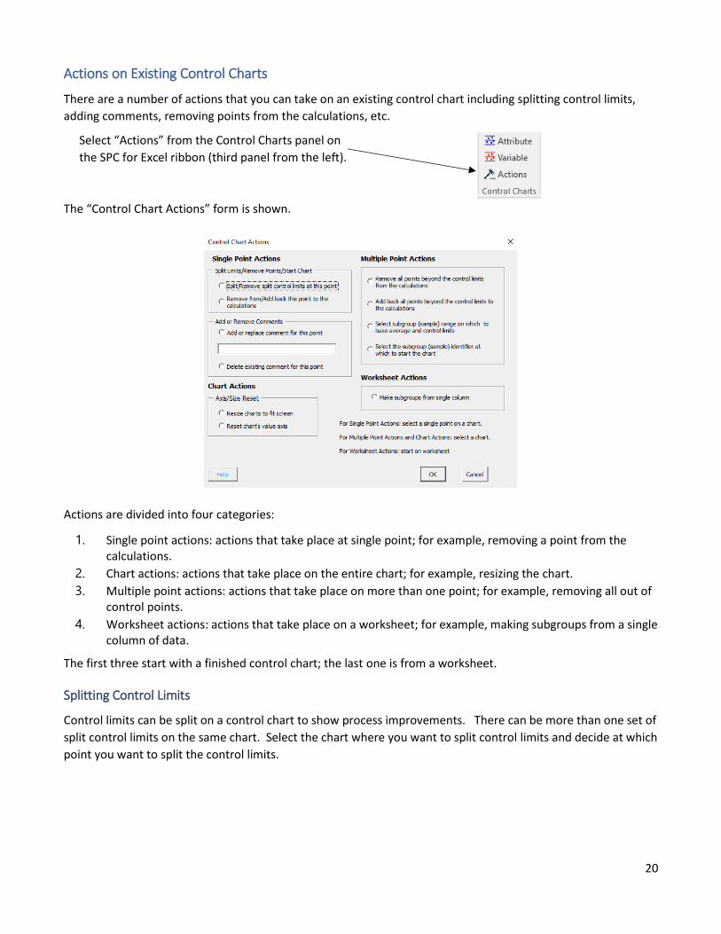
Select “Actions” from the Control Charts panel on
the SPC for Excel ribbon (third panel from the left).
The “Control Chart Actions” form is shown.
Actions are divided into four categories:
1. Single point actions: actions that take place at single point; for example, removing a point from the calculations.
2. Chart actions: actions that take place on the entire chart; for example, resizing the chart.
3. Multiple point actions: actions that take place on more than one point; for example, removing all out of control points.
4. Worksheet actions: actions that take place on a worksheet; for example, making subgroups from a single column of data.
The first three start with a finished control chart; the last one is from a worksheet.
Splitting Control Limits
Control limits can be split on a control chart to show process improvements. There can be more than one set of
split control limits on the same chart. Select the chart where you want to split control limits and decide at which
point you want to split the control limits.
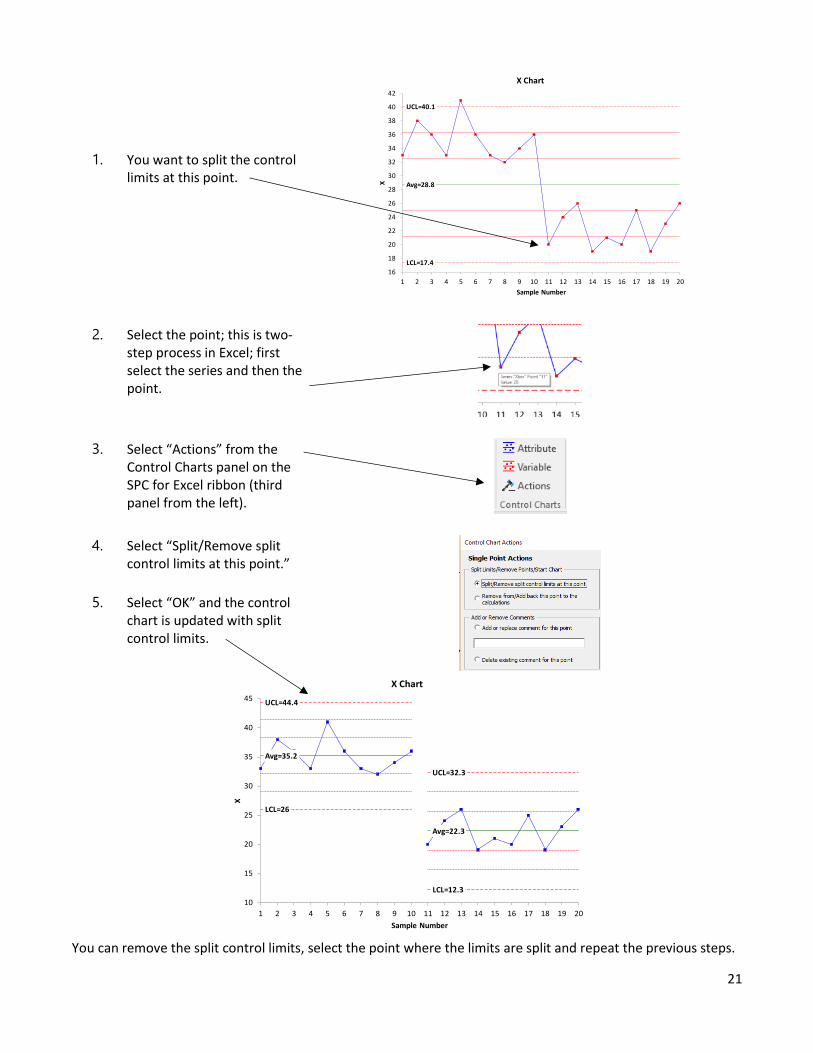
21
1. You want to split the control limits at this point.
2. Select the point; this is two-step process in Excel; first select the series and then the point.
3. Select “Actions” from the Control Charts panel on the SPC for Excel ribbon (third panel from the left).
4. Select “Split/Remove split control limits at this point.”
5. Select “OK” and the control chart is updated with split control limits.
You can remove the split control limits, select the point where the limits are split and repeat the previous steps.
Avg=28.8
UCL=40.1
LCL=17.4
16
18
20
22
24
26
28
30
32
34
36
38
40
42
1 2 3 4 5 6 7 8 9 10 11 12 13 14 15 16 17 18 19 20
X
Sample Number
X Chart
Avg=35.2
Avg=22.3
UCL=44.4
UCL=32.3
LCL=26
LCL=12.3
10
15
20
25
30
35
40
45
1 2 3 4 5 6 7 8 9 10 11 12 13 14 15 16 17 18 19 20
X
Sample Number
X Chart
22
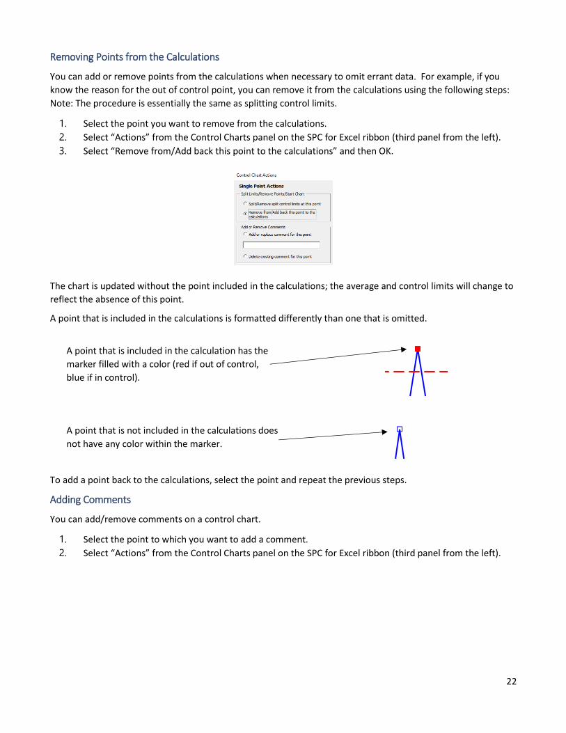
Removing Points from the Calculations
You can add or remove points from the calculations when necessary to omit errant data. For example, if you
know the reason for the out of control point, you can remove it from the calculations using the following steps:
Note: The procedure is essentially the same as splitting control limits.
1. Select the point you want to remove from the calculations.
2. Select “Actions” from the Control Charts panel on the SPC for Excel ribbon (third panel from the left).
3. Select “Remove from/Add back this point to the calculations” and then OK.
The chart is updated without the point included in the calculations; the average and control limits will change to
reflect the absence of this point.
A point that is included in the calculations is formatted differently than one that is omitted.
A point that is included in the calculation has the
marker filled with a color (red if out of control,
blue if in control).
A point that is not included in the calculations does
not have any color within the marker.
To add a point back to the calculations, select the point and repeat the previous steps.
Adding Comments
You can add/remove comments on a control chart.
1. Select the point to which you want to add a comment.
2. Select “Actions” from the Control Charts panel on the SPC for Excel ribbon (third panel from the left).
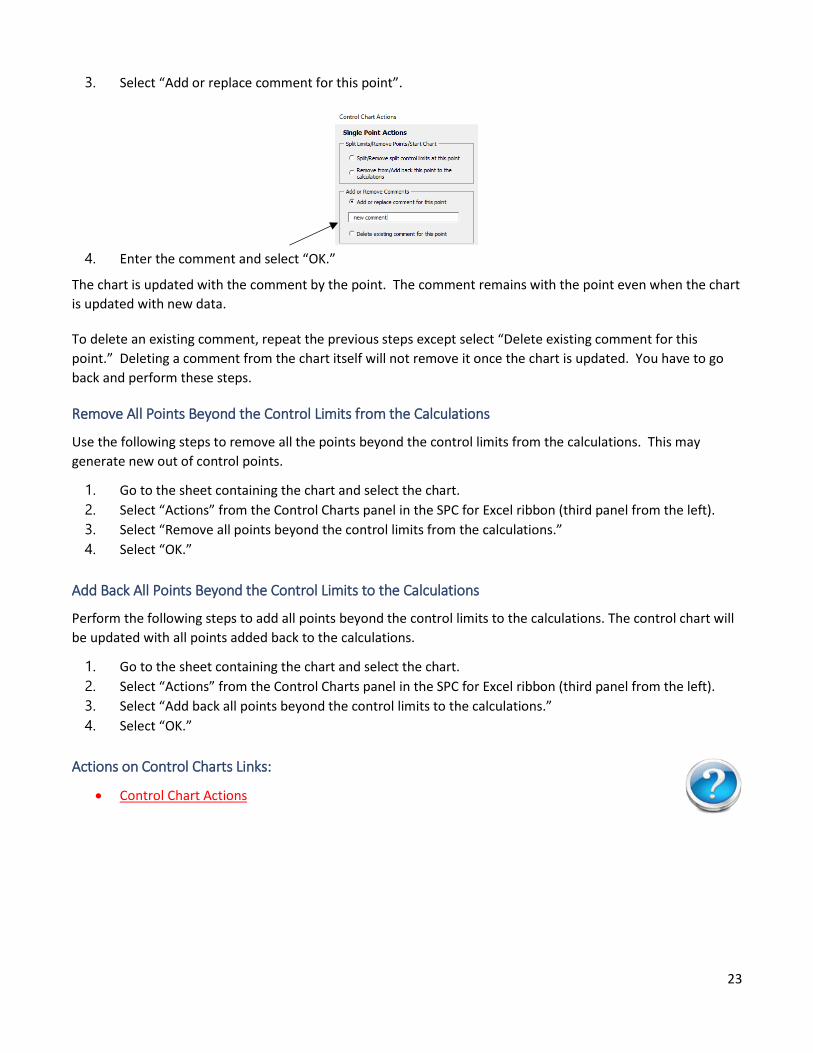
23
3. Select “Add or replace comment for this point”.
4. Enter the comment and select “OK.”
The chart is updated with the comment by the point. The comment remains with the point even when the chart
is updated with new data.
To delete an existing comment, repeat the previous steps except select “Delete existing comment for this
point.” Deleting a comment from the chart itself will not remove it once the chart is updated. You have to go
back and perform these steps.
Remove All Points Beyond the Control Limits from the Calculations
Use the following steps to remove all the points beyond the control limits from the calculations. This may
generate new out of control points.
1. Go to the sheet containing the chart and select the chart.
2. Select “Actions” from the Control Charts panel in the SPC for Excel ribbon (third panel from the left).
3. Select “Remove all points beyond the control limits from the calculations.”
4. Select “OK.”
Add Back All Points Beyond the Control Limits to the Calculations
Perform the following steps to add all points beyond the control limits to the calculations. The control chart will
be updated with all points added back to the calculations.
1. Go to the sheet containing the chart and select the chart.
2. Select “Actions” from the Control Charts panel in the SPC for Excel ribbon (third panel from the left).
3. Select “Add back all points beyond the control limits to the calculations.”
4. Select “OK.”
Actions on Control Charts Links:
• Control Chart Actions
24
Type of Control Chart Links
The software has help for each of the over 25 types of control charts. The help is available as you run the
software by selecting the blue “Help” button in the bottom left-hand corner of the initial dialog boxes. The
various types of control charts and their help links are also listed below.
You can watch a video highlighting control charts in SPC for Excel at this link.
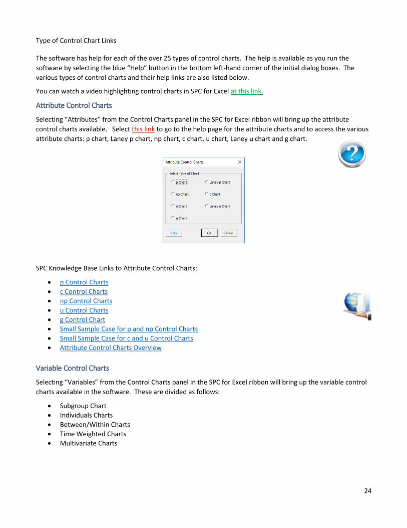
Attribute Control Charts
Selecting “Attributes” from the Control Charts panel in the SPC for Excel ribbon will bring up the attribute
control charts available. Select this link to go to the help page for the attribute charts and to access the various
attribute charts: p chart, Laney p chart, np chart, c chart, u chart, Laney u chart and g chart.
SPC Knowledge Base Links to Attribute Control Charts:
• p Control Charts
• c Control Charts
• np Control Charts
• u Control Charts
• g Control Chart
• Small Sample Case for p and np Control Charts
• Small Sample Case for c and u Control Charts
• Attribute Control Charts Overview
Variable Control Charts
Selecting “Variables” from the Control Charts panel in the SPC for Excel ribbon will bring up the variable control
charts available in the software. These are divided as follows:
• Subgroup Chart
• Individuals Charts
• Between/Within Charts
• Time Weighted Charts
• Multivariate Charts
25
Subgroup Charts
The subgroup charts available are shown below. Select this link to go the help page for the subgroup charts and
to access the help page for each chart.
SPC Knowledge Base Links About Control Charts with Subgroups:
• Xbar-R Charts - Part 1
• Xbar-R Charts - Part 2
• Chunky Data and Control Charts
• Xbar-s Control Charts - Part 1
• Xbar-s Control Charts - Part 2
• Rational Subgrouping and Xbar-R Charts
• Rational Subgrouping and Xbar-R Charts - Part 2
• SPC, Rational Subgrouping and Golf
• SPC and Rational Subgrouping
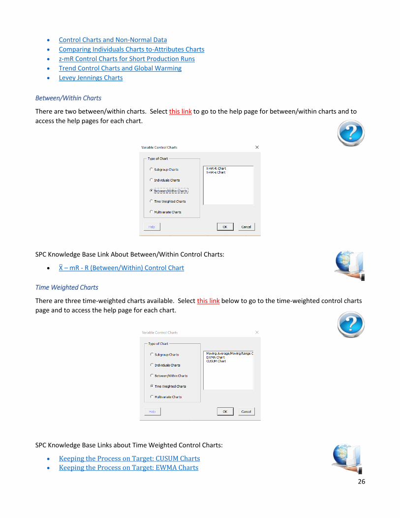
Individuals Charts
The individual charts available are shown below. Select this link to go to the help page for the individuals chart
and to access the helps pages for each of the charts.
SPC Knowledge Base Links to Individual Control Charts:
• Individual Control Charts
• Chunky Data and Control Charts
• Rare Events and X-mR Charts
26
• Control Charts and Non-Normal Data
• Comparing Individuals Charts to-Attributes Charts
• z-mR Control Charts for Short Production Runs
• Trend Control Charts and Global Warming
• Levey Jennings Charts
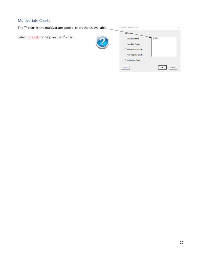
Between/Within Charts
There are two between/within charts. Select this link to go to the help page for between/within charts and to
access the help pages for each chart.
SPC Knowledge Base Link About Between/Within Control Charts:
• X̅ – mR - R (Between/Within) Control Chart
Time Weighted Charts
There are three time-weighted charts available. Select this link below to go to the time-weighted control charts
page and to access the help page for each chart.
SPC Knowledge Base Links about Time Weighted Control Charts:
• Keeping the Process on Target: CUSUM Charts
• Keeping the Process on Target: EWMA Charts
27
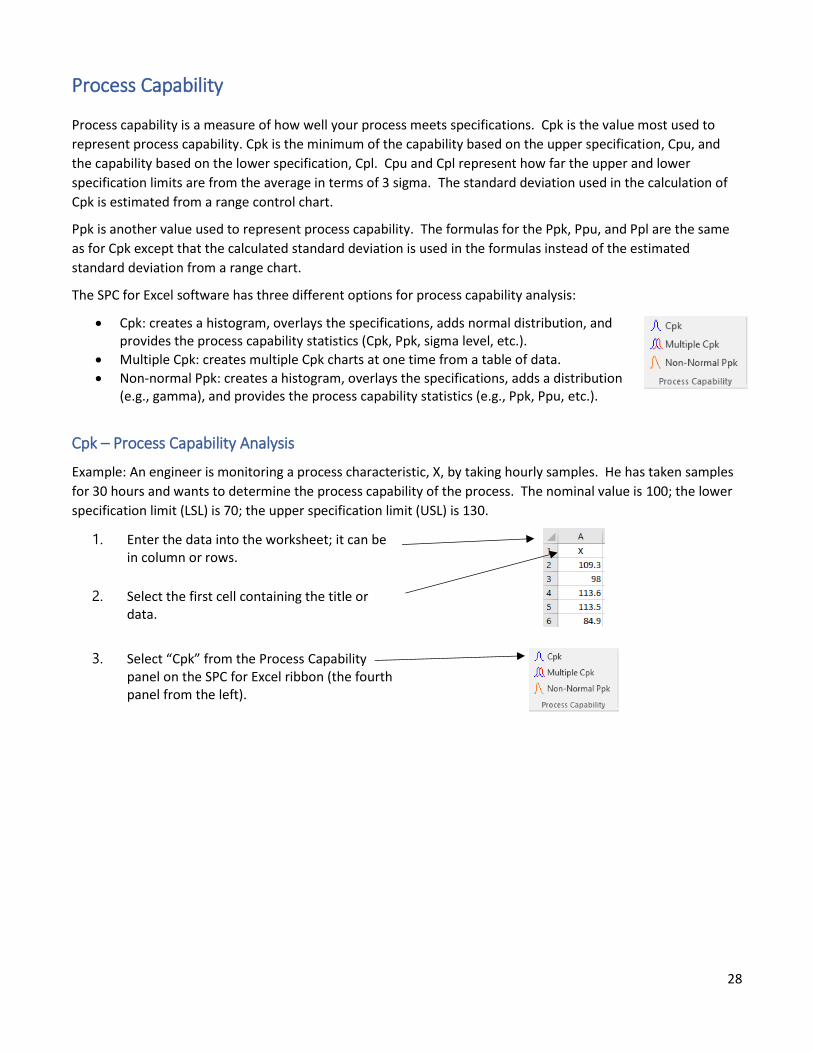
Multivariate Charts
The T2 chart is the multivariate control chart that is available.
Select this link for help on the T2 chart.
28
Process Capability
Process capability is a measure of how well your process meets specifications. Cpk is the value most used to
represent process capability. Cpk is the minimum of the capability based on the upper specification, Cpu, and
the capability based on the lower specification, Cpl. Cpu and Cpl represent how far the upper and lower
specification limits are from the average in terms of 3 sigma. The standard deviation used in the calculation of
Cpk is estimated from a range control chart.
Ppk is another value used to represent process capability. The formulas for the Ppk, Ppu, and Ppl are the same
as for Cpk except that the calculated standard deviation is used in the formulas instead of the estimated
standard deviation from a range chart.
The SPC for Excel software has three different options for process capability analysis:
• Cpk: creates a histogram, overlays the specifications, adds normal distribution, and provides the process capability statistics (Cpk, Ppk, sigma level, etc.).
• Multiple Cpk: creates multiple Cpk charts at one time from a table of data.
• Non-normal Ppk: creates a histogram, overlays the specifications, adds a distribution (e.g., gamma), and provides the process capability statistics (e.g., Ppk, Ppu, etc.).
Cpk – Process Capability Analysis
Example: An engineer is monitoring a process characteristic, X, by taking hourly samples. He has taken samples
for 30 hours and wants to determine the process capability of the process. The nominal value is 100; the lower
specification limit (LSL) is 70; the upper specification limit (USL) is 130.
1. Enter the data into the worksheet; it can be in column or rows.
2. Select the first cell containing the title or data.
3. Select “Cpk” from the Process Capability panel on the SPC for Excel ribbon (the fourth panel from the left).
29
4. Ensure that data range is correct.
5. Enter a name for the chart.
6. Select “Yes” or “No” to add a capability results table to summarize all capability results in the workbook.
7. Change options if desired.
8. Select “OK.”
9. Questions? Select “Help.”
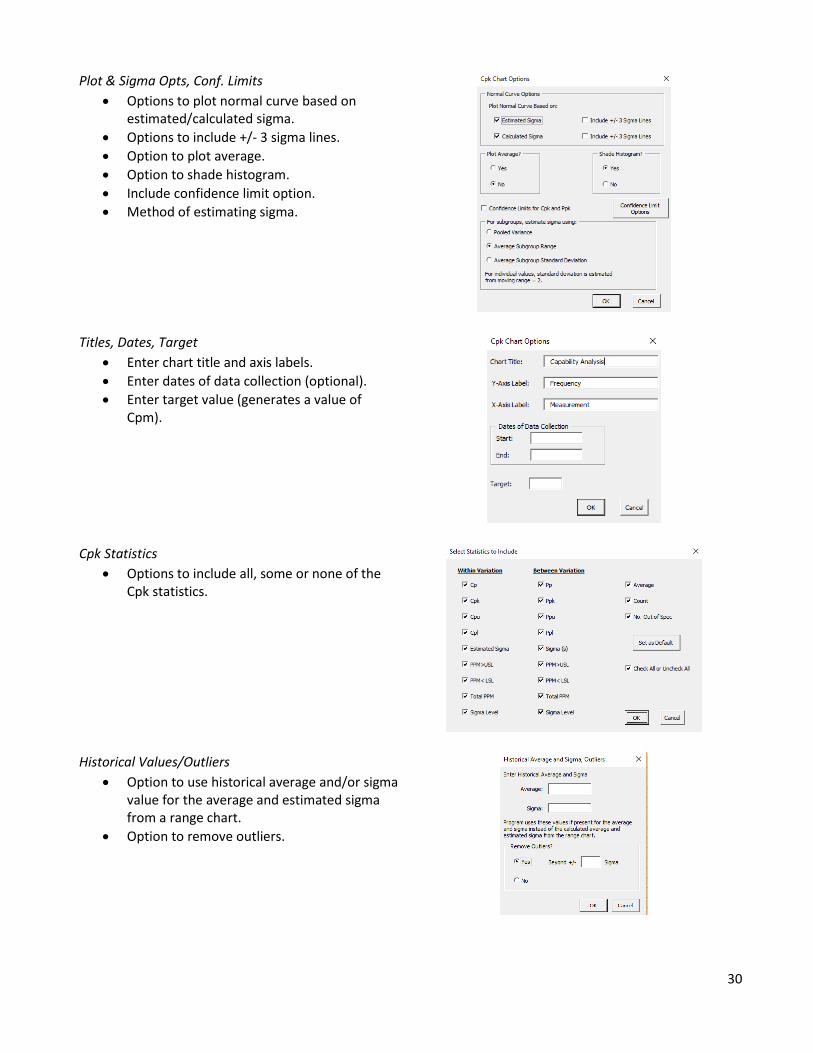
Options for Process Capability (Cpk)
There are options that you can select for the process capability,
either as it is being first made or after it has been created.
When the process capability chart is started, the options will be
hidden. To unhide the options, select the Show Options button.
The various options available are shown as follows.
LSL=70 USL=130Nom=100
0
2
4
6
8
10
12
14
60 80 100 120 140
Fre
qu
en
cy
Measurement
Capability Analysis Within Variation:(solid line)Cp=0.81Cpk=0.76Cpu=0.76Cpl=0.86Est. Sigma(σ)=12.37
PPM>USL=11442.53
PPM<LSL=5037.15Total PPM=16479.68Sigma Level=2.275
Overall Variation:(dashed line)Pp=0.89Ppk=0.83
Ppu=0.83Ppl=0.94Sigma(s)= 11.27PPM>USL=6227.26PPM<LSL=2355.18Total PPM=8582.44Sigma Level=2.499
Average=101.8
Count=30No. Out of Spec=1 (3.33%)
30
Plot & Sigma Opts, Conf. Limits
• Options to plot normal curve based on estimated/calculated sigma.
• Options to include +/- 3 sigma lines.
• Option to plot average.
• Option to shade histogram.
• Include confidence limit option.
• Method of estimating sigma.
Titles, Dates, Target
• Enter chart title and axis labels.
• Enter dates of data collection (optional).
• Enter target value (generates a value of Cpm).
Cpk Statistics
• Options to include all, some or none of the Cpk statistics.
Historical Values/Outliers
• Option to use historical average and/or sigma value for the average and estimated sigma from a range chart.
• Option to remove outliers.
31
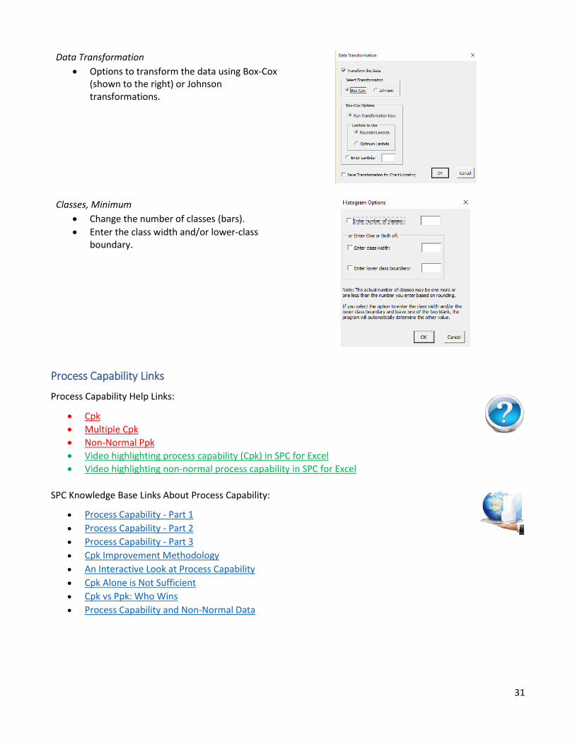
Data Transformation
• Options to transform the data using Box-Cox (shown to the right) or Johnson transformations.
Classes, Minimum
• Change the number of classes (bars).
• Enter the class width and/or lower-class boundary.
Process Capability Links
Process Capability Help Links:
• Cpk
• Multiple Cpk
• Non-Normal Ppk
• Video highlighting process capability (Cpk) in SPC for Excel
• Video highlighting non-normal process capability in SPC for Excel
SPC Knowledge Base Links About Process Capability:
• Process Capability - Part 1
• Process Capability - Part 2
• Process Capability - Part 3
• Cpk Improvement Methodology
• An Interactive Look at Process Capability
• Cpk Alone is Not Sufficient
• Cpk vs Ppk: Who Wins
• Process Capability and Non-Normal Data
32
Updating Charts/Changing Options
Existing charts can be easily updated with new data. Options on existing charts can also be changed. This
applies to the following charts:
• Pareto charts
• Histograms
• Control Charts
• Process Capability Charts
• Scatter Diagrams
• Waterfall Charts
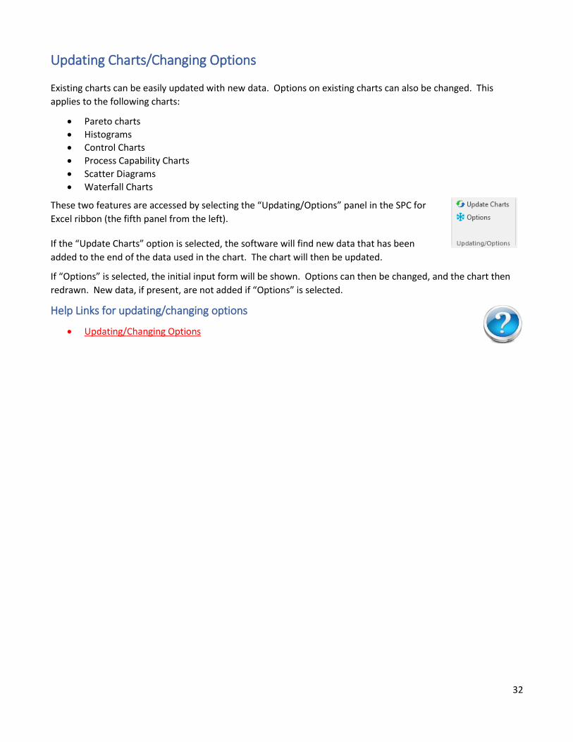
These two features are accessed by selecting the “Updating/Options” panel in the SPC for
Excel ribbon (the fifth panel from the left).
If the “Update Charts” option is selected, the software will find new data that has been
added to the end of the data used in the chart. The chart will then be updated.
If “Options” is selected, the initial input form will be shown. Options can then be changed, and the chart then
redrawn. New data, if present, are not added if “Options” is selected.
Help Links for updating/changing options
• Updating/Changing Options
33
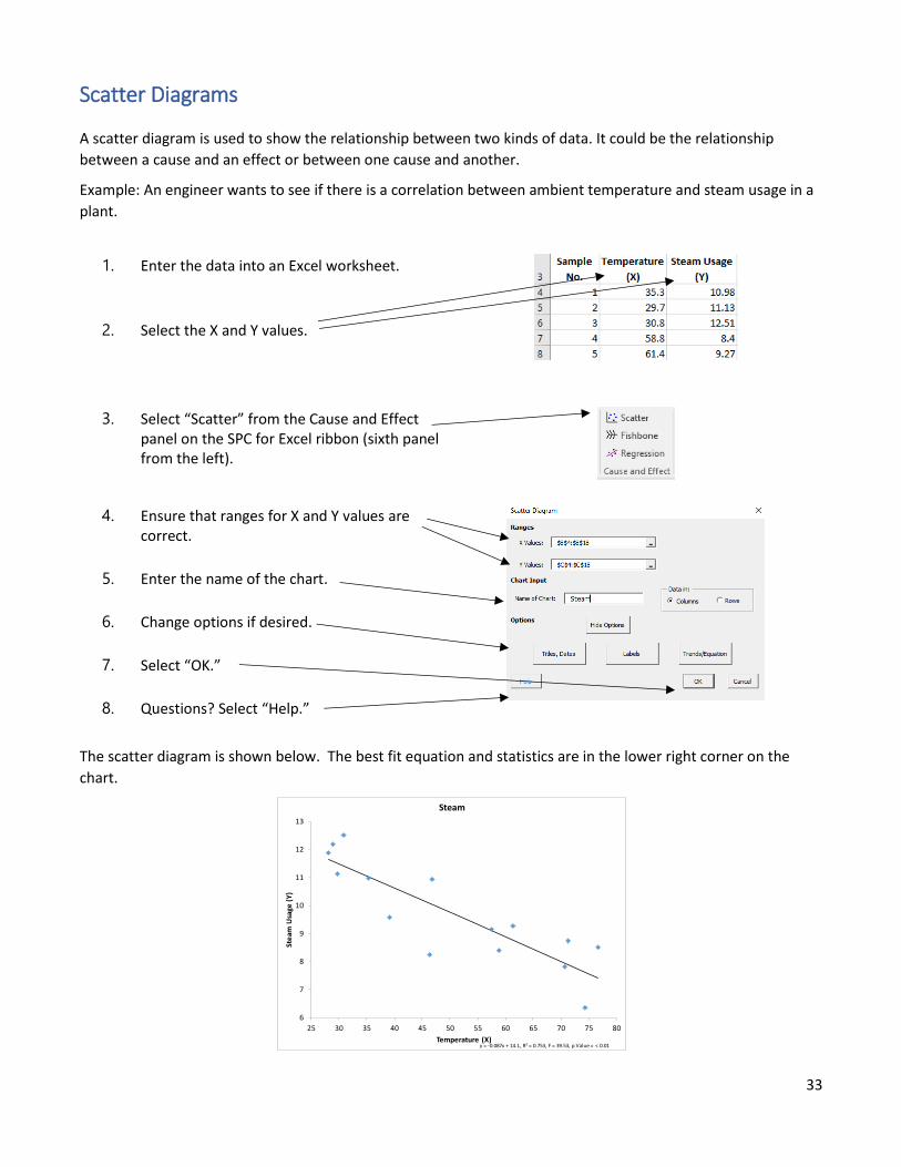
Scatter Diagrams
A scatter diagram is used to show the relationship between two kinds of data. It could be the relationship
between a cause and an effect or between one cause and another.
Example: An engineer wants to see if there is a correlation between ambient temperature and steam usage in a
plant.
1. Enter the data into an Excel worksheet.
2. Select the X and Y values.
3. Select “Scatter” from the Cause and Effect panel on the SPC for Excel ribbon (sixth panel from the left).
4. Ensure that ranges for X and Y values are correct.
5. Enter the name of the chart.
6. Change options if desired.
7. Select “OK.”
8. Questions? Select “Help.”
The scatter diagram is shown below. The best fit equation and statistics are in the lower right corner on the
chart.
6
7
8
9
10
11
12
13
25 30 35 40 45 50 55 60 65 70 75 80
Ste
am U
sage
(Y
)
Temperature (X)
Steam
y = -0.087x + 14.1, R² = 0.753, F = 39.53, p Value = < 0.01
34
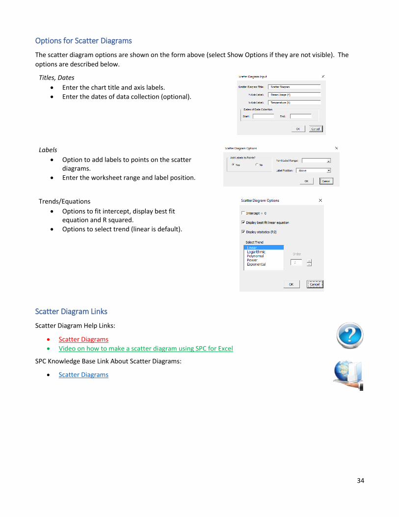
Options for Scatter Diagrams
The scatter diagram options are shown on the form above (select Show Options if they are not visible). The
options are described below.
Titles, Dates
• Enter the chart title and axis labels.
• Enter the dates of data collection (optional).
Labels
• Option to add labels to points on the scatter diagrams.
• Enter the worksheet range and label position.
Trends/Equations
• Options to fit intercept, display best fit equation and R squared.
• Options to select trend (linear is default).
Scatter Diagram Links
Scatter Diagram Help Links:
• Scatter Diagrams
• Video on how to make a scatter diagram using SPC for Excel
SPC Knowledge Base Link About Scatter Diagrams:
• Scatter Diagrams
35
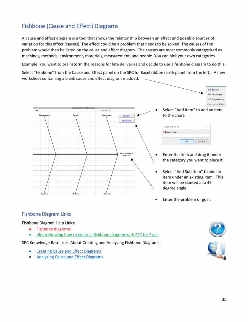
Fishbone (Cause and Effect) Diagrams
A cause and effect diagram is a tool that shows the relationship between an effect and possible sources of
variation for this effect (causes). The effect could be a problem that needs to be solved. The causes of the
problem would then be listed on the cause and effect diagram. The causes are most commonly categorized as
machines, methods, environment, materials, measurement, and people. You can pick your own categories.
Example: You want to brainstorm the reasons for late deliveries and decide to use a fishbone diagram to do this.
Select “Fishbone” from the Cause and Effect panel on the SPC for Excel ribbon (sixth panel from the left). A new
worksheet containing a blank cause and effect diagram is added.
• Select “Add Item” to add an item to the chart.
• Enter the item and drag it under the category you want to place it.
• Select “Add Sub Item” to add an item under an existing item. This item will be slanted at a 45-degree angle.
• Enter the problem or goal.
Fishbone Diagram Links
Fishbone Diagram Help Links:
• Fishbone diagrams
• Video showing how to create a fishbone diagram with SPC for Excel
SPC Knowledge Base Links About Creating and Analyzing Fishbone Diagrams:
• Creating Cause and Effect Diagrams
• Analyzing Cause and Effect Diagrams
36
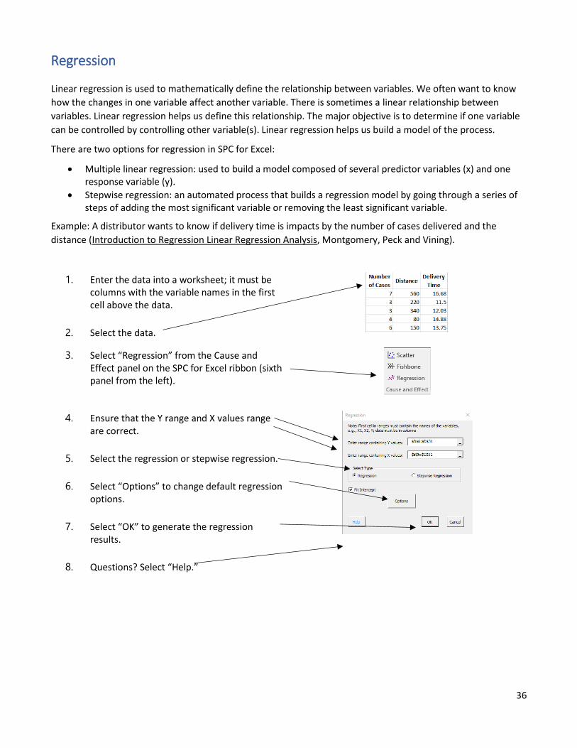
Regression
Linear regression is used to mathematically define the relationship between variables. We often want to know
how the changes in one variable affect another variable. There is sometimes a linear relationship between
variables. Linear regression helps us define this relationship. The major objective is to determine if one variable
can be controlled by controlling other variable(s). Linear regression helps us build a model of the process.
There are two options for regression in SPC for Excel:
• Multiple linear regression: used to build a model composed of several predictor variables (x) and one response variable (y).
• Stepwise regression: an automated process that builds a regression model by going through a series of steps of adding the most significant variable or removing the least significant variable.
Example: A distributor wants to know if delivery time is impacts by the number of cases delivered and the
distance (Introduction to Regression Linear Regression Analysis, Montgomery, Peck and Vining).
1. Enter the data into a worksheet; it must be columns with the variable names in the first cell above the data.
2. Select the data.
3. Select “Regression” from the Cause and Effect panel on the SPC for Excel ribbon (sixth panel from the left).
4. Ensure that the Y range and X values range are correct.
5. Select the regression or stepwise regression.
6. Select “Options” to change default regression options.
7. Select “OK” to generate the regression results.
8. Questions? Select “Help.”
37
Regression Output
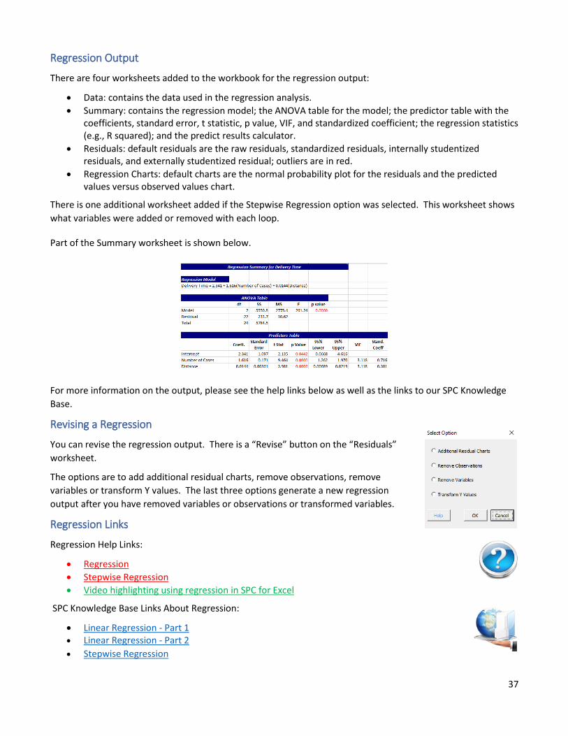
There are four worksheets added to the workbook for the regression output:
• Data: contains the data used in the regression analysis.
• Summary: contains the regression model; the ANOVA table for the model; the predictor table with the coefficients, standard error, t statistic, p value, VIF, and standardized coefficient; the regression statistics (e.g., R squared); and the predict results calculator.
• Residuals: default residuals are the raw residuals, standardized residuals, internally studentized residuals, and externally studentized residual; outliers are in red.
• Regression Charts: default charts are the normal probability plot for the residuals and the predicted values versus observed values chart.
There is one additional worksheet added if the Stepwise Regression option was selected. This worksheet shows
what variables were added or removed with each loop.
Part of the Summary worksheet is shown below.
For more information on the output, please see the help links below as well as the links to our SPC Knowledge
Base.
Revising a Regression
You can revise the regression output. There is a “Revise” button on the “Residuals”
worksheet.
The options are to add additional residual charts, remove observations, remove
variables or transform Y values. The last three options generate a new regression
output after you have removed variables or observations or transformed variables.
Regression Links
Regression Help Links:
• Regression
• Stepwise Regression
• Video highlighting using regression in SPC for Excel
SPC Knowledge Base Links About Regression:
• Linear Regression - Part 1 • Linear Regression - Part 2
• Stepwise Regression
38
Measurement Systems Analysis/Gage R&R
Measurement systems analysis is used to find out how “capable” a measurement system is. Is it capable enough
to tell the difference between parts/samples if the measurement system is being used for SPC or for process
control? Is it capable enough to tell if a part/sample is within specification or out of specification?
The SPC for Excel software has numerous measurement systems related techniques. The software features the
Evaluating the Measurement Process (EMP) techniques developed by Dr. Donald Wheeler. The EMP techniques
include the following:
• Consistency Study: the major use is to determine if the measurement system is consistent (in statistical control) and determine the measurement system variability.
• Short EMP Study: major use is to determine the measurement system variability and how that compares to the variation in the process.
• Basic EMP Study: major used is to analyze a crossed Gage R&R study where each operator runs multiple parts multiple times.
The SPC for Excel software also includes the other measurement systems analysis techniques:
• Crossed – ANOVA: crossed Gage R&R study analyzed using the ANOVA method.
• Crossed – Average/Range Method: crossed Gage R&R study analyzed using AIAG method.
• Nested – ANOVA: nested Gage R&R study analyzed using the ANOVA method.
• Type 1 Gage Study
• Attribute: crossed Gage R&R study but part is pass/fail.
• Gage Linearity and Bias Study: design where results are compared to a standard and where a check is made to see if there are problems with linearity in the measurement results.
Note: This guide focuses on how to setup a Gage R&R. There are extensive articles in the SPC Knowledge Base
to help you in setting up a Gage R&R study, running the Gage R&R, and interpreting the results.
Setting Up a Basic EMP Study
Example: You want to determine how capable one of your test methods is. You select 5 parts at random from
your process. You have three operators. Each operator will test each part three times.
To run a Gage R&R study, you have to setup a template first based on the number of operators, parts, and trials.
Once the results are entered into the template, the analysis can be run.
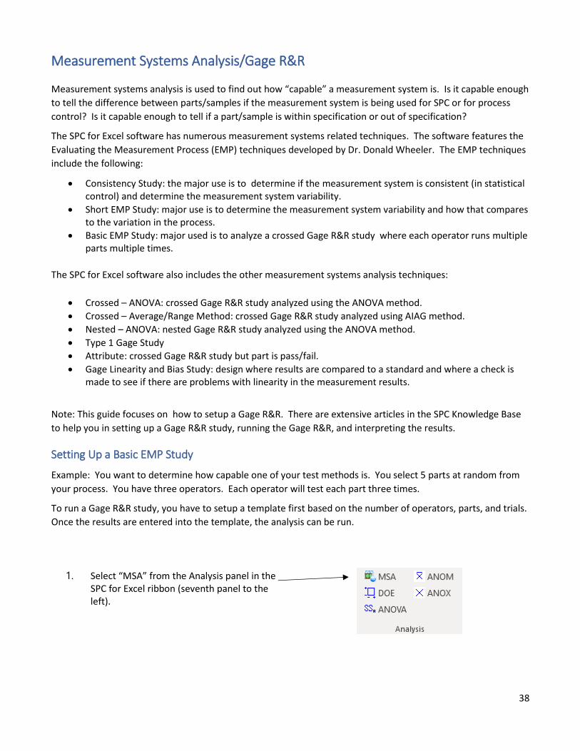
1. Select “MSA” from the Analysis panel in the SPC for Excel ribbon (seventh panel to the left).
39
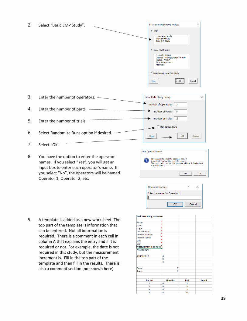
2. Select “Basic EMP Study”.
3. Enter the number of operators.
4. Enter the number of parts.
5. Enter the number of trials.
6. Select Randomize Runs option if desired.
7. Select “OK”
8. You have the option to enter the operator names. If you select “Yes”, you will get an input box to enter each operator’s name. If you select “No”, the operators will be named Operator 1, Operator 2, etc.
9. A template is added as a new worksheet. The top part of the template is information that can be entered. Not all information is required. There is a comment in each cell in column A that explains the entry and if it is required or not. For example, the date is not required in this study, but the measurement increment is. Fill in the top part of the template and then fill in the results. There is also a comment section (not shown here)
40
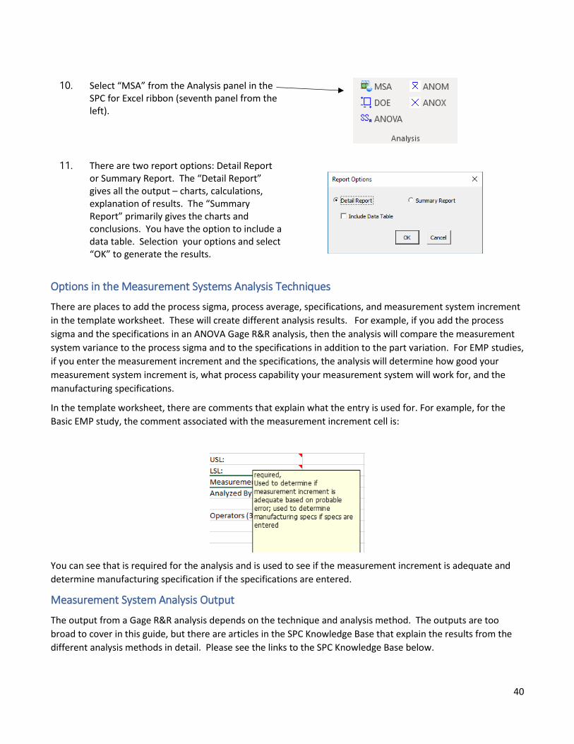
10. Select “MSA” from the Analysis panel in the SPC for Excel ribbon (seventh panel from the left).
11. There are two report options: Detail Report or Summary Report. The “Detail Report” gives all the output – charts, calculations, explanation of results. The “Summary Report” primarily gives the charts and conclusions. You have the option to include a data table. Selection your options and select “OK” to generate the results.
Options in the Measurement Systems Analysis Techniques
There are places to add the process sigma, process average, specifications, and measurement system increment
in the template worksheet. These will create different analysis results. For example, if you add the process
sigma and the specifications in an ANOVA Gage R&R analysis, then the analysis will compare the measurement
system variance to the process sigma and to the specifications in addition to the part variation. For EMP studies,
if you enter the measurement increment and the specifications, the analysis will determine how good your
measurement system increment is, what process capability your measurement system will work for, and the
manufacturing specifications.
In the template worksheet, there are comments that explain what the entry is used for. For example, for the
Basic EMP study, the comment associated with the measurement increment cell is:
You can see that is required for the analysis and is used to see if the measurement increment is adequate and
determine manufacturing specification if the specifications are entered.
Measurement System Analysis Output
The output from a Gage R&R analysis depends on the technique and analysis method. The outputs are too
broad to cover in this guide, but there are articles in the SPC Knowledge Base that explain the results from the
different analysis methods in detail. Please see the links to the SPC Knowledge Base below.
41
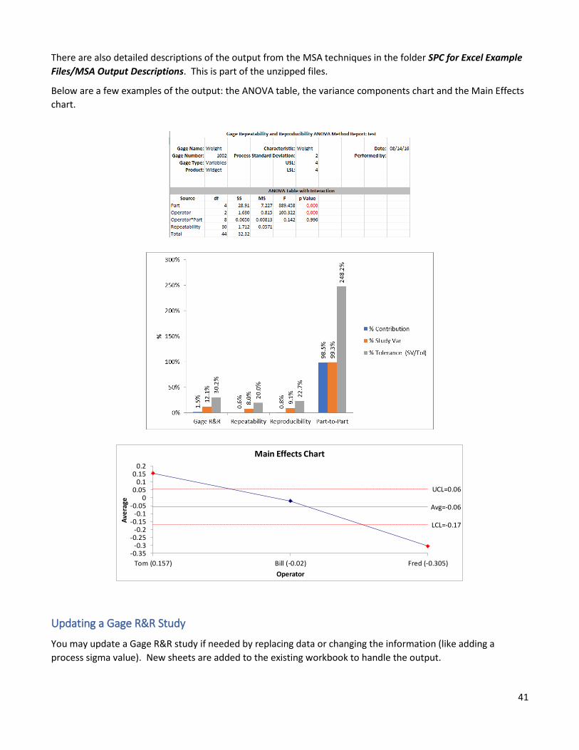
There are also detailed descriptions of the output from the MSA techniques in the folder SPC for Excel Example
Files/MSA Output Descriptions. This is part of the unzipped files.
Below are a few examples of the output: the ANOVA table, the variance components chart and the Main Effects
chart.
Updating a Gage R&R Study
You may update a Gage R&R study if needed by replacing data or changing the information (like adding a
process sigma value). New sheets are added to the existing workbook to handle the output.
Avg=-0.06
UCL=0.06
LCL=-0.17
-0.35-0.3
-0.25-0.2
-0.15-0.1
-0.050
0.050.1
0.150.2
Tom (0.157) Bill (-0.02) Fred (-0.305)
Ave
rage
Operator
Main Effects Chart
42
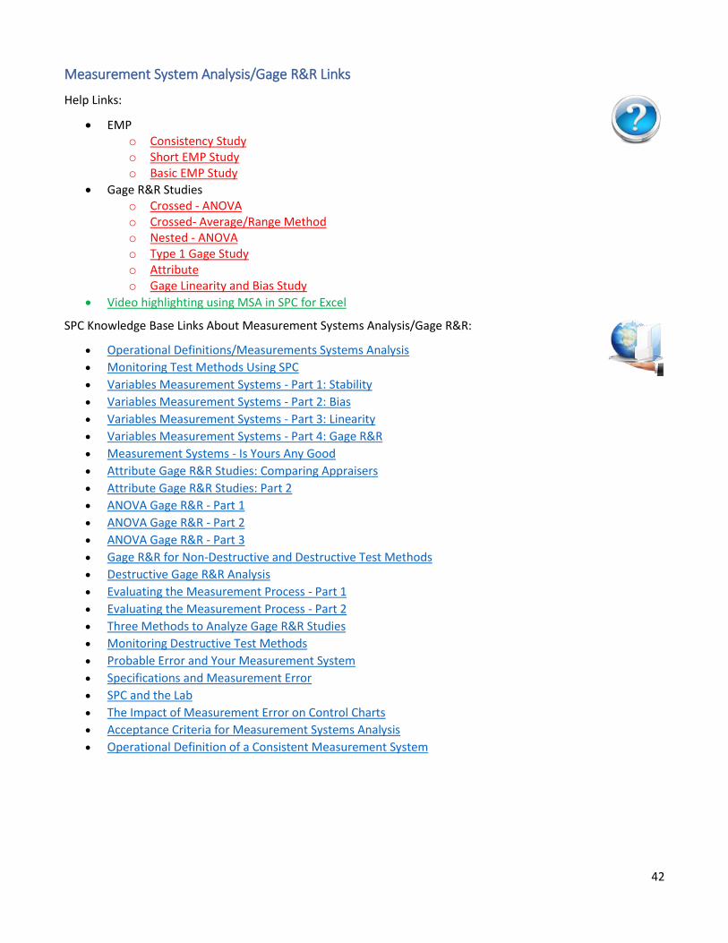
Measurement System Analysis/Gage R&R Links
Help Links:
• EMP o Consistency Study o Short EMP Study o Basic EMP Study
• Gage R&R Studies o Crossed - ANOVA o Crossed- Average/Range Method o Nested - ANOVA o Type 1 Gage Study o Attribute o Gage Linearity and Bias Study
• Video highlighting using MSA in SPC for Excel
SPC Knowledge Base Links About Measurement Systems Analysis/Gage R&R:
• Operational Definitions/Measurements Systems Analysis
• Monitoring Test Methods Using SPC
• Variables Measurement Systems - Part 1: Stability
• Variables Measurement Systems - Part 2: Bias
• Variables Measurement Systems - Part 3: Linearity
• Variables Measurement Systems - Part 4: Gage R&R
• Measurement Systems - Is Yours Any Good
• Attribute Gage R&R Studies: Comparing Appraisers
• Attribute Gage R&R Studies: Part 2
• ANOVA Gage R&R - Part 1
• ANOVA Gage R&R - Part 2
• ANOVA Gage R&R - Part 3
• Gage R&R for Non-Destructive and Destructive Test Methods
• Destructive Gage R&R Analysis
• Evaluating the Measurement Process - Part 1
• Evaluating the Measurement Process - Part 2
• Three Methods to Analyze Gage R&R Studies
• Monitoring Destructive Test Methods
• Probable Error and Your Measurement System
• Specifications and Measurement Error
• SPC and the Lab
• The Impact of Measurement Error on Control Charts
• Acceptance Criteria for Measurement Systems Analysis
• Operational Definition of a Consistent Measurement System
43
Design of Experiments (DOE)
Experimental design techniques help you determine what factors significantly impact a response variable and by
how much. The SPC for Excel software contains the following two-level designs:
• Full factorial designs (up to 7 factors).
• Fractional factorial designs (29 designs to choose from for up to 15 factors).
• Plackett-Burman designs (up to 27 factors).
The first step in running a DOE using the software is to select the design you want to use. You enter the
response variable names as well as the factor names and their respective levels. The software then generates a
template with the experimental runs listed. You enter the results of the experimental runs into the template
and then run the software to analyze the results.
Two Level Full Factorial Design
Example: Three factors are thought to impact a nitride etch process on a single-wafer plasma etching tool
(Montgomery, D.C., Design and Analysis of Experiments, 6th Edition, John Wiley & Sons, 2005). The three
design factors (with their low and high levels) are:
• Gap between the electrodes in centimeters (0.8, 1.2)
• C2F6 gas flow in SCCM (125, 200)
• RF power applied to the cathode in watts (275, 325)
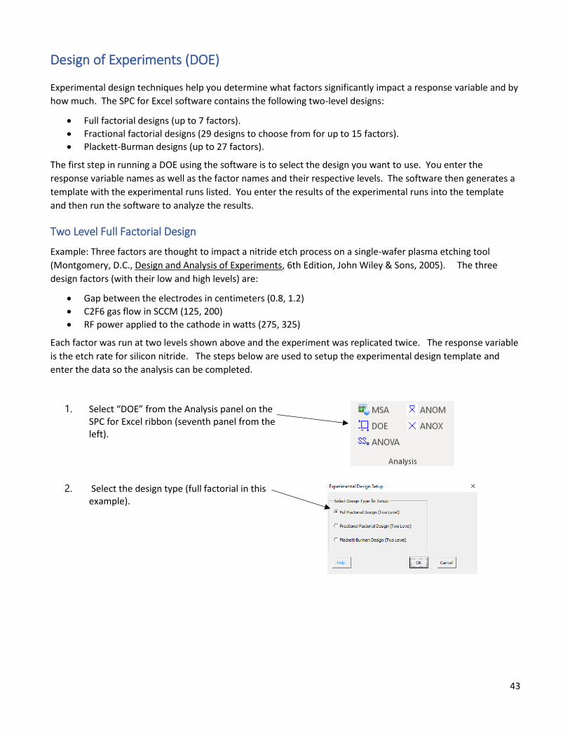
Each factor was run at two levels shown above and the experiment was replicated twice. The response variable
is the etch rate for silicon nitride. The steps below are used to setup the experimental design template and
enter the data so the analysis can be completed.
1. Select “DOE” from the Analysis panel on the SPC for Excel ribbon (seventh panel from the left).
2. Select the design type (full factorial in this example).
44
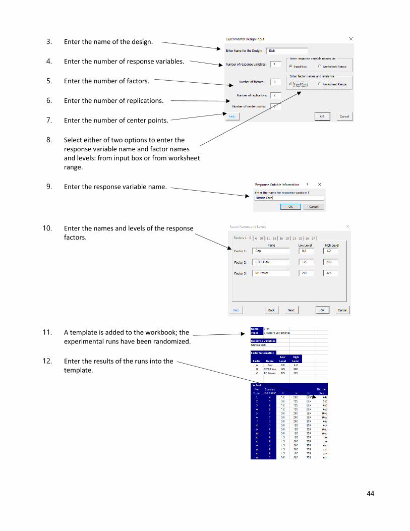
3. Enter the name of the design.
4. Enter the number of response variables.
5. Enter the number of factors.
6. Enter the number of replications.
7. Enter the number of center points.
8. Select either of two options to enter the response variable name and factor names and levels: from input box or from worksheet range.
9. Enter the response variable name.
10. Enter the names and levels of the response factors.
11. A template is added to the workbook; the experimental runs have been randomized.
12. Enter the results of the runs into the template.
45
13. Select “DOE” from the Analysis panel in the SPC for Excel ribbon (seventh panel from the left).
14. Select options in the analysis.
15. Select “OK” to generate the DOE results in a new workbook.
16. Questions? Select “Help.”
DOE Output
The output from the DOE is contained in a new workbook. The following sheets are included (with a few
examples):
• All Factors Analysis Worksheet
• Design table analyzed using Yates’ Algorithm
• Range chart results if replications were run
• ANOVA table based on all factors and interactions
• ANOVA for the model (containing all the factors)
• Average, standard deviation, coefficient of variation, R2, adjusted R2, PRESS and R2 prediction
• Factor information include coefficient, degrees of freedom, standard error, and 95% confidence limits
• Model containing all factors based on coded and actual levels
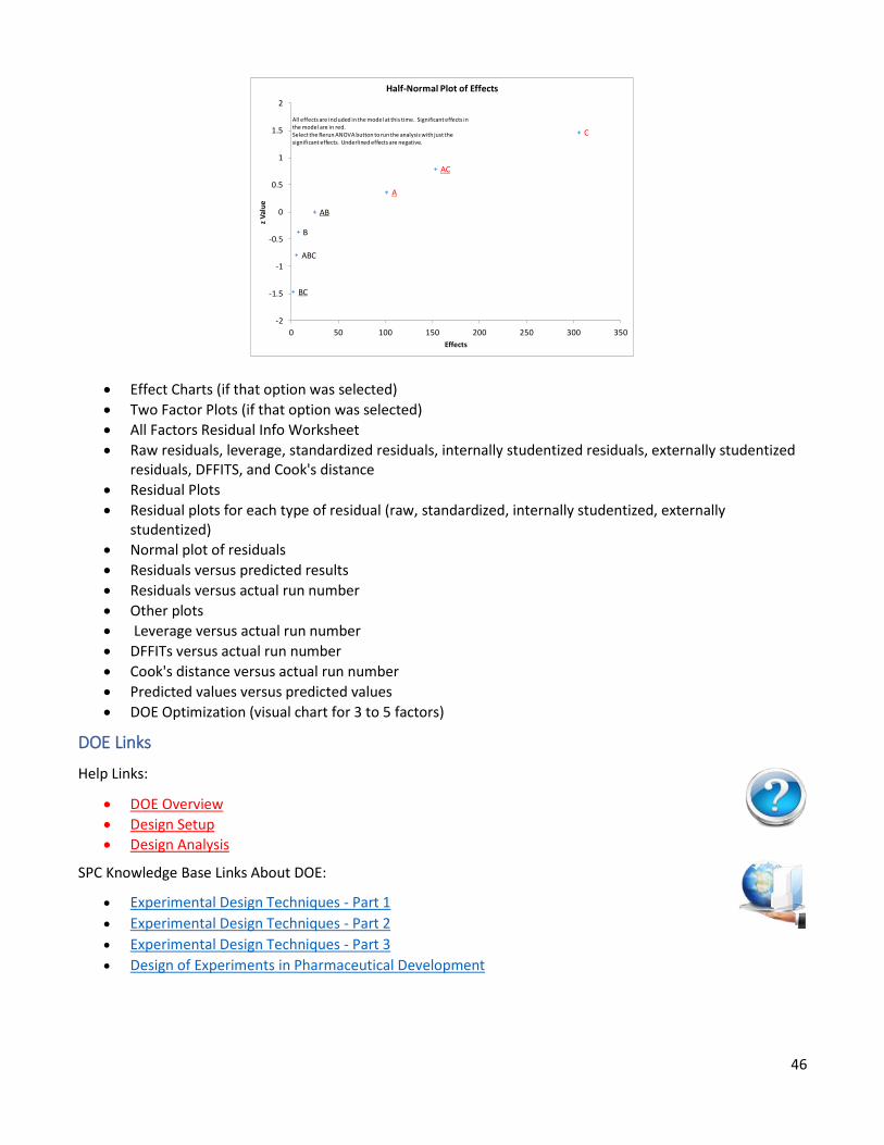
• Normal Plot of Effects
• Half-Normal Plot of Effects (used to select factors to keep in the model and to rerun the analysis with a smaller set of factors)
46
• Effect Charts (if that option was selected)
• Two Factor Plots (if that option was selected)
• All Factors Residual Info Worksheet
• Raw residuals, leverage, standardized residuals, internally studentized residuals, externally studentized residuals, DFFITS, and Cook's distance
• Residual Plots
• Residual plots for each type of residual (raw, standardized, internally studentized, externally studentized)
• Normal plot of residuals
• Residuals versus predicted results
• Residuals versus actual run number
• Other plots
• Leverage versus actual run number
• DFFITs versus actual run number
• Cook's distance versus actual run number
• Predicted values versus predicted values
• DOE Optimization (visual chart for 3 to 5 factors)
DOE Links
Help Links:
• DOE Overview
• Design Setup
• Design Analysis
SPC Knowledge Base Links About DOE:
• Experimental Design Techniques - Part 1
• Experimental Design Techniques - Part 2
• Experimental Design Techniques - Part 3
• Design of Experiments in Pharmaceutical Development
BC
ABC
B
AB
A
AC
C
-2
-1.5
-1
-0.5
0
0.5
1
1.5
2
0 50 100 150 200 250 300 350
z V
alu
e
Effects
Half-Normal Plot of Effects
All effects are included in the model at this time. Significant effects in the model are in red.Select the Rerun ANOVA button to run the analysis with just the significant effects. Underlined effects are negative.
47
Analysis of Variance (ANOVA)
Analysis of Variance (ANOVA ) is used to determine which factors have a significant effect on a response
variable. The program has the following options:
• 1 to 5 factors
• Random and/or fixed factors
• Crossed, nested or mixed designs
To run an ANOVA, you first determine the response variable as well as what factors to include in the ANOVA and
their levels. That information is used by the software to create a template. The names and levels must be
entered into a worksheet before you start. You enter the results from the experimental runs and the software
uses ANOVA to analyze the results.
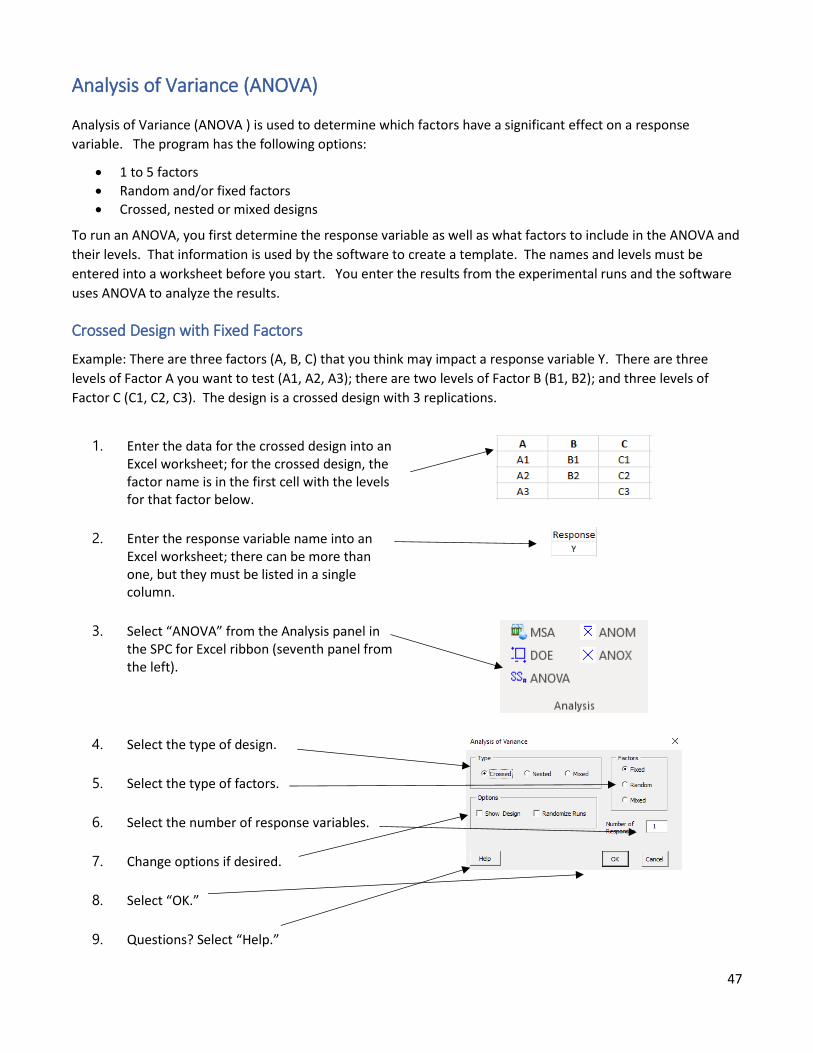
Crossed Design with Fixed Factors
Example: There are three factors (A, B, C) that you think may impact a response variable Y. There are three
levels of Factor A you want to test (A1, A2, A3); there are two levels of Factor B (B1, B2); and three levels of
Factor C (C1, C2, C3). The design is a crossed design with 3 replications.
1. Enter the data for the crossed design into an Excel worksheet; for the crossed design, the factor name is in the first cell with the levels for that factor below.
2. Enter the response variable name into an Excel worksheet; there can be more than one, but they must be listed in a single column.
3. Select “ANOVA” from the Analysis panel in the SPC for Excel ribbon (seventh panel from the left).
4. Select the type of design.
5. Select the type of factors.
6. Select the number of response variables.
7. Change options if desired.
8. Select “OK.”
9. Questions? Select “Help.”
48
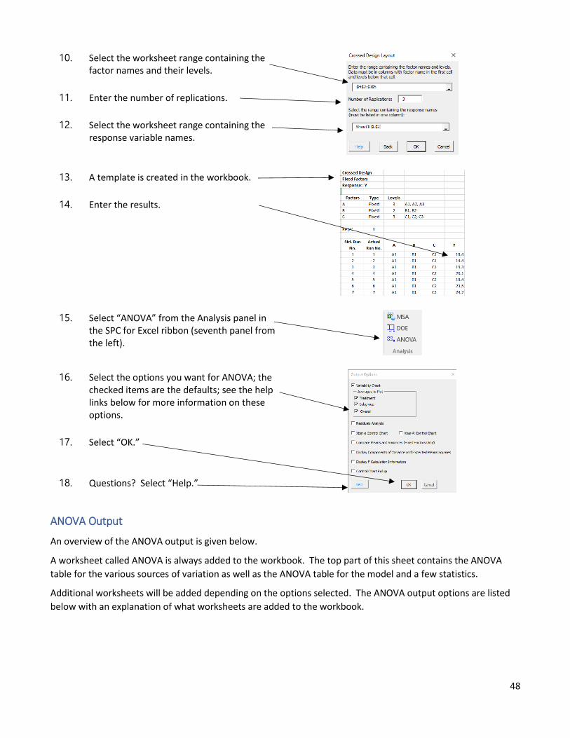
10. Select the worksheet range containing the factor names and their levels.
11. Enter the number of replications.
12. Select the worksheet range containing the response variable names.
13. A template is created in the workbook.
14. Enter the results.
15. Select “ANOVA” from the Analysis panel in the SPC for Excel ribbon (seventh panel from the left).
16. Select the options you want for ANOVA; the checked items are the defaults; see the help links below for more information on these options.
17. Select “OK.”
18. Questions? Select “Help.”
ANOVA Output
An overview of the ANOVA output is given below.
A worksheet called ANOVA is always added to the workbook. The top part of this sheet contains the ANOVA
table for the various sources of variation as well as the ANOVA table for the model and a few statistics.
Additional worksheets will be added depending on the options selected. The ANOVA output options are listed
below with an explanation of what worksheets are added to the workbook.
49
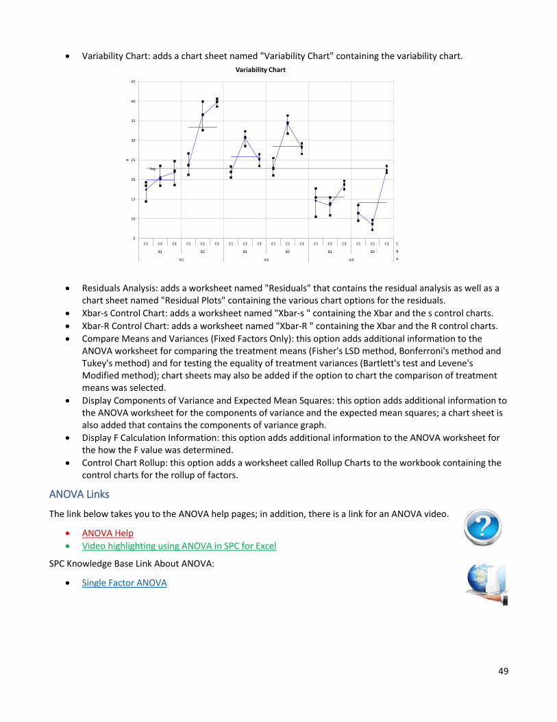
• Variability Chart: adds a chart sheet named "Variability Chart" containing the variability chart.
• Residuals Analysis: adds a worksheet named "Residuals" that contains the residual analysis as well as a chart sheet named "Residual Plots" containing the various chart options for the residuals.
• Xbar-s Control Chart: adds a worksheet named "Xbar-s " containing the Xbar and the s control charts.
• Xbar-R Control Chart: adds a worksheet named "Xbar-R " containing the Xbar and the R control charts.
• Compare Means and Variances (Fixed Factors Only): this option adds additional information to the ANOVA worksheet for comparing the treatment means (Fisher's LSD method, Bonferroni's method and Tukey's method) and for testing the equality of treatment variances (Bartlett's test and Levene's Modified method); chart sheets may also be added if the option to chart the comparison of treatment means was selected.
• Display Components of Variance and Expected Mean Squares: this option adds additional information to the ANOVA worksheet for the components of variance and the expected mean squares; a chart sheet is also added that contains the components of variance graph.
• Display F Calculation Information: this option adds additional information to the ANOVA worksheet for the how the F value was determined.
• Control Chart Rollup: this option adds a worksheet called Rollup Charts to the workbook containing the control charts for the rollup of factors.
ANOVA Links
The link below takes you to the ANOVA help pages; in addition, there is a link for an ANOVA video.
• ANOVA Help
• Video highlighting using ANOVA in SPC for Excel
SPC Knowledge Base Link About ANOVA:
• Single Factor ANOVA
Avg
5
10
15
20
25
30
35
40
45
C1 C2 C3 C1 C2 C3 C1 C2 C3 C1 C2 C3 C1 C2 C3 C1 C2 C3
B1 B2 B1 B2 B1 B2
A1 A2 A3
Y
Variability Chart
C
B
A
50
ANOM (Analysis of Means)
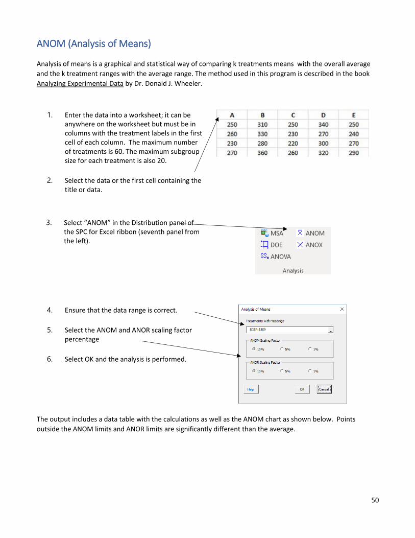
Analysis of means is a graphical and statistical way of comparing k treatments means with the overall average
and the k treatment ranges with the average range. The method used in this program is described in the book
Analyzing Experimental Data by Dr. Donald J. Wheeler.
1. Enter the data into a worksheet; it can be anywhere on the worksheet but must be in columns with the treatment labels in the first cell of each column. The maximum number of treatments is 60. The maximum subgroup size for each treatment is also 20.
2. Select the data or the first cell containing the title or data.
3. Select “ANOM” in the Distribution panel of the SPC for Excel ribbon (seventh panel from the left).
4. Ensure that the data range is correct.
5. Select the ANOM and ANOR scaling factor percentage
6. Select OK and the analysis is performed.
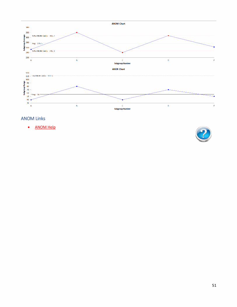
The output includes a data table with the calculations as well as the ANOM chart as shown below. Points
outside the ANOM limits and ANOR limits are significantly different than the average.
51
ANOM Links
• ANOM Help
52
ANOX (Analysis of Individual Values)
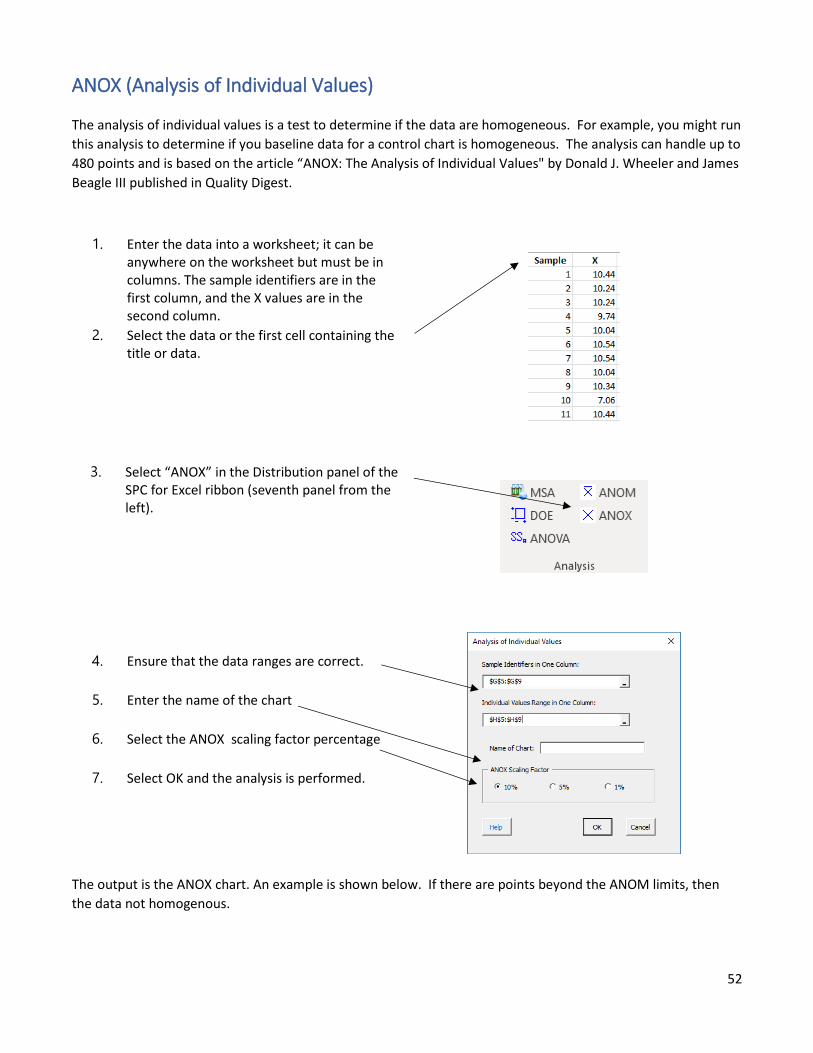
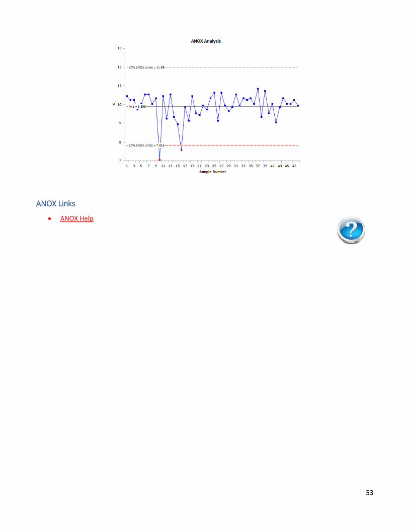
The analysis of individual values is a test to determine if the data are homogeneous. For example, you might run
this analysis to determine if you baseline data for a control chart is homogeneous. The analysis can handle up to
480 points and is based on the article “ANOX: The Analysis of Individual Values" by Donald J. Wheeler and James
Beagle III published in Quality Digest.
1. Enter the data into a worksheet; it can be anywhere on the worksheet but must be in columns. The sample identifiers are in the first column, and the X values are in the second column.
2. Select the data or the first cell containing the title or data.
3. Select “ANOX” in the Distribution panel of the SPC for Excel ribbon (seventh panel from the left).
4. Ensure that the data ranges are correct.
5. Enter the name of the chart
6. Select the ANOX scaling factor percentage
7. Select OK and the analysis is performed.
The output is the ANOX chart. An example is shown below. If there are points beyond the ANOM limits, then
the data not homogenous.
53
ANOX Links
• ANOX Help
54
Normal Probability Plot
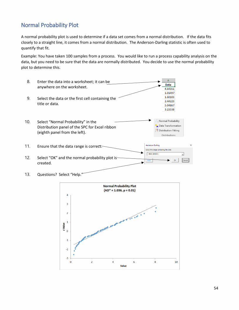
A normal probability plot is used to determine if a data set comes from a normal distribution. If the data fits
closely to a straight line, it comes from a normal distribution. The Anderson-Darling statistic is often used to
quantify that fit.
Example: You have taken 100 samples from a process. You would like to run a process capability analysis on the
data, but you need to be sure that the data are normally distributed. You decide to use the normal probability
plot to determine this.
8. Enter the data into a worksheet; it can be anywhere on the worksheet.
9. Select the data or the first cell containing the title or data.
10. Select “Normal Probability” in the Distribution panel of the SPC for Excel ribbon (eighth panel from the left).
11. Ensure that the data range is correct.
12. Select “OK” and the normal probability plot is created.
13. Questions? Select “Help.”

55
If the data are normally distributed, the points should lie along the sold straight line. The points in the chart
above do not do that. AD* is the Anderson-Darling statistic. “p” is the p-value associated with the statistic. If
the p-value is less than 0.05, then you can conclude the data are not normally distributed. If it is larger than 0.20
you can conclude that the data are normally distributed. If it is between 0.05 and 0.20, you probably need more
data – although some will say since it is greater than 0.05, the data are normally distributed.
Normal Probability Plot Links
Help Link:
• Normal Probability Plot
SPC Knowledge Base Links About Normal Probability Plots:
• Normal Probability Plots
• Anderson-Darling Test for Normality
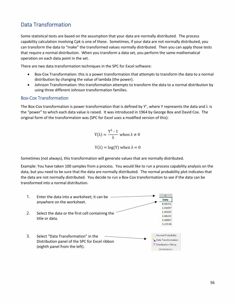
56
Data Transformation
Some statistical tests are based on the assumption that your data are normally distributed. The process
capability calculation involving Cpk is one of these. Sometimes, if your data are not normally distributed, you
can transform the data to “make” the transformed values normally distributed. Then you can apply those tests
that require a normal distribution. When you transform a data set, you perform the same mathematical
operation on each data point in the set.
There are two data transformation techniques in the SPC for Excel software:
• Box-Cox Transformation: this is a power transformation that attempts to transform the data to a normal distribution by changing the value of lambda (the power).
• Johnson Transformation: this transformation attempts to transform the data to a normal distribution by using three different Johnson transformation families.
Box-Cox Transformation
The Box-Cox transformation is power transformation that is defined by Y, where Y represents the data and is
the “power” to which each data value is raised. It was introduced in 1964 by George Box and David Cox. The
original form of the transformation was (SPC for Excel uses a modified version of this):
Y(λ) = Yλ - 1
λ when λ ≠ 0
Y(λ) = log(Y) when λ = 0
Sometimes (not always), this transformation will generate values that are normally distributed.
Example: You have taken 100 samples from a process. You would like to run a process capability analysis on the
data, but you need to be sure that the data are normally distributed. The normal probability plot indicates that
the data are not normally distributed. You decide to run a Box-Cox transformation to see if the data can be
transformed into a normal distribution.
1. Enter the data into a worksheet; it can be anywhere on the worksheet.
2. Select the data or the first cell containing the title or data.
3. Select “Data Transformation” in the Distribution panel of the SPC for Excel ribbon (eighth panel from the left).
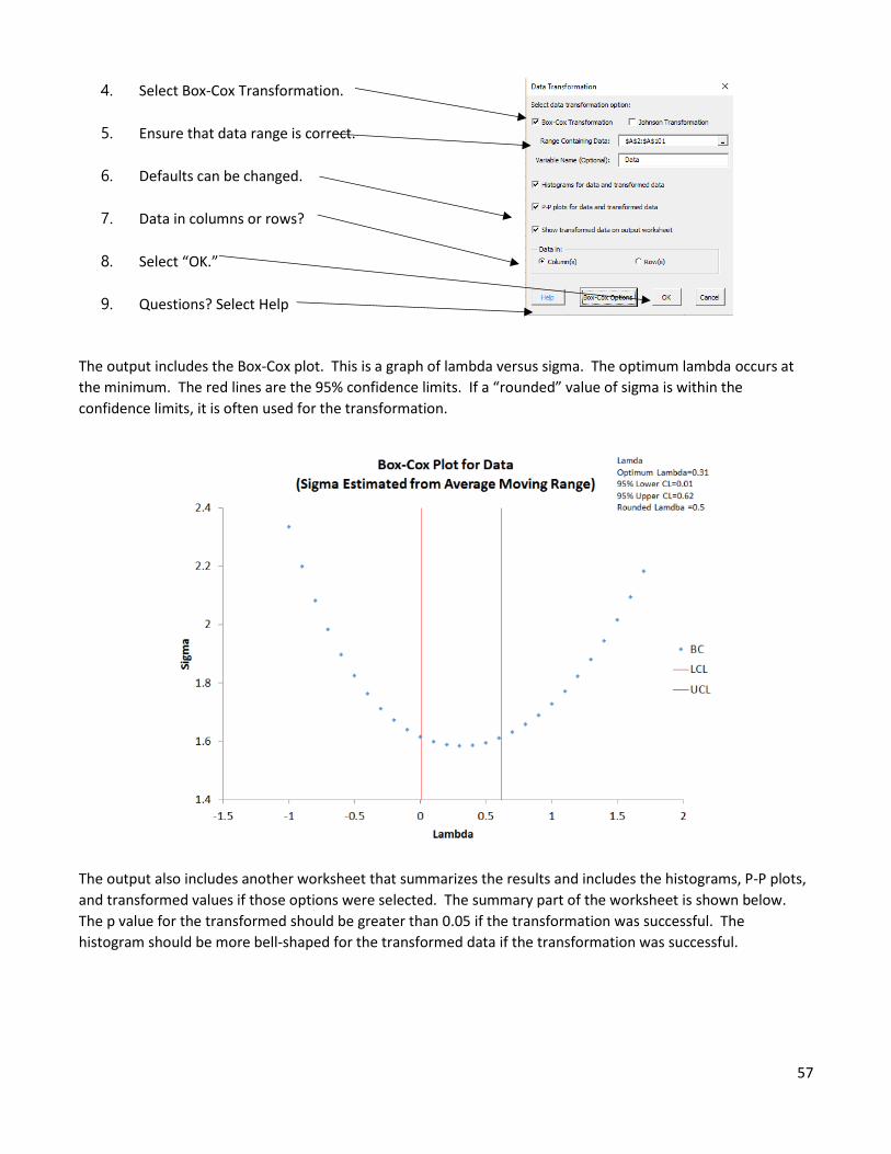
57
4. Select Box-Cox Transformation.
5. Ensure that data range is correct.
6. Defaults can be changed.
7. Data in columns or rows?
8. Select “OK.”
9. Questions? Select Help
The output includes the Box-Cox plot. This is a graph of lambda versus sigma. The optimum lambda occurs at
the minimum. The red lines are the 95% confidence limits. If a “rounded” value of sigma is within the
confidence limits, it is often used for the transformation.
The output also includes another worksheet that summarizes the results and includes the histograms, P-P plots,
and transformed values if those options were selected. The summary part of the worksheet is shown below.
The p value for the transformed should be greater than 0.05 if the transformation was successful. The
histogram should be more bell-shaped for the transformed data if the transformation was successful.
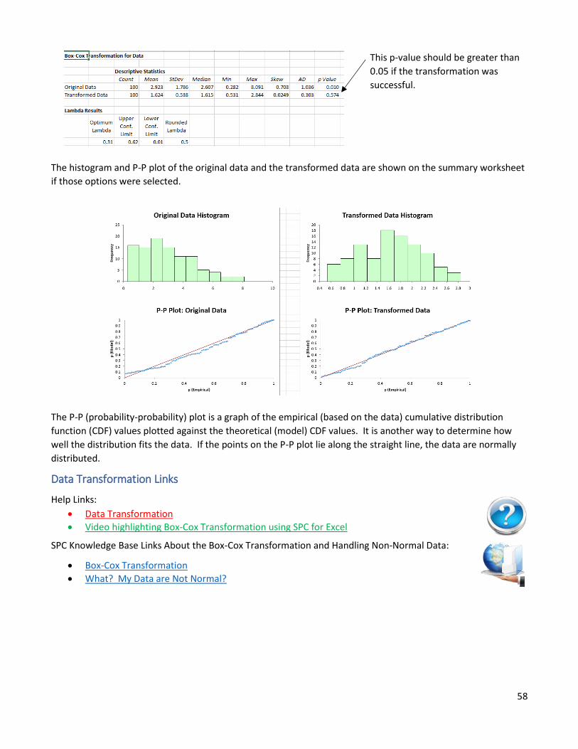
58
This p-value should be greater than
0.05 if the transformation was
successful.
The histogram and P-P plot of the original data and the transformed data are shown on the summary worksheet
if those options were selected.
The P-P (probability-probability) plot is a graph of the empirical (based on the data) cumulative distribution
function (CDF) values plotted against the theoretical (model) CDF values. It is another way to determine how
well the distribution fits the data. If the points on the P-P plot lie along the straight line, the data are normally
distributed.
Data Transformation Links
Help Links:
• Data Transformation
• Video highlighting Box-Cox Transformation using SPC for Excel
SPC Knowledge Base Links About the Box-Cox Transformation and Handling Non-Normal Data:
• Box-Cox Transformation
• What? My Data are Not Normal?
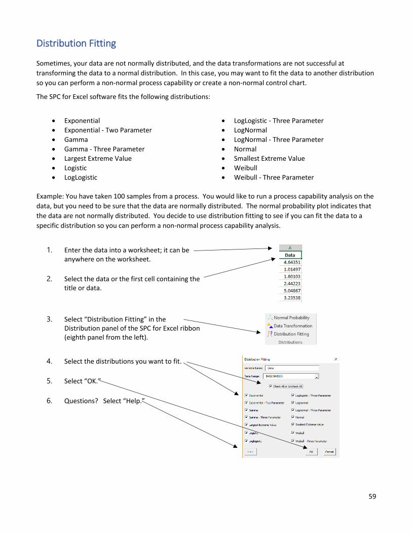
59
Distribution Fitting
Sometimes, your data are not normally distributed, and the data transformations are not successful at
transforming the data to a normal distribution. In this case, you may want to fit the data to another distribution
so you can perform a non-normal process capability or create a non-normal control chart.
The SPC for Excel software fits the following distributions:
• Exponential
• Exponential - Two Parameter
• Gamma
• Gamma - Three Parameter
• Largest Extreme Value
• Logistic
• LogLogistic
• LogLogistic - Three Parameter
• LogNormal
• LogNormal - Three Parameter
• Normal
• Smallest Extreme Value
• Weibull
• Weibull - Three Parameter
Example: You have taken 100 samples from a process. You would like to run a process capability analysis on the
data, but you need to be sure that the data are normally distributed. The normal probability plot indicates that
the data are not normally distributed. You decide to use distribution fitting to see if you can fit the data to a
specific distribution so you can perform a non-normal process capability analysis.
1. Enter the data into a worksheet; it can be anywhere on the worksheet.
2. Select the data or the first cell containing the title or data.
3. Select “Distribution Fitting” in the Distribution panel of the SPC for Excel ribbon (eighth panel from the left).
4. Select the distributions you want to fit.
5. Select “OK.”
6. Questions? Select “Help.”
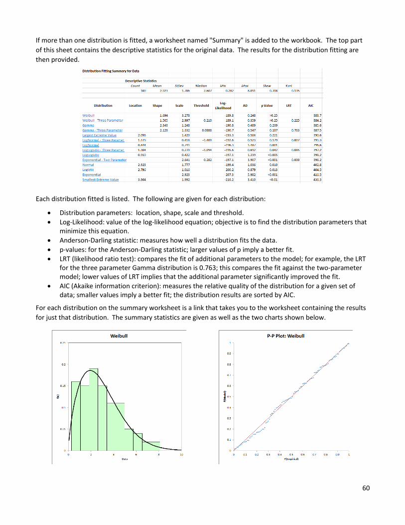
60
If more than one distribution is fitted, a worksheet named "Summary" is added to the workbook. The top part
of this sheet contains the descriptive statistics for the original data. The results for the distribution fitting are
then provided.
Each distribution fitted is listed. The following are given for each distribution:
• Distribution parameters: location, shape, scale and threshold.
• Log-Likelihood: value of the log-likelihood equation; objective is to find the distribution parameters that minimize this equation.
• Anderson-Darling statistic: measures how well a distribution fits the data.
• p-values: for the Anderson-Darling statistic; larger values of p imply a better fit.
• LRT (likelihood ratio test): compares the fit of additional parameters to the model; for example, the LRT for the three parameter Gamma distribution is 0.763; this compares the fit against the two-parameter model; lower values of LRT implies that the additional parameter significantly improved the fit.
• AIC (Akaike information criterion): measures the relative quality of the distribution for a given set of data; smaller values imply a better fit; the distribution results are sorted by AIC.
For each distribution on the summary worksheet is a link that takes you to the worksheet containing the results
for just that distribution. The summary statistics are given as well as the two charts shown below.
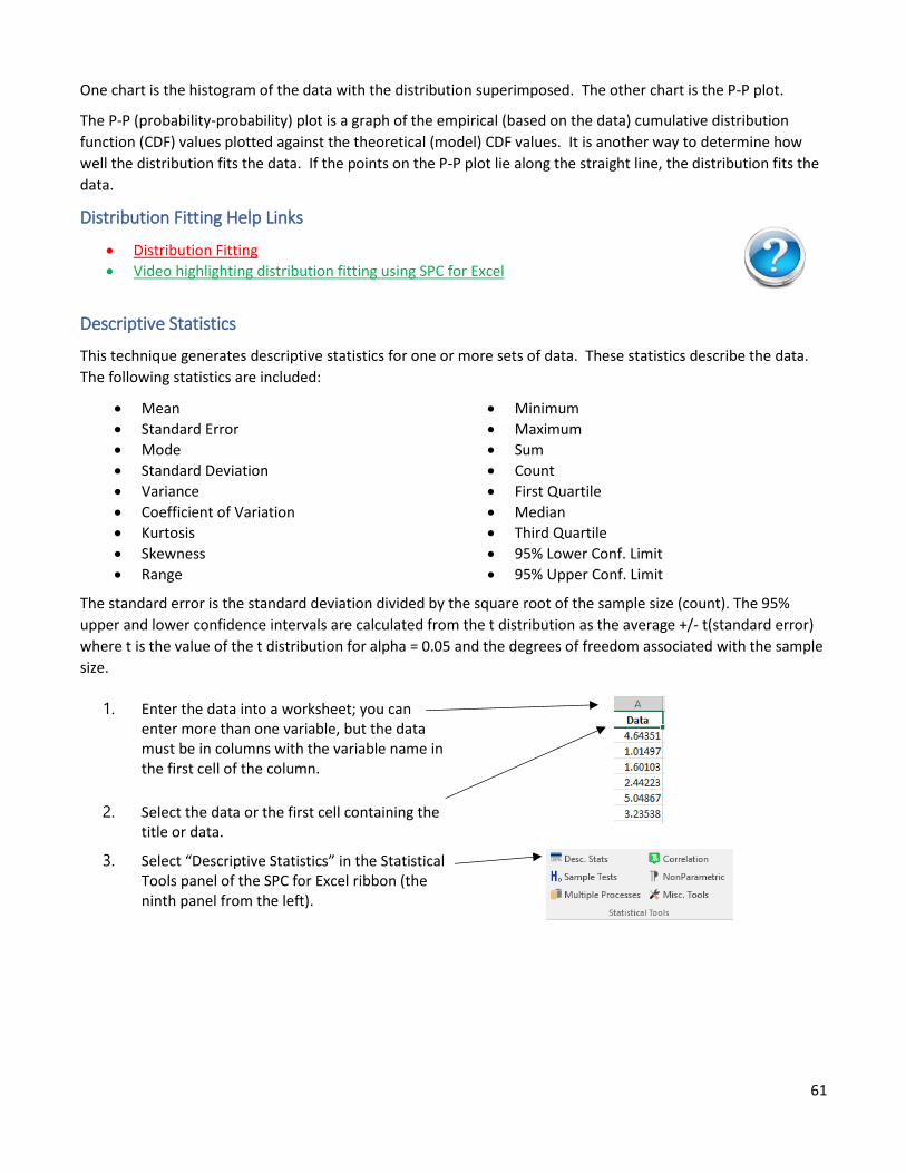
61
One chart is the histogram of the data with the distribution superimposed. The other chart is the P-P plot.
The P-P (probability-probability) plot is a graph of the empirical (based on the data) cumulative distribution
function (CDF) values plotted against the theoretical (model) CDF values. It is another way to determine how
well the distribution fits the data. If the points on the P-P plot lie along the straight line, the distribution fits the
data.
Distribution Fitting Help Links
• Distribution Fitting
• Video highlighting distribution fitting using SPC for Excel
Descriptive Statistics
This technique generates descriptive statistics for one or more sets of data. These statistics describe the data.
The following statistics are included:
• Mean
• Standard Error
• Mode
• Standard Deviation
• Variance
• Coefficient of Variation
• Kurtosis
• Skewness
• Range
• Minimum
• Maximum
• Sum
• Count
• First Quartile
• Median
• Third Quartile
• 95% Lower Conf. Limit
• 95% Upper Conf. Limit
The standard error is the standard deviation divided by the square root of the sample size (count). The 95%
upper and lower confidence intervals are calculated from the t distribution as the average +/- t(standard error)
where t is the value of the t distribution for alpha = 0.05 and the degrees of freedom associated with the sample
size.
1. Enter the data into a worksheet; you can enter more than one variable, but the data must be in columns with the variable name in the first cell of the column.
2. Select the data or the first cell containing the title or data.
3. Select “Descriptive Statistics” in the Statistical Tools panel of the SPC for Excel ribbon (the ninth panel from the left).
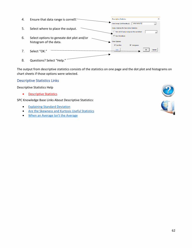
62
4. Ensure that data range is correct.
5. Select where to place the output.
6. Select options to geneate dot plot and/or histogram of the data.
7. Select “OK.”
8. Questions? Select “Help.”
The output from descriptive statistics consists of the statistics on one page and the dot plot and histograms on
chart sheets if those options were selected.
Descriptive Statistics Links
Descriptive Statistics Help
• Descriptive Statistics
SPC Knowledge Base Links About Descriptive Statistics:
• Explaining Standard Deviation
• Are the Skewness and Kurtosis Useful Statistics
• When an Average Isn't the Average
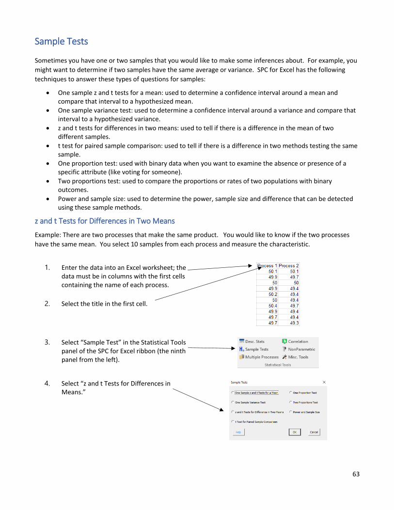
63
Sample Tests
Sometimes you have one or two samples that you would like to make some inferences about. For example, you
might want to determine if two samples have the same average or variance. SPC for Excel has the following
techniques to answer these types of questions for samples:
• One sample z and t tests for a mean: used to determine a confidence interval around a mean and compare that interval to a hypothesized mean.
• One sample variance test: used to determine a confidence interval around a variance and compare that interval to a hypothesized variance.
• z and t tests for differences in two means: used to tell if there is a difference in the mean of two different samples.
• t test for paired sample comparison: used to tell if there is a difference in two methods testing the same sample.
• One proportion test: used with binary data when you want to examine the absence or presence of a specific attribute (like voting for someone).
• Two proportions test: used to compare the proportions or rates of two populations with binary outcomes.
• Power and sample size: used to determine the power, sample size and difference that can be detected using these sample methods.
z and t Tests for Differences in Two Means
Example: There are two processes that make the same product. You would like to know if the two processes
have the same mean. You select 10 samples from each process and measure the characteristic.
1. Enter the data into an Excel worksheet; the data must be in columns with the first cells containing the name of each process.
2. Select the title in the first cell.
3. Select “Sample Test” in the Statistical Tools panel of the SPC for Excel ribbon (the ninth panel from the left).
4. Select “z and t Tests for Differences in Means.”
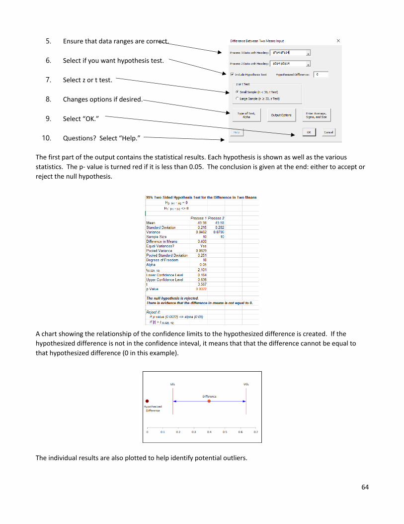
64
5. Ensure that data ranges are correct.
6. Select if you want hypothesis test.
7. Select z or t test.
8. Changes options if desired.
9. Select “OK.”
10. Questions? Select “Help.”
The first part of the output contains the statistical results. Each hypothesis is shown as well as the various
statistics. The p- value is turned red if it is less than 0.05. The conclusion is given at the end: either to accept or
reject the null hypothesis.
A chart showing the relationship of the confidence limits to the hypothesized difference is created. If the
hypothesized difference is not in the confidence inteval, it means that that the difference cannot be equal to
that hypothesized difference (0 in this example).
The individual results are also plotted to help identify potential outliers.
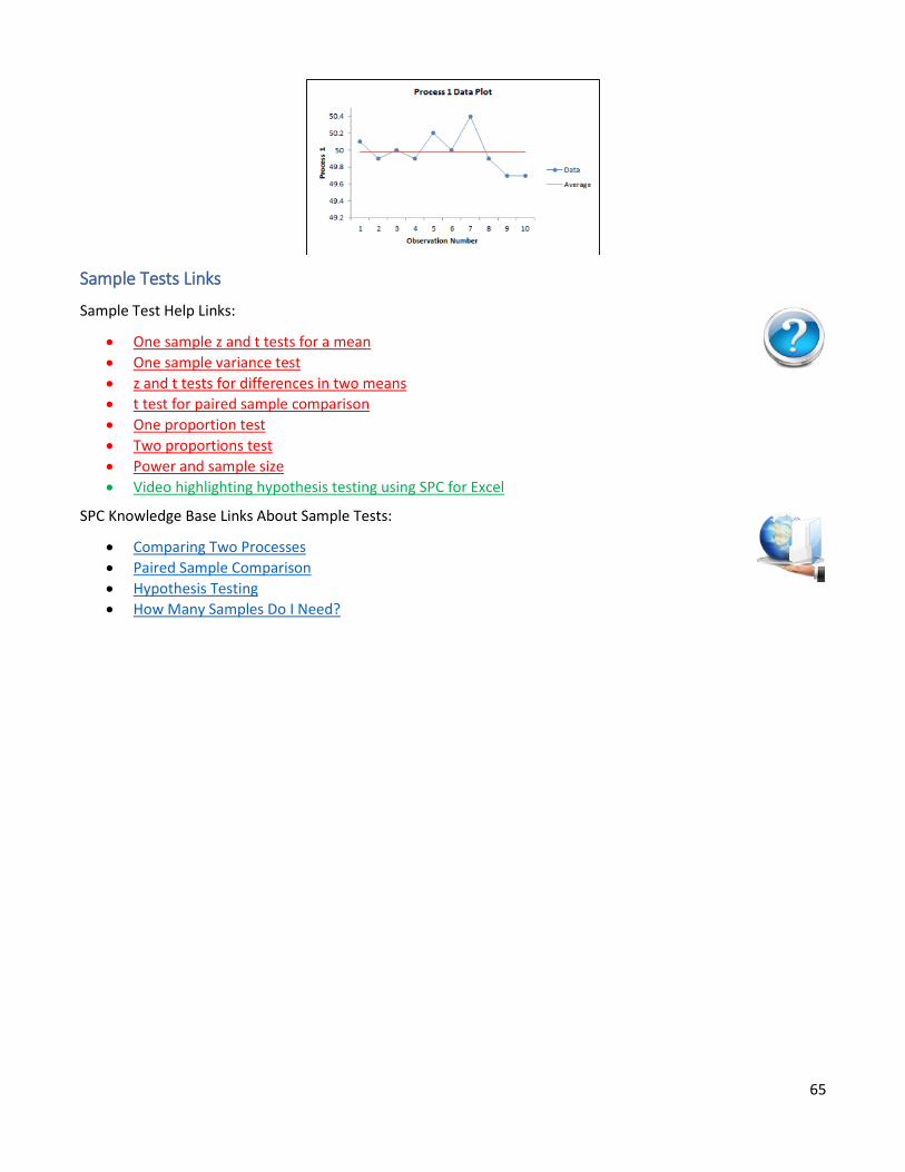
65
Sample Tests Links
Sample Test Help Links:
• One sample z and t tests for a mean
• One sample variance test
• z and t tests for differences in two means
• t test for paired sample comparison
• One proportion test
• Two proportions test
• Power and sample size
• Video highlighting hypothesis testing using SPC for Excel
SPC Knowledge Base Links About Sample Tests:
• Comparing Two Processes
• Paired Sample Comparison
• Hypothesis Testing
• How Many Samples Do I Need?
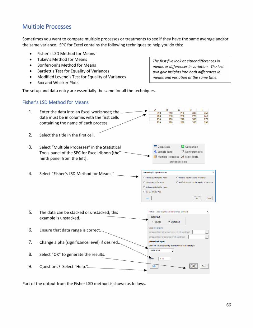
66
Multiple Processes
Sometimes you want to compare multiple processes or treatments to see if they have the same average and/or
the same variance. SPC for Excel contains the following techniques to help you do this:
• Fisher’s LSD Method for Means
• Tukey’s Method for Means
• Bonferroni’s Method for Means
• Bartlett’s Test for Equality of Variances
• Modified Levene’s Test for Equality of Variances
• Box and Whisker Plots
The setup and data entry are essentially the same for all the techniques.
Fisher’s LSD Method for Means
1. Enter the data into an Excel worksheet; the data must be in columns with the first cells containing the name of each process.
2. Select the title in the first cell.
3. Select “Multiple Processes” in the Statistical Tools panel of the SPC for Excel ribbon (the ninth panel from the left).
4. Select “Fisher’s LSD Method for Means.”
5. The data can be stacked or unstacked; this example is unstacked.
6. Ensure that data range is correct.
7. Change alpha (significance level) if desired.
8. Select “OK” to generate the results.
9. Questions? Select “Help.”
Part of the output from the Fisher LSD method is shown as follows.
The first five look at either differences in
means or differences in variation. The last
two give insights into both differences in
means and variation at the same time.
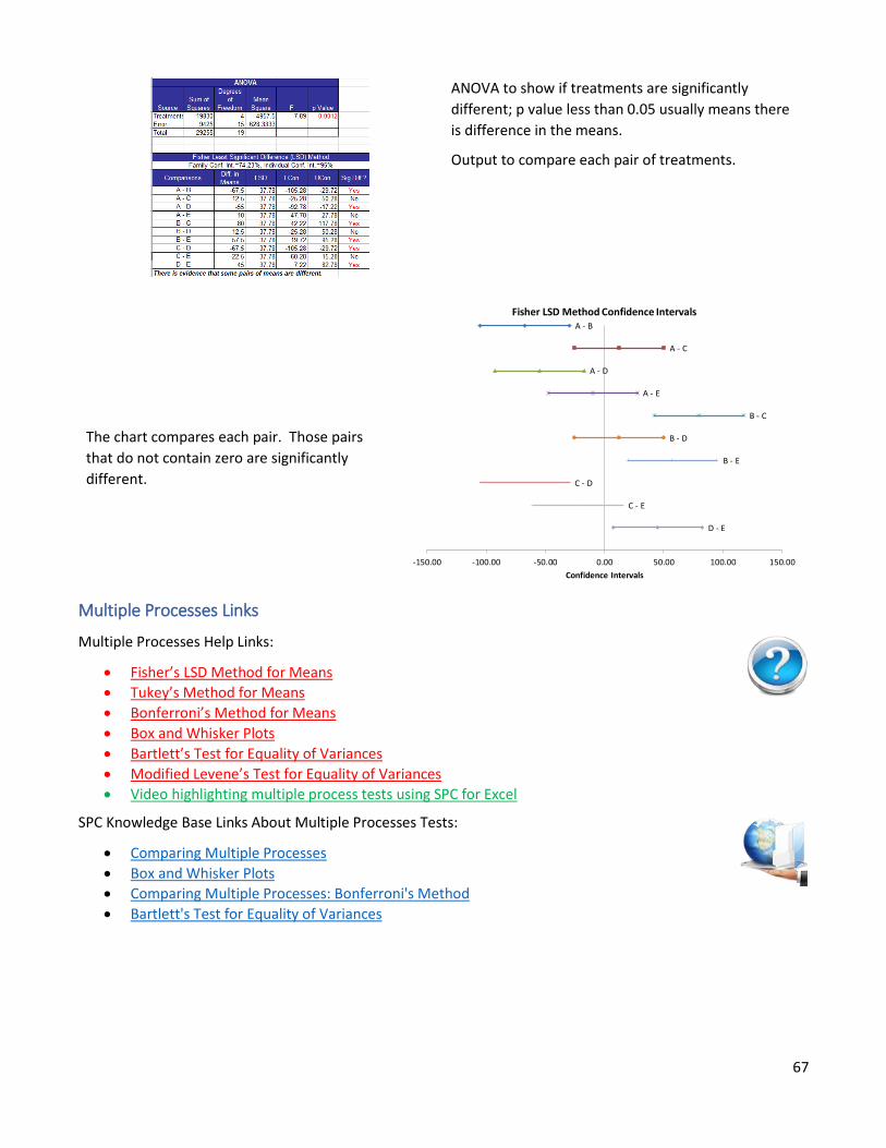
67
ANOVA to show if treatments are significantly
different; p value less than 0.05 usually means there
is difference in the means.
Output to compare each pair of treatments.
The chart compares each pair. Those pairs
that do not contain zero are significantly
different.
Multiple Processes Links
Multiple Processes Help Links:
• Fisher’s LSD Method for Means
• Tukey’s Method for Means
• Bonferroni’s Method for Means
• Box and Whisker Plots
• Bartlett’s Test for Equality of Variances
• Modified Levene’s Test for Equality of Variances
• Video highlighting multiple process tests using SPC for Excel
SPC Knowledge Base Links About Multiple Processes Tests:
• Comparing Multiple Processes
• Box and Whisker Plots
• Comparing Multiple Processes: Bonferroni's Method
• Bartlett's Test for Equality of Variances
A - B
A - C
A - D
A - E
B - C
B - D
B - E
C - D
C - E
D - E
-150.00 -100.00 -50.00 0.00 50.00 100.00 150.00
Confidence Intervals
Fisher LSD Method Confidence Intervals
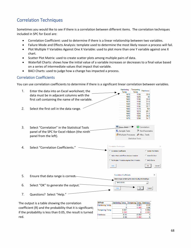
68
Correlation Techniques
Sometimes you would like to see if there is a correlation between different items. The correlation techniques
included in SPC for Excel are:
• Correlation Coefficient: used to determine if there is a linear relationship between two variables.
• Failure Mode and Effects Analysis: template used to determine the most likely reason a process will fail.
• Plot Multiple Y Variables Against One X Variable: used to plot more than one Y variable against one X chart.
• Scatter Plot Matrix: used to create scatter plots among multiple pairs of data.
• Waterfall Charts: shows how the initial value of a variable increases or decreases to a final value based on a series of intermediate values that impact that variable.
• BACI Charts: used to judge how a change has impacted a process.
Correlation Coefficients
You can use correlation coefficients to determine if there is a significant linear correlation between variables.
1. Enter the data into an Excel worksheet; the data must be in adjacent columns with the first cell containing the name of the variable.
2. Select the first cell in the data range.
3. Select “Correlation” in the Statistical Tools panel of the SPC for Excel ribbon (the ninth panel from the left).
4. Select “Correlation Coefficients.”
5. Ensure that data range is correct.
6. Select “OK” to generate the output.
7. Questions? Select “Help.”
The output is a table showing the correlation
coefficient (R) and the probability that it is significant;
if the probability is less than 0.05, the result is turned
red.

69
Correlation Techniques Links
Correlation Techniques Help Links:
• Correlation Coefficients
• Failure Mode and Effects Analysis
• Plot Multiple Y Variables Against One X Variable
• Scatter Plot Matrix
• Waterfall Charts
• BACI Charts
• Video highlighting correlation techniques using SPC for Excel
SPC Knowledge Base About Correlation Techniques:
• Failure Mode and Effects Analysis
• Waterfall Charts
• Correlation Analysis
• Scatter Plot Matrix
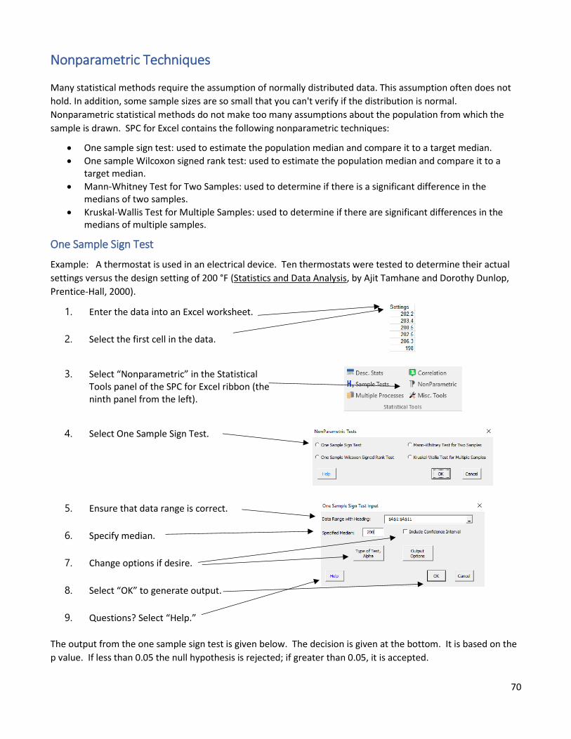
70
Nonparametric Techniques
Many statistical methods require the assumption of normally distributed data. This assumption often does not
hold. In addition, some sample sizes are so small that you can't verify if the distribution is normal.
Nonparametric statistical methods do not make too many assumptions about the population from which the
sample is drawn. SPC for Excel contains the following nonparametric techniques:
• One sample sign test: used to estimate the population median and compare it to a target median.
• One sample Wilcoxon signed rank test: used to estimate the population median and compare it to a target median.
• Mann-Whitney Test for Two Samples: used to determine if there is a significant difference in the medians of two samples.
• Kruskal-Wallis Test for Multiple Samples: used to determine if there are significant differences in the medians of multiple samples.
One Sample Sign Test
Example: A thermostat is used in an electrical device. Ten thermostats were tested to determine their actual
settings versus the design setting of 200 °F (Statistics and Data Analysis, by Ajit Tamhane and Dorothy Dunlop,
Prentice-Hall, 2000).
1. Enter the data into an Excel worksheet.
2. Select the first cell in the data.
3. Select “Nonparametric” in the Statistical Tools panel of the SPC for Excel ribbon (the ninth panel from the left).
4. Select One Sample Sign Test.
5. Ensure that data range is correct.
6. Specify median.
7. Change options if desire.
8. Select “OK” to generate output.
9. Questions? Select “Help.”
The output from the one sample sign test is given below. The decision is given at the bottom. It is based on the
p value. If less than 0.05 the null hypothesis is rejected; if greater than 0.05, it is accepted.
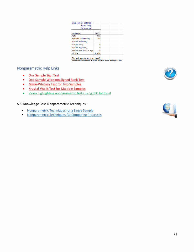
71
Nonparametric Help Links
• One Sample Sign Test
• One Sample Wilcoxon Signed Rank Test
• Mann-Whitney Test for Two Samples
• Kruskal-Wallis Test for Multiple Samples
• Video highlighting nonparametric tests using SPC for Excel
SPC Knowledge Base Nonparametric Techniques:
• Nonparametric Techniques for a Single Sample • Nonparametric Techniques for Comparing Processes
72
Miscellaneous Tools
SPC for Excel contains the following miscellaneous statistical techniques:
• Chi Square Goodness of Fit Test: used to determine if a set of data fits a particular distribution.
• Chi Square Test for Association: used to determine if there is any association between two variables.
• Side by Side Histogram: used to compare results.
• Item Analysis: used to test how reliable the questions are on a survey.
• Random Number Generator: generates random number from one of 13 distributions.
Each of these, except the random number generator, are unique in the way data are entered into the
worksheet. Please see the help links below for information.
Miscellaneous Tools Help Links
• Chi Square Goodness of Fit Test
• Chi Square Test for Association
• Side by Side Histogram
• Item Analysis
• Random Number Generator
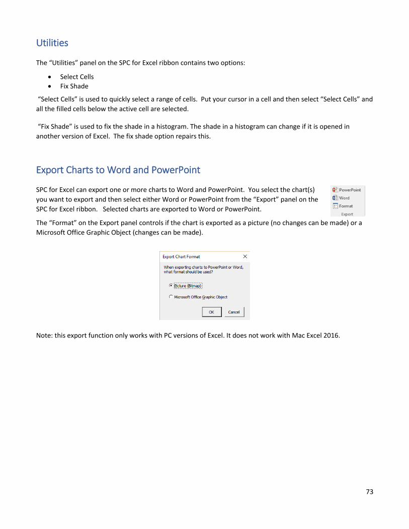
73
Utilities
The “Utilities” panel on the SPC for Excel ribbon contains two options:
• Select Cells
• Fix Shade
“Select Cells” is used to quickly select a range of cells. Put your cursor in a cell and then select “Select Cells” and
all the filled cells below the active cell are selected.
“Fix Shade” is used to fix the shade in a histogram. The shade in a histogram can change if it is opened in
another version of Excel. The fix shade option repairs this.
Export Charts to Word and PowerPoint
SPC for Excel can export one or more charts to Word and PowerPoint. You select the chart(s)
you want to export and then select either Word or PowerPoint from the “Export” panel on the
SPC for Excel ribbon. Selected charts are exported to Word or PowerPoint.
The “Format” on the Export panel controls if the chart is exported as a picture (no changes can be made) or a
Microsoft Office Graphic Object (changes can be made).
Note: this export function only works with PC versions of Excel. It does not work with Mac Excel 2016.
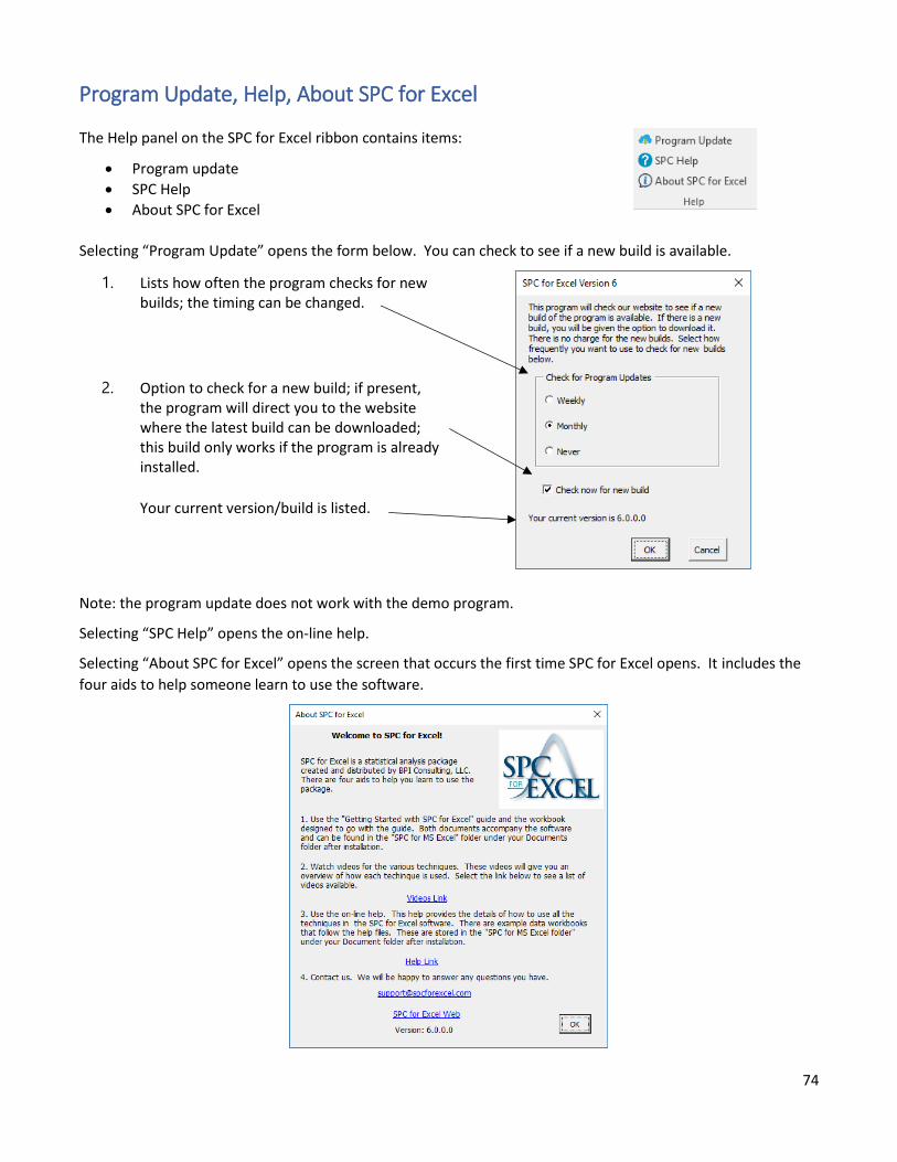
74
Program Update, Help, About SPC for Excel
The Help panel on the SPC for Excel ribbon contains items:
• Program update
• SPC Help
• About SPC for Excel
Selecting “Program Update” opens the form below. You can check to see if a new build is available.
1. Lists how often the program checks for new builds; the timing can be changed.
2. Option to check for a new build; if present, the program will direct you to the website where the latest build can be downloaded; this build only works if the program is already installed.
Your current version/build is listed.
Note: the program update does not work with the demo program.
Selecting “SPC Help” opens the on-line help.
Selecting “About SPC for Excel” opens the screen that occurs the first time SPC for Excel opens. It includes the
four aids to help someone learn to use the software.